Explore 10+ Most Beautiful Web Design of 2024
Summer Nguyen | 08-14-2024
Explore the forefront of web design with our curated collection of the 10+ Most Beautiful Web Designs of 2024. From vibrant e-commerce platforms to serene corporate portals, these designs showcase the artistry and strategic thinking behind effective digital interfaces. Join us as we delve into the creative minds and technical prowess shaping the future of online aesthetics.
Free 1-1 consultation: Website Design Service

Discover 10+ Best Beautiful Web Design Example
PLANR by OrangeOrange
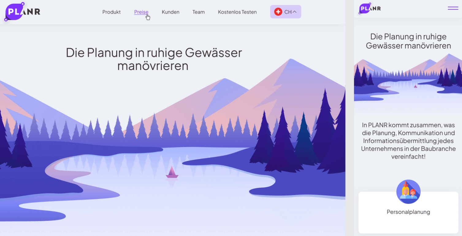
Highlighted Features:
- Emotionally engaging user interface
- Soothing color palette
- Tribute to Swiss landscapes
PLANR, a CRM system in construction, aimed to establish reliability. OrangeOrange achieved this with a web design that instills comfort and confidence. Gentle content and rounded buttons promote relaxation, while majestic imagery creates a fairy-tale ambiance.
The design’s pastel colors and serene digital art pay homage to Switzerland, featuring landscapes of mountains, lakes, and trees. Soft purples, blues, white, and gray complete the tranquil color scheme.
North Ammonia by Mission
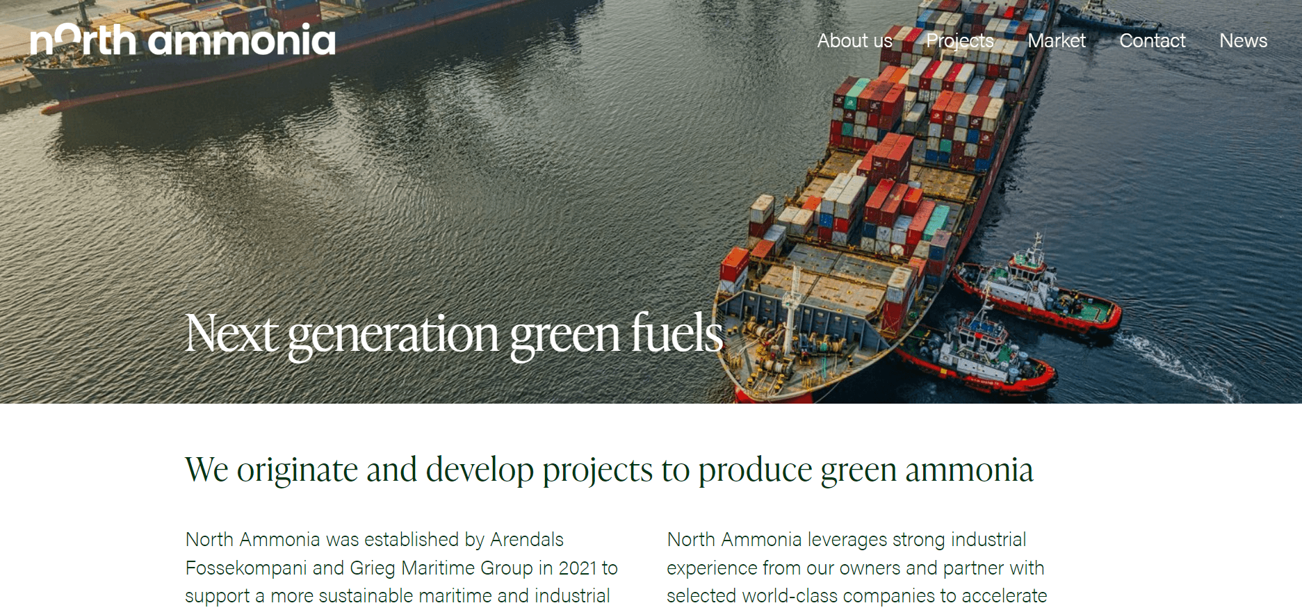
Highlighted Features:
- Fluid motion
- Playful illustrations
- Emphasis on empirical data
North Ammonia’s efforts to become Norway’s leading green energy provider in the maritime sector are brilliantly showcased through this attractive website design by Mission. The website tackles serious issues while educating the public about them.
The primary color in this design is green, with various shades balancing each other. These colors are featured in the hero section, where light green gas spots move around a gradient built on darker green shades. They are also used to create playful illustrations that accompany the website’s educational sections.
Odesa subway by Solar Digital
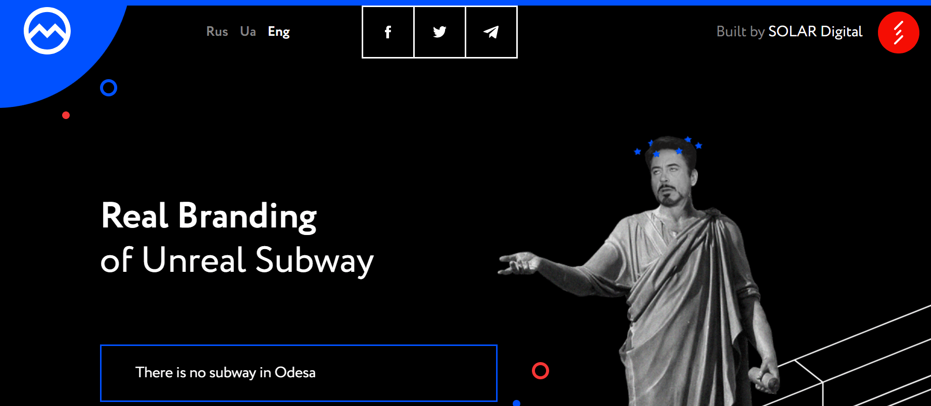
Highlighted Features:
- Clever and satirical
- Built on meme culture
- Uses humor to highlight a serious issue
When we talk about beautiful cities, we often mention their transportation because it keeps them moving. And to this day, there’s no better way to navigate a big city than by subway. The same goes for Odessa and its nonexistent subway station. The only problem is—it doesn’t exist!
But their website does, and it’s one of the attractive website designs, thanks to Solar Digital. The agency has created a website to critique authorities for their years of unfulfilled promises. While parts of it are built around meme culture that’s genuinely humorous and satirical, the real beauty of the design lies in the potential feasible solutions presented by this agency.
o’k by Vorbulla
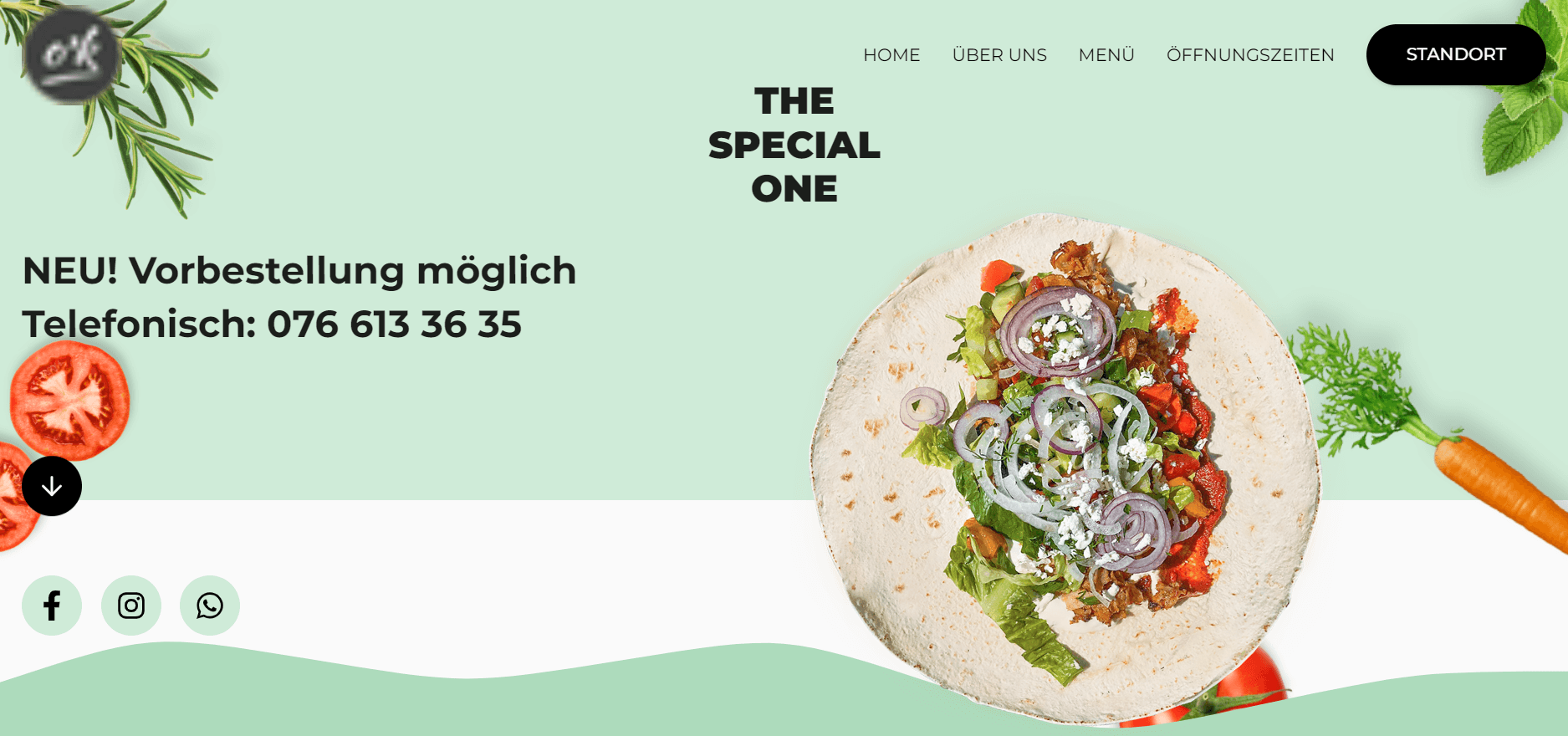
Key Features:
- Realistic, appetizing imagery
- Wave-like single-page layout
- Two interactive images
O’k leads the Swiss food market by offering the first vegetarian and vegan doner kebab sandwiches made from locally sourced vegetables. Vorbulla has crafted this attractive yet tasteful website with a background of navy blue and soft green hues. The website incorporates cute dynamic elements and images of fresh ingredients and products to appeal to both existing and new customers.
Navigating this single-page layout provides a comfortable and visual experience, with fresh vegetables displayed throughout and beautiful wavy horizontal lines introducing each color-coded section.
Conceptions Reproductive by The 215 Guys
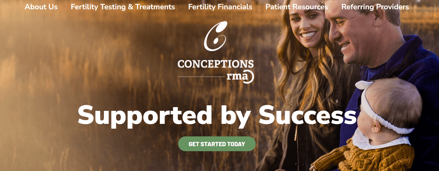
Key Features:
- Ambitious and aesthetically pleasing imagery
- Fresh, vibrant color palette
- Intuitive navigation with dropdown menus
The website for Conceptions Reproductive, designed by The 215 Guys, not only captivates visually but also offers valuable information for users seeking reproductive care services.
A standout feature is the user-friendly navigation bar. Hovering over options reveals neatly organized dropdown menus, facilitating easy access to various subcategories.
The white and green color scheme adds a fresh and harmonious look, perfectly aligned with the organization’s focus on reproductive health. It exudes cleanliness and a sense of tranquility, crucial in such a sensitive field.
Moreover, the website utilizes visual data visualization tools to simplify complex information and highlight significant clinical research projects and global advancements in reproductive medicine.
Mensy Shop by Malord
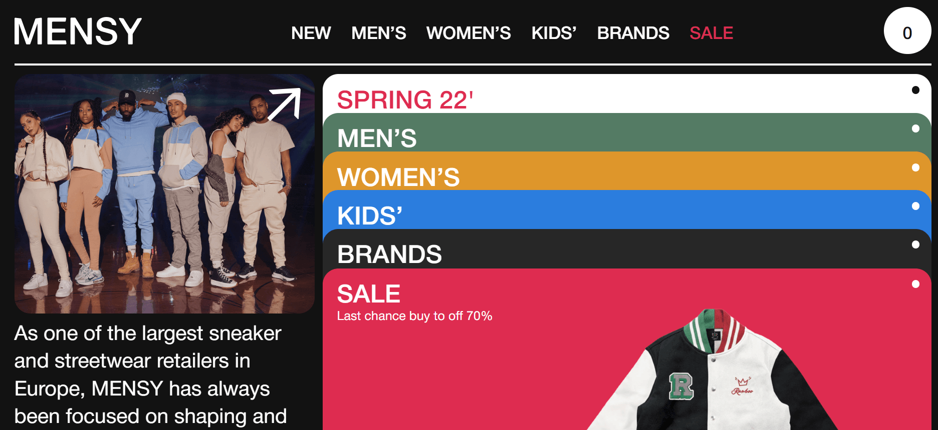
Highlighted Features:
- Fashionable and luxurious
- Circular geometric elements
- Custom fonts for headings
The Mensy Shop online store, designed by Malord Design, is intended to be one of the most beautiful e-commerce websites. This company has evoked an emotional response through its sleek monochrome design, setting the stage for a vibrant product showcase.
The layout features five shades: white, black, and two shades of gray, creating a stylish composition that is punctuated by a bold orange accent that breaks the monotony. The headings feature custom fonts with small handwritten orange text adorning them.
Huawei Corp by Elena Saharova

Highlighted Features:
- Rounded edges
- Product-oriented
- Well-branded design
Huawei Corp’s new website concept, designed by Elena Saharova, strikes a balance between customer needs and brand recognition, creating one of the most stunning web designs in the tech industry!
The hero section is split into two interactive parts. The left side serves as an information hub, shuffling the latest tech news, while the right side simultaneously showcases featured products on a carousel.
As you scroll, you’ll encounter animated product images. You can browse product details and marvel at the representations surrounding the products.
Next is the news section, featuring a zoomed-in quote from the CEO and a full-screen video that introduces the Huawei universe through an immersive journey, offering an attractive website design.
Love, Ara Shopify Store by Petruth IT Solutions
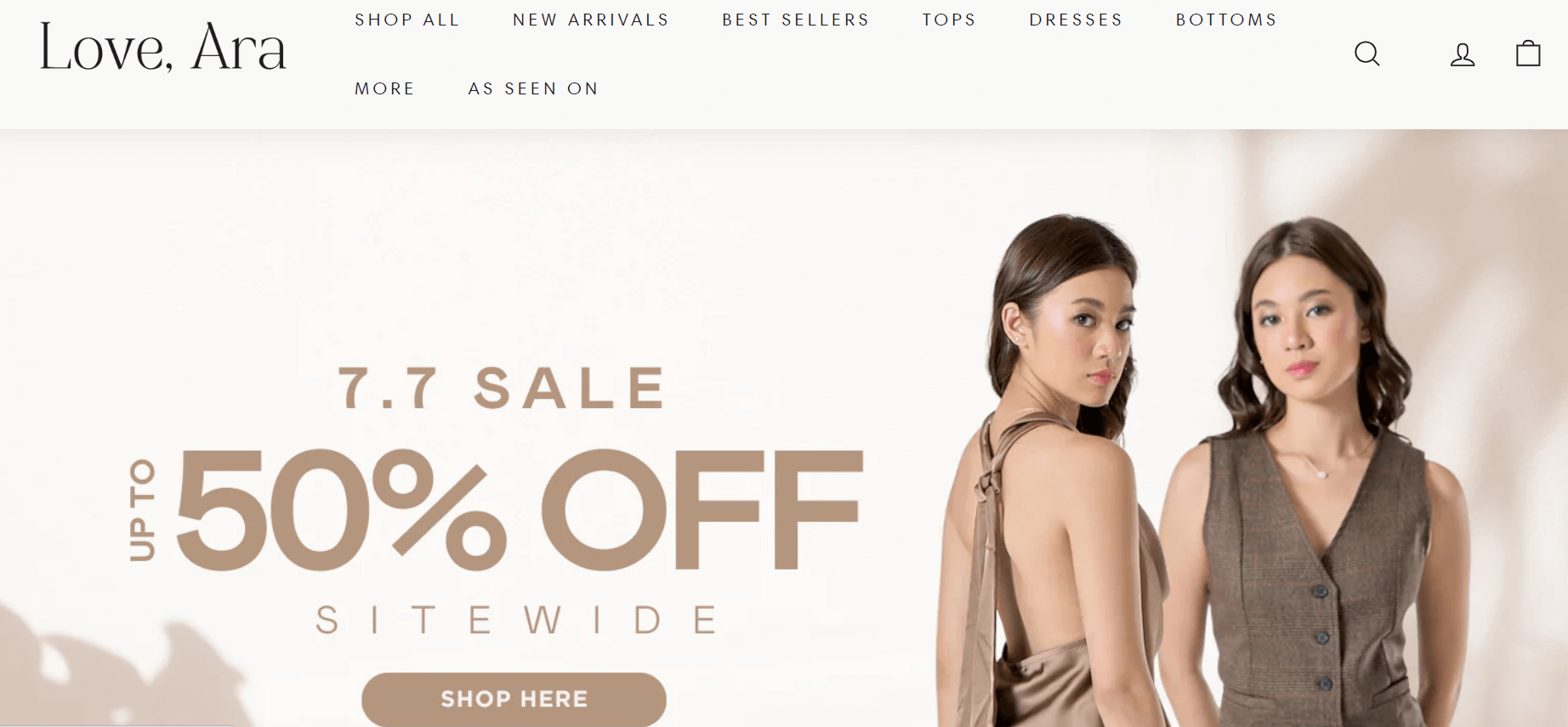
Highlighted Features:
- Clean, comprehensive design
- Testimonial section in a carousel
- Charming, feminine
- About section
Petruth IT Solutions has crafted one of today’s most stunning web designs with the impressive revamp of the Love, Ara Shopify Store. This new design enhances the user experience by improving functionality and brand recognition through theme adjustments.
The hero section greets you with two poster-style copies, one advertising the latest collection and the other informing you of their top promotion times. The design is clean and product-focused, utilizing ample white space to showcase different clothing styles.
However, aesthetics take precedence in some areas. The About section is a standout branding tool for this design – it’s elegant, feminine, and personal, addressing the brand and the user as a browser.
LUXECIERGE by be++er
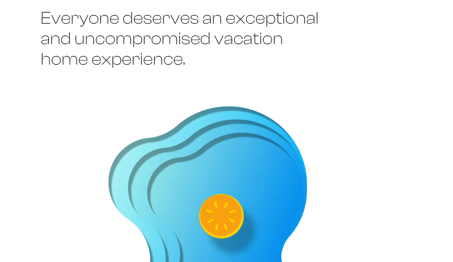
Highlighted Features:
- Clean and relaxing
- Comfortable, borderless design
- “Show, don’t tell” approach
Through a clean and relaxing web design crafted by be++er, this brand unveils a secret to you – planning your trip doesn’t have to be stressful. With empty spaces serving as a pleasant canvas free of aggressive buttons and unnecessary elements, this design invites you to relax and browse through a series of short copy that assures a safe space for your needs.
The tranquil simplicity of this one-page design is divided into three sections. The first section displays digital artwork of an orange cross-section in the middle of an abstract blue image. This seemingly random piece is followed by more copy, realistic images of a resort with a pool, and an orange-like swimming ring. These images convey a strong “show, don’t tell” message to the viewer, ensuring they understand what is promised.
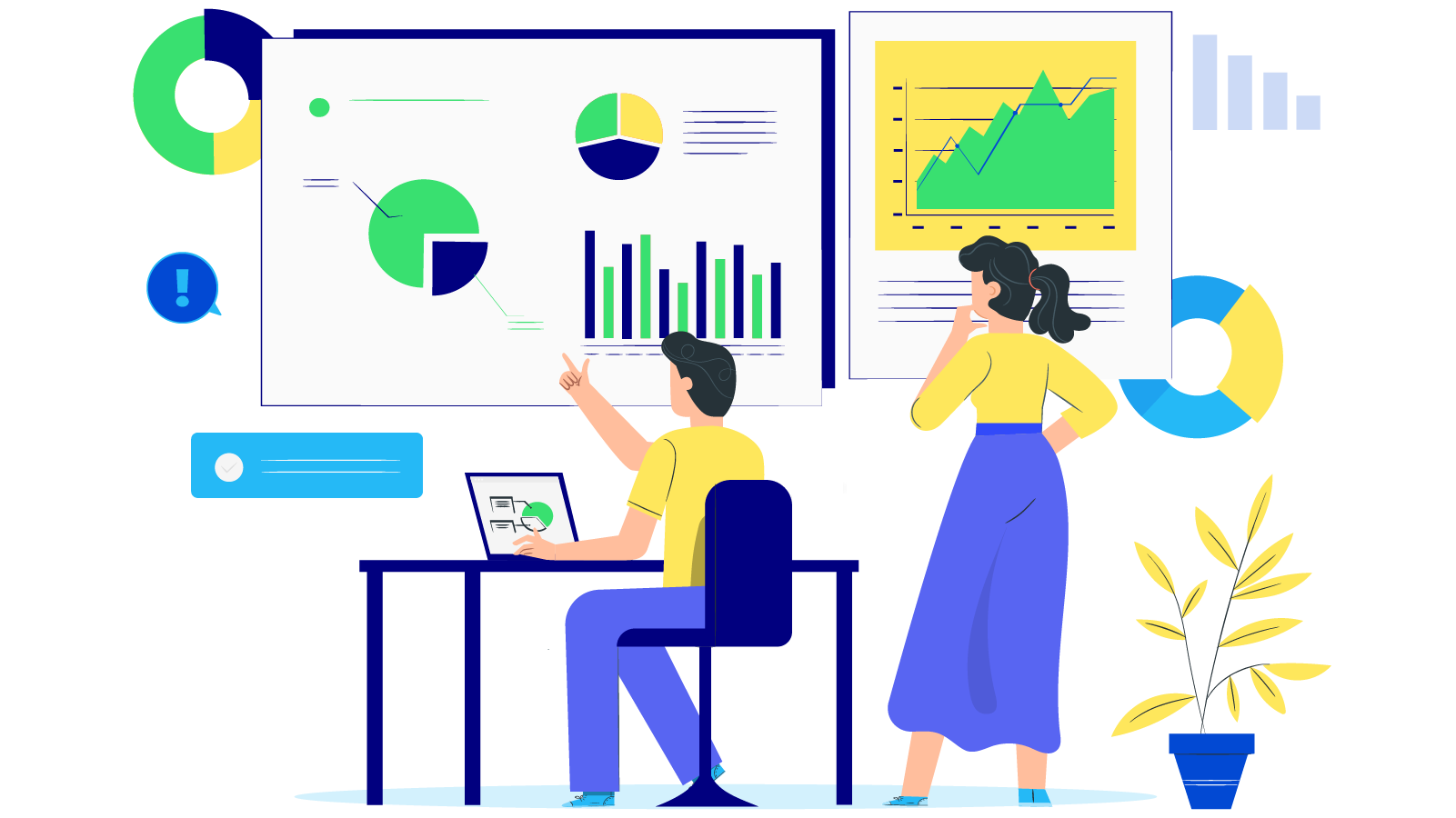
Iziproff by DRUGOE Digital bureau
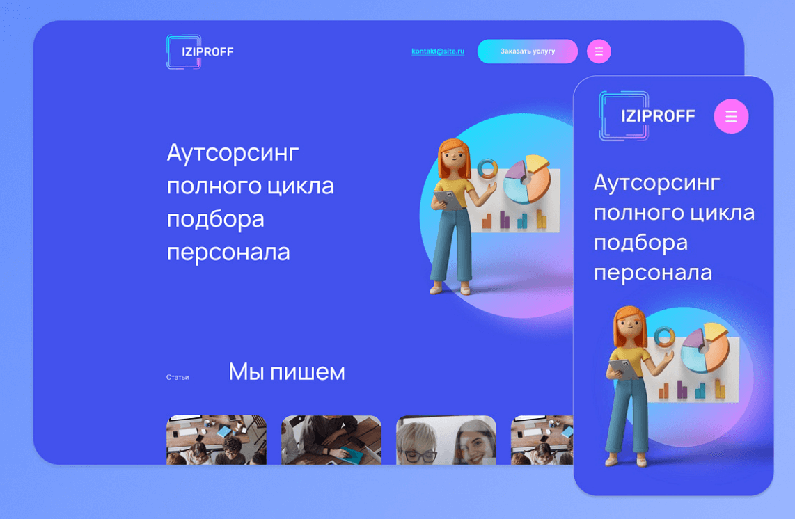
Highlighted Features:
- Avatar mascot
- Comprehensive service menu
- Pastel gradient transitions
DRUGOE Digital Bureau has helped Iziproff enhance its online brand visibility through a simple yet stunning web design that excellently conveys the brand’s outsourcing potential.
The design is led by an avatar mascot. An orange-haired girl holding data charts is often placed alongside other images that enhance the design’s appeal, such as pie charts and digital bar graphs. Other visual elements are primarily geometric, displaying complete or partial circles, each filled with pastel tones that highlight the brand’s logo frame colors. These tones are also found on the buttons!
The design is streamlined and optimized to seamlessly showcase the brand’s services. The browsing experience features real people performing various tasks and explaining how everything works.
Boho Studio by Uniforma Studio
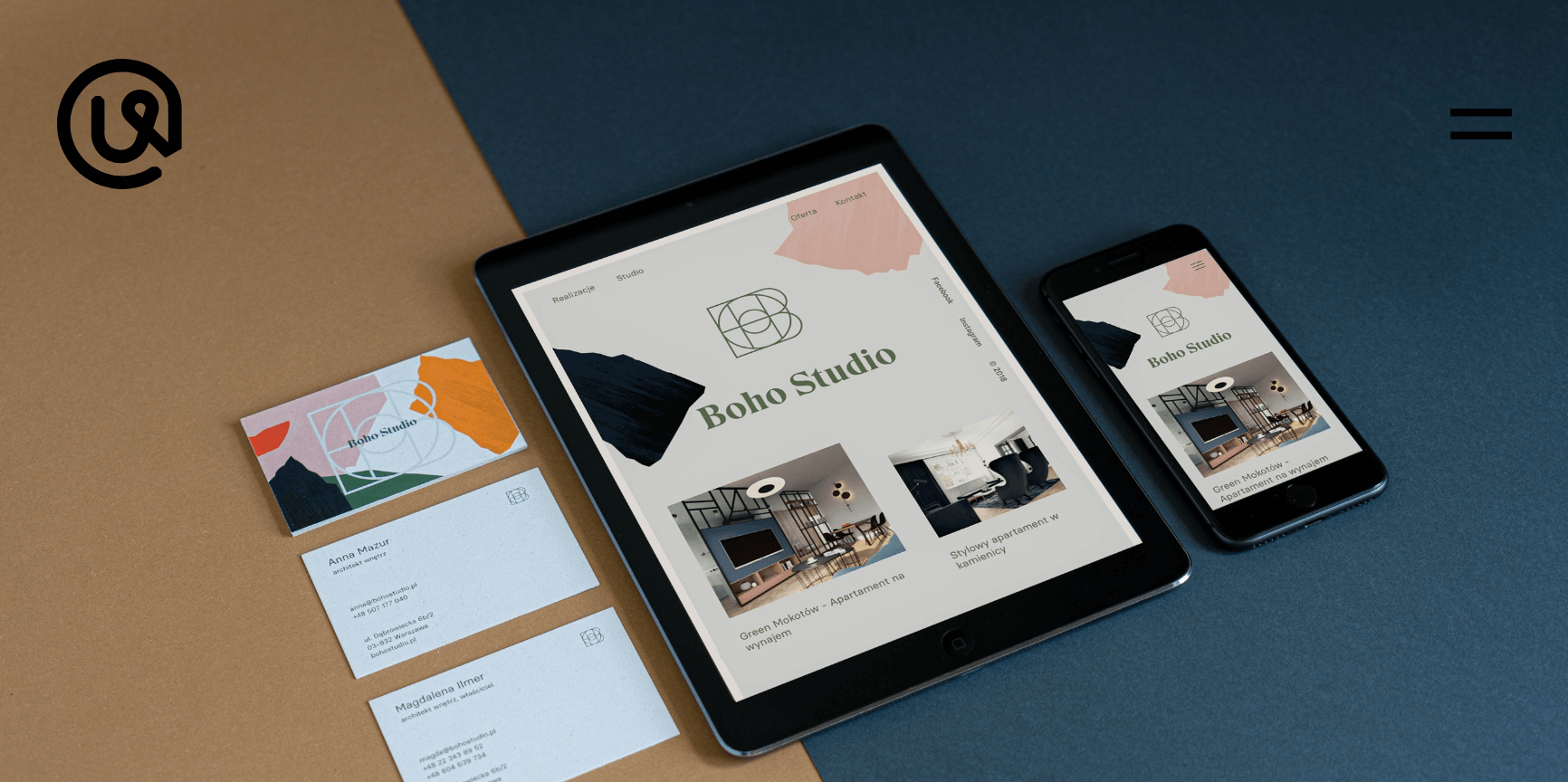
Highlighted Features:
- Modern design
- Stylish color palette
- Distinctive typography
Boho Studio’s brand needed a refresh, and Uniforma Studio knew just what to do. They delivered a modern, visually appealing web design that preserves the brand’s identity while enhancing its online visibility.
The design is vibrant, with a soft turquoise background and various pastel and bright colors scattered around the layout’s edges. The homepage initially welcomes you with the brand’s team and portfolio, all presented through a freely positioned image collection.
European Outdoor Group by Blunt Crayon
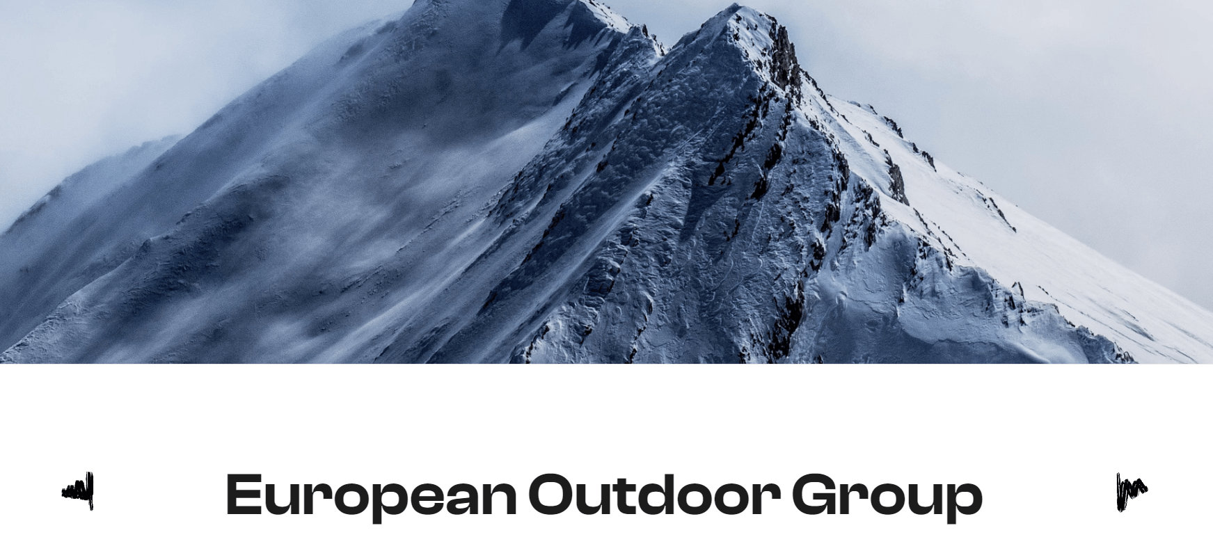
Highlighted Features:
-
- Collection of stunning nature landscapes
- Emphasis on readability
- Expanded “About” page
The beautiful web design of European Outdoor Group, created by Blunt Crayon, takes you on a series of breathtaking virtual trips through a gallery that makes you want to join the organization. The clean design heavily relies on widescreen images of serene and unobstructed natural landscapes, combined with short copy and buttons that match the logo’s hues.
The “About” section is particularly notable, providing detailed explanations of the types of activities and how to engage in them. Once again, readability is maintained through vertical dividers that separate the points, each represented by matching icons that complement the content blocks.
Victorian Woodworkers Association by Hue Studio

Highlighted Features:
- Thick black squares and rectangles
- Community gallery
- Well-branded design
One of the most beautiful web designs is provided by Hue Studio for the Victoria Carpenters’ Association. This well-structured website supports clients in their mission to foster generations of carpenters and woodworking enthusiasts.
The entire design follows the structure of the logo, with thick black lines dividing sections and forming squares and rectangles reminiscent of the logo’s frame. The color scheme mirrors the various types of wood artisans commonly work with, complemented by shades of green found in the leaves and grass of the natural environment.
Several galleries showcase community activities and member events, along with an engaging blog section that introduces new members and announces events.
Tips to Create a Beautiful Web Design
Maintain a minimalist and clutter-free homepage
Your website’s homepage should immediately convey your core message. After all, we seldom read every word on a website. Instead, we quickly scan for keywords, phrases, and images. With these known behaviors, it’s better to evoke emotions rather than a quantity of words.
The fewer visitors have to read, click, or remember, the better they can process and evaluate your content. By designing to reduce attention spans (and according to web design statistics), and applying modern web design, users are more likely to do what you want them to.
Learning how to design a website, these simple web design tips will help you chunk content and create an attractive and engaging homepage:
- Highlight important content at the top: Visitors should understand your website’s content as early as possible without having to scroll or click anywhere.
- Space out your content: Use white space between elements. By leaving some areas empty, you’ll create a more spacious and balanced design. For your text, format your text into short paragraphs for easy readability.
- Include images: High-quality media features such as beautiful photos, vector art, or icons are great ways to convey your viewpoint.
- Incorporate a call to action: From making a purchase to signing up, encourage website visitors to take action by placing a call-to-action (CTA) button on the homepage of your website.
Read more: Website Development Cost: Everything You Need to Know
Design with visual hierarchy in mind
Hierarchical structure is a crucial design principle that helps present your content clearly and effectively. By employing proper hierarchy, you can direct the attention of website visitors to specific page elements in order of priority, starting with the most important.
The key components of a visual hierarchy system include:
- Size and weight: Highlight your top assets, such as your business name and logo, by making them larger and visually prominent. Readers naturally gravitate towards larger, bold headlines first, before moving on to smaller body text.
- Component positioning: Use appropriate website layouts to guide visitors’ eyes in the right direction. For instance, you might place a prominent call-to-action button in the center of the screen or position your logo at the top of the website.
Create easy to read website content
Readability measures how easily people recognize words, sentences, and phrases. When your website has high readability, users can scan or read through it easily, making information absorption straightforward.
Here are essential tips to enhance readability on your website:
- Contrast: Ensure sufficient contrast between text and background for readability and accessibility.
- Font size: Keep body text at least 16pt to aid readability, adjusting based on your chosen font.
- Font type: Choose serif or sans-serif fonts wisely; sans-serif fonts are often better for online reading.
- Limit fonts: Use no more than three font styles to maintain a clean and cohesive design.
- Hierarchy: Vary text sizes to establish clear content hierarchy, guiding readers through your website effectively.
Ensure your site is easy to navigate
Ensure your site’s navigation is user-friendly and intuitive. While your design may break new ground elsewhere, navigation should be straightforward. Users should easily find what they need, and a well-structured navigation system not only enhances user experience but also integrates with SEO. Here are key tips:
- Link your logo to the homepage: This is expected by visitors and saves clicks. If you haven’t already, create a distinctive logo as part of your branding.
- Optimize your menu: Whether it’s a horizontal list, hamburger menu, or another style, make sure it’s prominent and prioritized logically.
- Implement scroll navigation: For long-scrolling websites, anchor menus allow quick navigation to any section.
- Enhance your footer: Include essential links like contact details, social media icons, and a condensed menu for easy access.
Stay mobile friendly
All visitors to your website can enjoy its professional appearance at its best, regardless of the device they are browsing on. When designing your website, Wix automatically creates a mobile-friendly version so you can keep up with the increasingly mobile world.
Consider the mobile version of your website by putting yourself in the user’s shoes and checking each page, action, and button.
Your mobile website should be cleaner and less cluttered than the desktop version, so consider minimizing page elements and condensing some content, such as menus. There are also unique mobile features that you can use to enhance your mobile design.
Read more: Website Support and Maintenance: 10 Types & Benefits
Summary
In conclusion, the landscape of web design continues to evolve, driven by creativity, technology, and user-centric principles. The showcased designs not only inspire but also provide practical insights into crafting compelling digital experiences. As businesses and designers strive for excellence in both form and function, these examples serve as beacons of innovation and style, guiding us towards a future where beauty meets usability seamlessly on the digital frontier.

Summer is the CMO and Digital Commerce Solution Expert with 10+ years of experience. She specializes in Magento, Shopify, ERP, CRM, AI, and Blockchain, delivering strategic solutions that transform businesses. With a deep understanding of digital commerce, she helps brands scale and stay ahead in a competitive market.
Related Post

Mageplaza Announces Official Separation from Avada Group
Mageplaza is pleased to announce a significant milestone in our journey as we officially separate from the Avada Group to operate as an independent company.
Magento 2.4.8 Release: What's New In This Latest Enhancements?
In this article, we’ll explore the standout new features and enhancements that make the Magento 2.4.8 Beta version truly special.
Explore the latest from Mageplaza in January 2025, with new modules and updates designed to enhance your Magento e-commerce experience.
AngularJS and ReactJS: Which Framework Should We Use?
AngularJS vs ReactJS: Which framework is right for your project? In this article, we aim to discover strengths, weaknesses, and best use cases of them.
& Maintenance Services
Make sure your store is not only in good shape but also thriving with a professional team yet at an affordable price.
Get Started