13 Dark Mode Websites with Unique Designs
Summer Nguyen | 08-08-2024
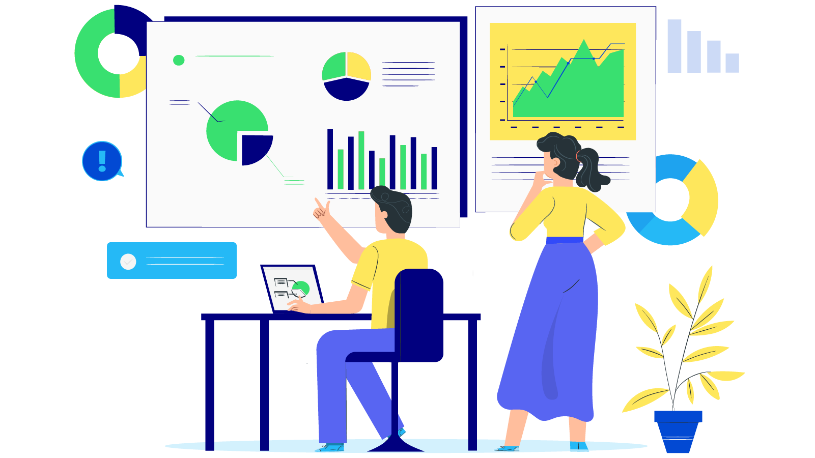
The increasing popularity of dark mode in web design provides a stylish and contemporary appearance that improves user interaction. In this article, we showcase 13 impressive dark mode website examples. These dark mode website examples will motivate you to install dark mode in your brand, enhancing the visual appeal and engagement of your website.
Free 1-1 consultation: Website Design Service

Why Does A Dark Mode Website Matter?
In recent years, dark mode website examples have become increasingly popular for various convincing reasons. Here is a summary of the importance of dark mode:
- Comfort for the User: Dark mode websites have gained popularity due to their focus on user comfort. By reducing blue light emissions, dark mode helps to minimize eye strain, especially in low-light conditions. This makes nighttime browsing or using devices in dimly lit environments more comfortable.
- Battery Life and Aesthetic Appeal: An important advantage of dark mode, particularly on OLED and AMOLED screens, is its ability to conserve battery life. By deactivating pixels to display black, dark mode consumes less energy compared to brighter pixels. Additionally, the dark mode offers a sleek and modern aesthetic that many users find visually appealing.
- Content Emphasis and Usability: The dark background in dark mode serves to highlight content such as images, videos, and colorful buttons. This can enhance the visual appeal of the website and draw attention to key elements. Furthermore, the improved readability and contrast in dark mode can benefit users with visual impairments or light sensitivity.
- Health Benefits and Market Trends: Dark mode websites may contribute to better sleep patterns by decreasing exposure to blue light, which is known to disrupt sleep cycles. This is especially beneficial for individuals who use electronic devices before bedtime. The growing demand for dark mode across devices and apps indicates a rising trend that website developers can leverage to meet user expectations and enhance overall satisfaction.
Key Elements Of A Dark Mode Website
Designing a successful dark mode website requires taking into account various important factors to guarantee a good user experience and uphold visual attractiveness. Here are six crucial components to concentrate on:
Color Combination
- Opt for dark gray tones instead of pure black to lessen contrast and prevent eye fatigue. Add accent colors to buttons, links, and highlights to contrast with the dark background.
- Body text should be in light colors, such as white or light gray, to ensure readability. To cut glare, steer clear of using pure white.
Contrast and Readability
- Keep text easily readable by maintaining a strong contrast ratio between text and background. Use resources such as the WCAG contrast checker to conform with accessibility guidelines.
- Using vibrant or intense colors for interactive elements helps to differentiate them and make them stand out more.
Shadows and Highlights
- Use gentle shadows to add depth and emphasize interactive elements on the dark background while avoiding overpowering them.
- Use highlights in moderation to emphasize key elements. These can be CTA buttons or essential content sections.
13 Examples of Dark Mode Website Designs
ReShape
Challenge Studio designed ReShape‘s website to be simple, structured, and tidy. The main page shows important choices without the need to scroll, such as buttons for Deals, Buy a Pass, and Book Squash. The information is segmented into distinct parts with noticeable borders, and the menu is organized into services, objectives, teams, and booking.
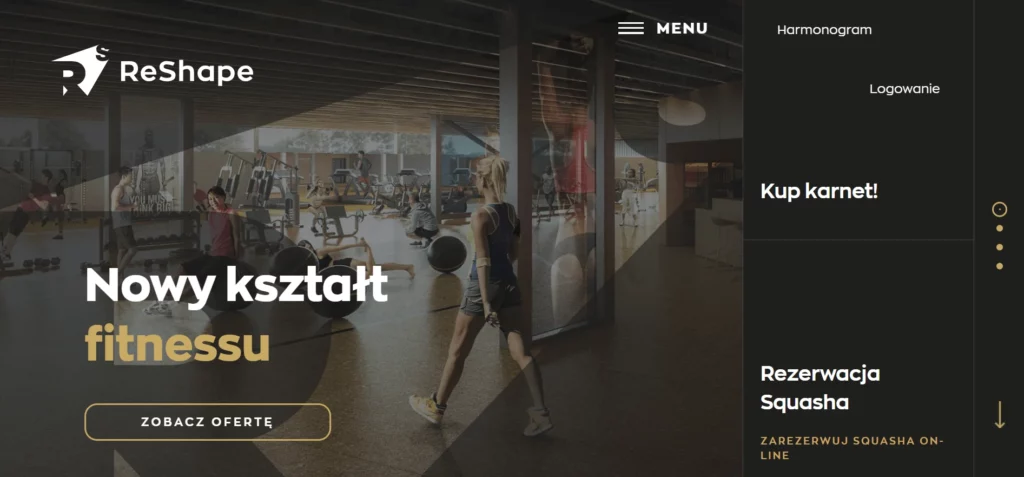
Key Takeaways:
- Menu arranged into categories for simple navigation.
- Neatly organized content sections.
- CTAs that can be seen: Important choices presented immediately.
- Neat design: No mess.
Loud Mob Media
The website of Loud Mob Media is striking and colorful. There is a dynamic cursor and a fixed menu for effortless navigation. A roller paint brush is used to display the phrase, “We Create Brands,” in teal paint, along with a call-to-action button leading to their portfolio. Graphics and text move according to the user’s gestures, emphasizing important areas. As you scroll down, you will find texts, graphics, and animations stacked on top of each other. Even with its cluttered design, it appears visually attractive. Every page features distinct header animations. This provides a creative element to the dark-themed layout.
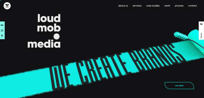
Key Takeaways:
- Dynamic Cursor: Captivates individuals.
- Menu that sticks: Simple way to navigate.
- Vivid graphics: Engaging and visually appealing.
- Innovative designs: Hectic yet structured.
- Distinct animations: Varied on every page.
Will Ventures
Will Ventures‘ website showcases a sleek dark theme with striking white text against a black backdrop. The menu navigation that is concealed is straightforward. Catchy greeting text captures interest. Strategic call-to-action buttons provide effective navigation for visitors. Flashes of yellow stand out against the dark background, showing up on CTAs and clickable links.
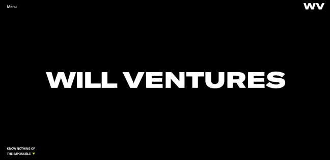
Key Takeaways:
- Simple Design: Neat and direct.
- Menu that is not easily visible but has easy navigation.
- Short and catchy greeting.
- CTAs that are strategically positioned are impactful.
- Bright yellow accents: Provide a stark contrast to the dark theme.
Imotion Factory
The website of Imotion Factory is both distinctive and captivating. The video production agency subtly hints at their identity with the red dot in their logo. Visitors are greeted with a striking decorative font on a completely black webpage. The design is neat and uncomplicated. There are two choices in the top right menu: Contact and Menu. A round loading symbol is located in the lower right corner, blending with the dark color scheme. The homepage displays diagonal static images instead of videos. These images liquefy as you scroll. Every picture comes with a project title, play button, and Call to Action (CTA) button.
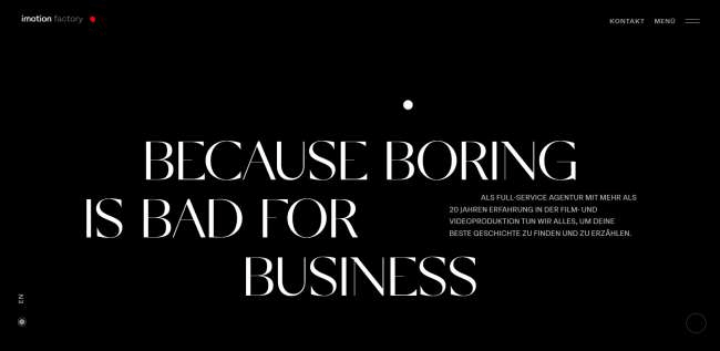
Key Takeaways:
- Bold Typeface: Attractive and ornamental.
- Basic design: Neat and user-friendly.
- Innovative Pictures: Distinctive melting impact.
- Simple Menu: Only necessary choices.
- Dark Theme: Suited to the brand.
Tigers
The Tigers website features a striking black and red theme created by Wise People. Puzzle-shaped images bring depth. Gray and red vertical accents elevate the appearance. The slogan “We will prove the correct path” is quite noticeable. The bottom part displays logos of previous clients for simple navigation.
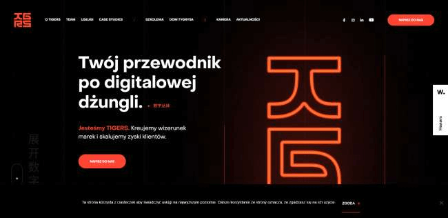
Key Takeaways:
- Vibrant Shades: Black and red.
- Imaginative Pictures: Shapes for puzzles.
- Include vertical accents in the design.
- Footer layout: Navigation accompanied by logos of clients.
DoublePoint
On DoublePoint Studio’s website, you will find a subtle menu and a captivating portfolio placed prominently on the homepage. A GIF showcasing their creations instantly seizes the viewer’s attention. The backdrop switches back and forth from black to red, creating visual intrigue. The titles in the Contact and Our Services sections are created as rotating badges. The Projects page features a red heart animation beside the header. It conveys the message “Projects crafted with love for you,” adding a special flair.
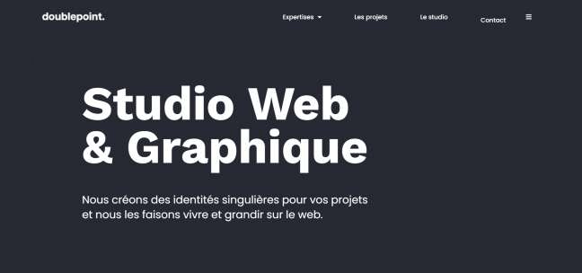
Key Takeaways:
- Subtle Menu: Basic and uncluttered.
- Portfolio that changes frequently: Interactive main screen.
- Title badges that rotate in sections.
- Visual Appeal: Black and red background alternating for added interest.
- Artistic Elements: Animated red heart in Projects.
WallsStreetBets Dapp
The website of WallsStreetBets showcases a modern street aesthetic with a dark purple color scheme. The design incorporates LED visuals associated with blockchain and cryptocurrency, capturing immediate interest. The front page has a modern appearance, featuring purple-framed embedded videos that match the design. CTAs turn purple when hovered over.
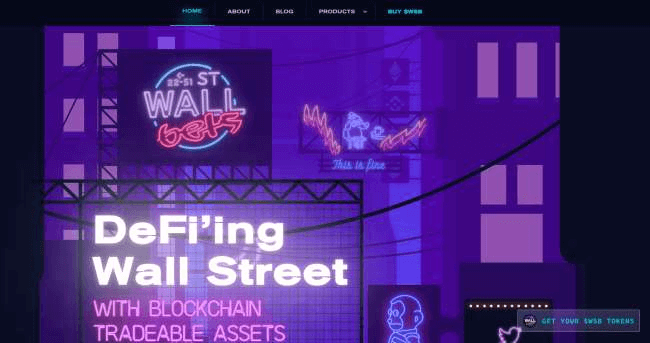
Key Takeaways:
- Contemporary Aesthetics: Futuristic urban layout.
- LED Graphics: Attractive and theme-based.
- Purple Theme: Uniform and captivating.
- Effects emphasized: Purple accents on calls to action.
- Videos are incorporated into the design.
Avocado Systems
The primary focus of Avocado Systems‘ website is on application security. The theme is dark with lively mechanical drawings and bright icons. The arrangement is structured and orderly. The website features dark hues complemented by pops of vibrant colors such as blue, purple, yellow, and orange. These colors enhance the visual attractiveness of the website. The mechanical movements are captivating and simple to comprehend.
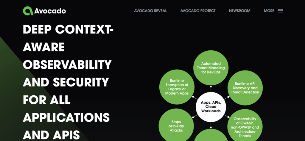
Key Takeaways:
- Dynamic illustrations: captivating animated visuals.
- Vibrant icons: Luminous and attention-grabbing.
- Layouts that are organized are both consistent and clear.
- Matches the brand: Dark Theme.
- Innovative Design: Enjoyable and practical.
Wroclaw University of Technology
The website of Wroclaw University of Technology features a unique, artistic design created by Lama Media. The background is animated with a gradient, icons have a chalk-like texture and content blocks change color. The banner includes a user-friendly menu, various call-to-action buttons, and highlighted content. Social media icons enhance visibility and interaction among users on the internet. The modern element is added by the animated background. Vivid icons and content blocks add brightness to the dark theme. Chalk-like visuals bring creativity.
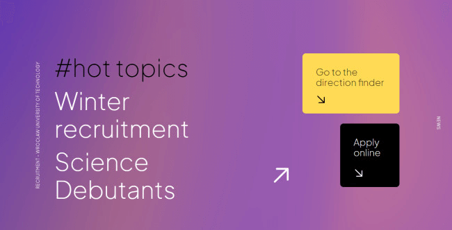
Key Takeaways:
- Dynamic backdrop: Contemporary and attractive.
- Chalk Icons: Original and imaginative.
- Blocks that change color: Bright.
- Simple to get around: Easy to use.
- Social Media: Increases interaction.
Angelina Swann
Get Great Sites designed Angeline Swann‘s website with a dark color scheme and white and gold lettering. It displays geles, decorative head coverings. The main page features an image slideshow and videos that fill the entire screen. The Lookbook page displays fashionable images of the geles. The website also features an Accessibility Assistant tool for adjusting display settings.
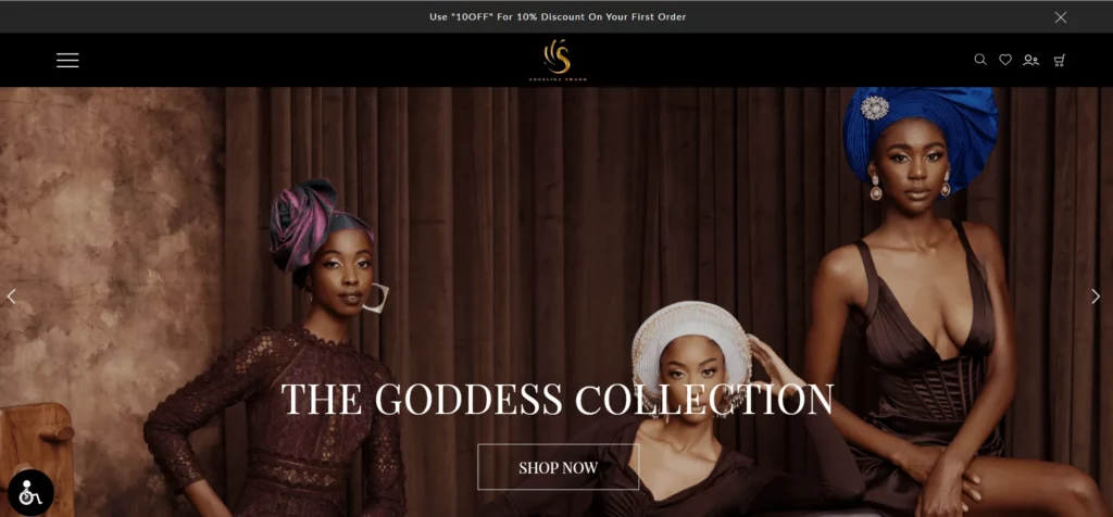
Main Points:
- Gallery Title: Stimulating and graphical.
- Fashion catalog appearance: Sophisticated showcase of items.
- Accessibility feature: Can be tailored to meet individual visual requirements.
- Fashionable photos elevate attractiveness.
- White and Gold Text: Enhances dark theme.
GD Stones
Bluestone98 designed the GD Stones website with a dark theme and a background that resembles marble. The simplistic navigation menu is user-friendly and uncomplicated. Important information is highlighted in white and yellow in the large text. A brand video on the homepage showcases GD Stones working in a loop. The yellow color makes the News section noticeable. Every article includes a heading, date, summary, and a call-to-action. Arrows help users in navigating articles effortlessly.
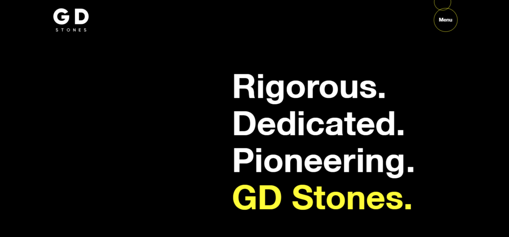
Key Takeaways:
- Marble Background: Complements the brand.
- Bold text: Utilizes white and yellow to highlight important points.
- Video showcasing the activities of the company.
- Highlighted News: Significant information in a shade of yellow.
- Simple to navigate and easy for users to use.
Pablo Lavezzari
Pablo Lavezzari‘s website showcases a dark theme with prominent features. A video showcasing his work can be seen on the homepage, along with an optional Watch Video button. Elements smoothly emerge while you scroll. The menu is subtle, can be easily accessed through a hamburger icon in the top right corner and a footer menu. The text is set against a backdrop inspired by the solar system, enriching the artist’s concept.
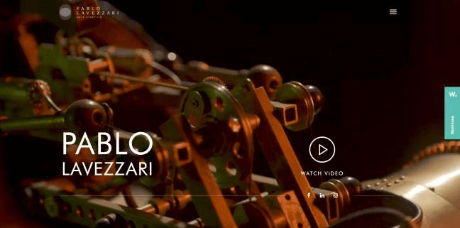
Key Takeaways:
- Preview video: Dynamic clip featuring a play button.
- Smooth Scroll: Objects are displayed in a fluid manner.
- Subtle Menu: Hamburger symbol and bottom navigation.
- Innovative Setting: Background featuring text inspired by the solar system.
Uptec
Uptec website features a dark theme with contrasting shapes. The homepage showcases vertical lines and disintegrating circles. Texts use bold and italic fonts, with italic fonts for emphasis. The website features an innovative submission form, a news ticker on every page, and interactive CTAs. There is a submission form that is accessible via a big “Apply” button.
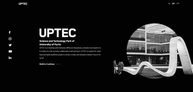
Key Takeaways:
- Bold Design: Shapes that stand out in contrast.
- Creative Text: Strong and empty fonts.
- Attractive and interactive calls to action: Vibrant and captivating.
- Headline Updates: Featured on every page.
- Dark Theme includes the colors black and white.
Tips To Successfully Create Your Dark Mode Website Example
Designing a dark mode website successfully requires meticulous planning and focusing on design elements. These are 5 suggestions to assist you in creating an excellent dark mode experience:
- Use color schemes carefully: Instead of opting for pure black, choose dark gray shades like #121212 or charcoal to minimize eye strain. Additionally, introduce pops of color with vibrant yet moderate accent hues, such as #1E90FF, for buttons or links, ensuring ample contrast against the dark background.
- Enhance the typography: Select off-white (#E0E0E0) or light gray (#B0B0B0) for text to avoid glare and maintain readability. Employ slightly thicker fonts for headers and ensure main text remains easily readable with an appropriate font size (16px or larger) and sufficient line spacing (1.5x line height).
- Adjust pictures and visuals: Apply dark filters, such as rgba(0, 0, 0, 0.5), to images, preventing them from appearing overly bright against the dark backdrop. It is also essential to utilize or design icons specifically for dark mode, ensuring they have sufficient contrast and visibility without clashing with the background.
- Install user-friendly navigation: Clearly indicate active and hovered states for navigation items using lighter tones or subtle color variations, such as #1E90FF for hover states. Moreover, maintain design consistency throughout, especially in navigation elements, to create a cohesive user experience.
- Prioritize accessibility ensures inclusivity: Adhere to Web Content Accessibility Guidelines (WCAG) by ensuring a contrast ratio of at least 4.5:1 for all text and interactive elements against the background. Verify compliance using tools like WebAIM’s Contrast Checker. Moreover, empower users with an easily accessible toggle to switch between light and dark modes, and save their preferences in local storage for a personalized experience.
Free 1-1 consultation: Website Design Service
Conclusion
These 13 impressive dark mode website examples display the flexibility and influence of dark themes. Every design provides distinct methods to differentiate your brand and capture users’ attention. Use dark mode to change the appearance of your website and make it more visually attractive.

Summer is the CMO and Digital Commerce Solution Expert with 10+ years of experience. She specializes in Magento, Shopify, ERP, CRM, AI, and Blockchain, delivering strategic solutions that transform businesses. With a deep understanding of digital commerce, she helps brands scale and stay ahead in a competitive market.
Related Post

Magento 2.4.8 Official Release: What's Updated?
In this article, we’ll explore the standout new features and enhancements that make the Magento 2.4.8 official version truly special.
Mageplaza Announces Official Separation from Avada Group
Mageplaza is pleased to announce a significant milestone in our journey as we officially separate from the Avada Group to operate as an independent company.
Explore the latest from Mageplaza in January 2025, with new modules and updates designed to enhance your Magento e-commerce experience.
& Maintenance Services
Make sure your store is not only in good shape but also thriving with a professional team yet at an affordable price.
Get Started