Explore 10+ Best Educational Website Design Examples [Inspiring 2024]
Summer Nguyen | 08-03-2024
In today’s digital age, an educational website is more than just a repository of information; it is a required tool for engaging and inspiring students, educators, and stakeholders. Designing an exceptional educational website needs a blend of aesthetic captivating, user experience, and functional elements. This article explores over 10 outstanding educational website design examples that not only captivate with their visual appeal but also excel in providing a seamless and improving user experience. Whether you are looking to revamp your current educational site or are in the process of creating a new one, these examples from 2024 will provide valuable insights and stimulation.
Key Elements of Educational Website Design
An attractive image is half the battle. Designing an educational website goes beyond visuals; it encompasses the overall user experience. Here are key features to help you understand current trends in educational websites, ensuring you focus on the right aspects.
Appearance
This includes the layout, colors, images, and fonts used to create an educational website. All these elements should be carefully considered as they contribute to the user’s overall impression.
Visually appealing platforms are always more popular, whether it’s a telehealth app or a car sales website. The same principle applies to educational platforms.
Authentication and Profiles
It’s crucial to provide users with an authentication process (email/phone number and password combination). Student and teacher profiles should be distinct and feature different functionalities. While students need lists of active/completed courses and detailed information on certificates/grades/credits, teachers require a page detailing their qualifications and a list of courses they’ve added.
These elements are crucial for any new educational website as they provide feature-rich interfaces along with a tailored user experience. A vivid example is the payment gateway on online learning platforms. Languages, driving, and other schools allow users to pay for courses or required materials online, saving time. It’s all about convenience and care.
Dashboard
The dashboard is a workspace for both students and teachers, where they can track course progress and receive feedback. Through the dashboard, students can check enrolled courses, available hours, and more. Teachers can review added courses, track ratings, traffic, and their earnings.
Content Management System (CMS)
A CMS is another crucial component of an educational platform, directly impacting SEO optimization, performance, and site popularity. It should be convenient for administrators and users to ensure new materials are updated quickly and successfully. This is the only way to manage a platform effectively, especially for large educational institutions with thousands of users.
Navigation
The most basic and important form of navigation on your site is the main menu in the header. This menu should be simple with a limited number of options. Additionally, include clear calls to action in your website navigation, especially on pages like Apply and See Programs/Courses.
Good website navigation is like a guide. Users don’t always know what they want to do next, so it’s essential to provide them with several options. If users find navigating the website difficult, they might leave and seek another site that meets their needs.
Conveying the Right Message
Every educational website is designed to convey the right message to its visitors. People want to be sure that the educational site is reliable and meets their expectations. The website is crucial in creating the best image and brand.
Any professional designer will tell you that a school website should be built around the message your organization is promoting. This should be reflected in everything, from the choice of color palette to the functionality and type of website. This is critical not only from a branding perspective but also from personalization and convenience, as adhering to the message helps select the most optimal features and create an intuitive interface design that meets the specific needs of your users.
Mobile Version
This is another crucial feature that shouldn’t be overlooked. The website must have a responsive design so teachers, parents, and students can access it on their devices whenever convenient.
The listed features are essential when designing a website if education is your area of expertise. Overall, they are vital for any website, regardless of the type of knowledge provided or the target audience you are trying to reach.
Free 1-1 consultation: Website Design Service

Discover 10+ Best Educational Website Design Examples
Interactive Science Educational Platforms
Planet Schule Klima Challenge by Netzbewegung
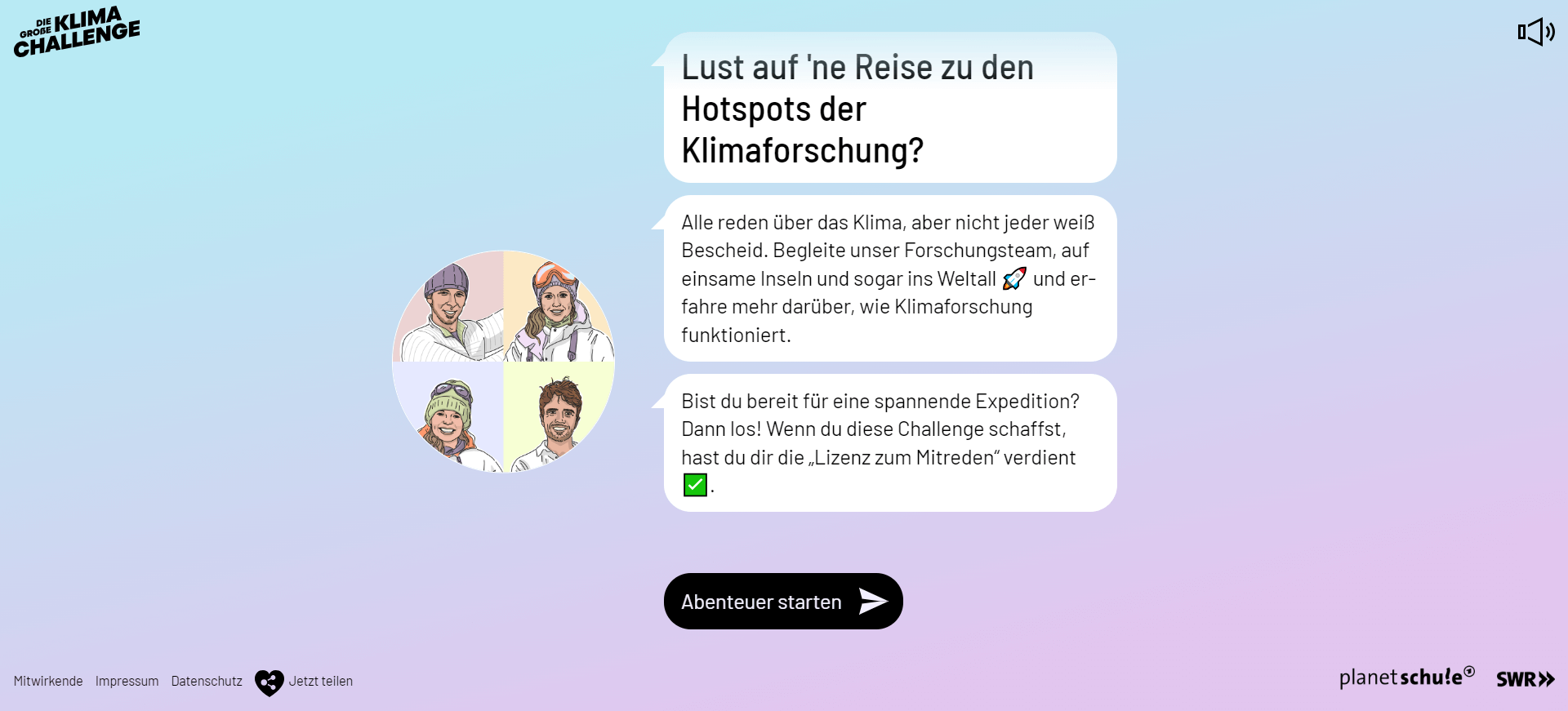
Highlighted Features:
- Immersive user experience
- Engaging chat windows
- Captivating video content
The Planet Schule Klima Challenge has earned its place on our list of top educational website designs. This remarkable learning platform, developed by Netzbewegung, teaches users about the importance of climate research in a contemporary and accessible manner.
Instead of overwhelming you with extensive uninterrupted text, the design mimics a chat application through an engaging and immersive user experience that piques your curiosity.
You embark on a learning journey by rotating the globe to explore one of four areas. Once you select an area, you encounter short but captivating video lessons that reveal intriguing facts about climate research.
Each video triggers a quiz-like sequence that tests your newly acquired knowledge as you gather points and earn cool badges in this game-like experience.
Stories of Clay by vueloIV
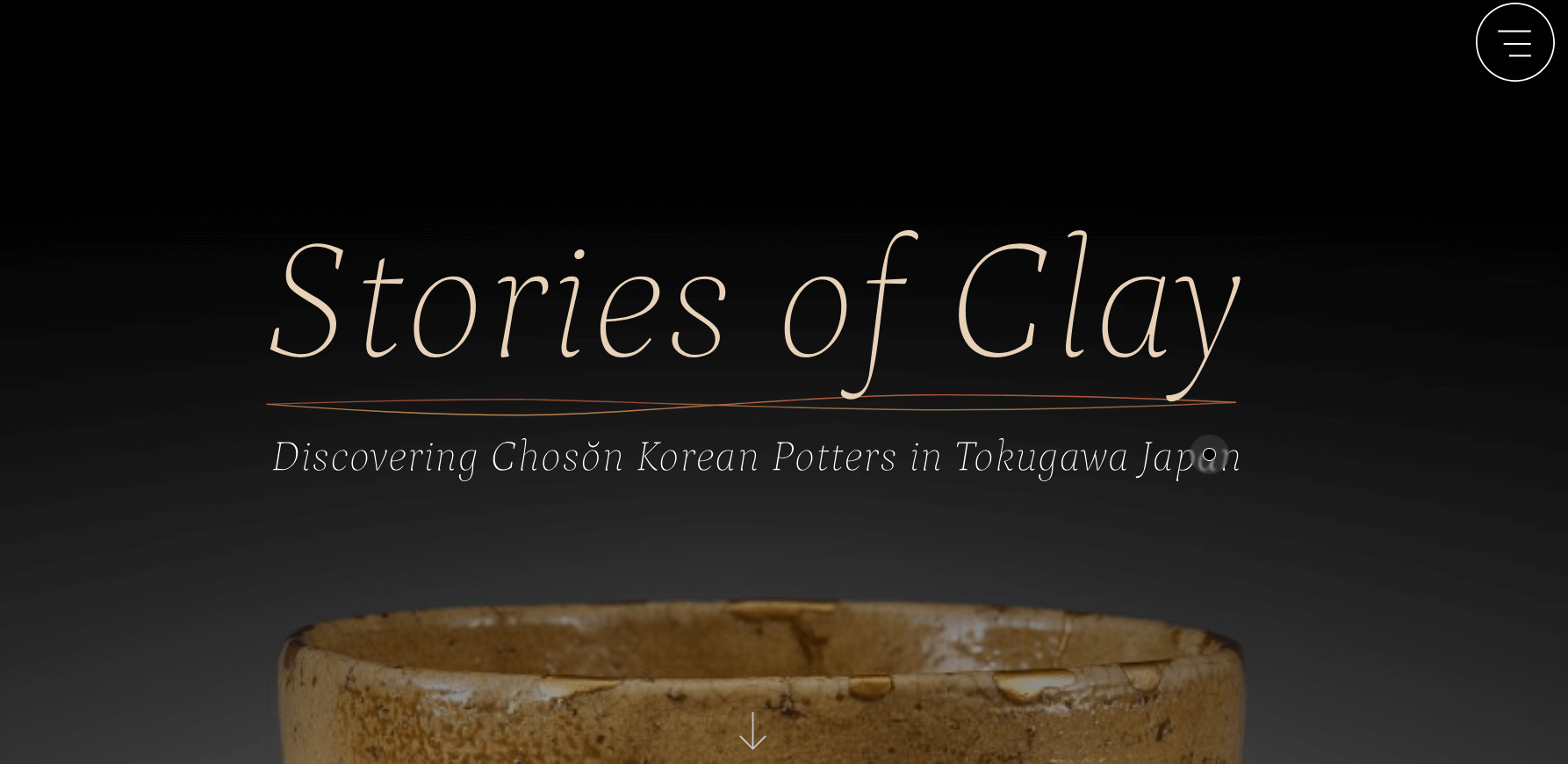
Standout Features:
- Fluid background colors
- Mysterious design
- Interactive map
One of the most engaging educational web designs is Stories of Clay, crafted by vueloIV. This website captures the viewer’s attention with a series of simple yet visually appealing elements.
The landing page features an illuminated image of an ancient clay vase set against a gray background, immediately setting a mysterious tone for the design. As you begin to scroll, you’re immersed in a historical narrative, with fluid background colors and smooth font styles evoking a sense of legend and antiquity.
The background transitions seamlessly from dark to light shades, changing the content accordingly and presenting a balanced mix of visual and textual sections.
Joco by Other Digital

Standout Features:
- Original scrolling animations
- Captivating cube dance
- Highlighting an extensive portfolio
The Joco website, designed by Other Digital, shines as a digital masterpiece among top educational website designs.
The company’s logo, mission, and vision are depicted through hundreds of identical cubes constantly dancing around. As you’re introduced to the brand with a brief statement, you can immediately interact with the hovering cubes surrounding it.
These geometric objects start moving as you scroll, transforming into larger shapes that reveal related content. This unique animation effect makes browsing incredibly engaging, as you anticipate the next image the website will display.
Higher Education Websites
UMS-Wright Preparatory School by Mighty
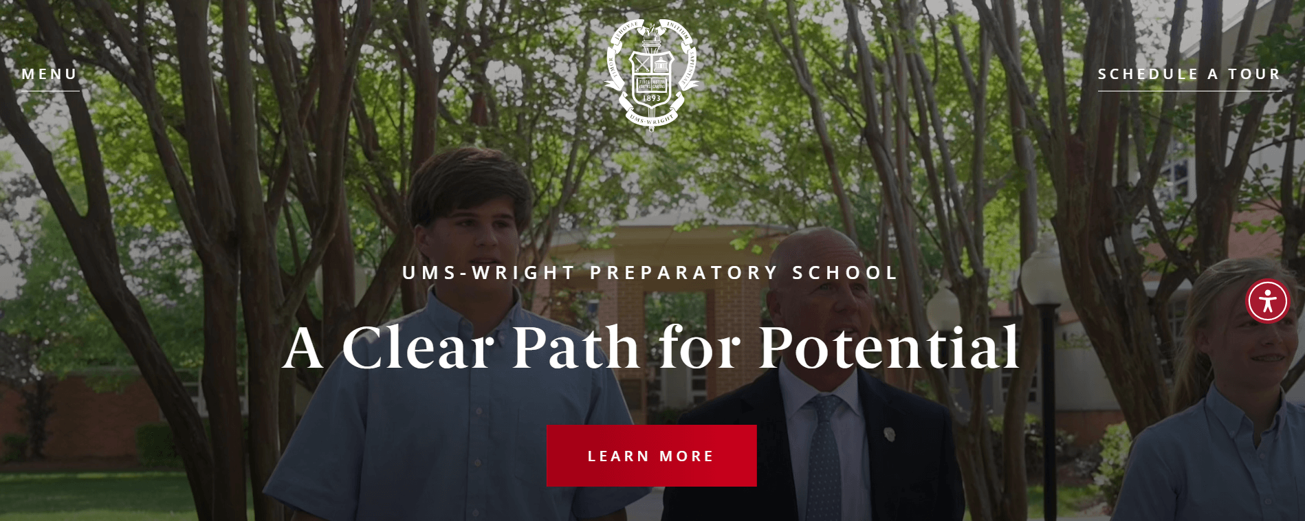
Standout Features:
- Video in the hero section
- Royal-inspired color palette
- Compelling About section
The next educational website design, crafted by Mighty for UMS-Wright Preparatory School, showcases the school’s prestige and heritage through an elegant and easy-to-navigate interface.
Although it lacks complex effects, the design incorporates simple elements that refresh the flow and prevent monotony.
Royal red and white are the only colors used in the palette. As these colors alternate between text and background, they highlight the institution’s esteemed status.
Be sure to visit the About page to fully grasp the spirit of the institution and its members. This section takes you through the significant milestones in the school’s history, using stimulating visual elements to complement the content.
CvSU OSFFS by Angely Dy
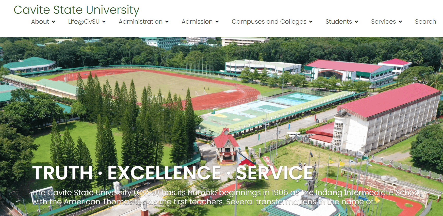
Standout Features:
- Feedback system
- QR code-based solution
- Simplified search query
The next noteworthy website is CvSU OSFFS, designed by Angely Dy. This platform assists students in improving their schools by enabling them to rate various services. Its sheer simplicity, practical UX design, and remarkable functionality make it one of the top educational web designs.
The platform features a feedback system that streamlines the reporting process, helping students complete forms and allowing specific school departments to track and address issues effectively.
The website provides an easy-to-use search query that lets you find services you want to rate or review. Instead of downloading and printing forms, you can now scan a QR code that instantly takes you to the desired form. This design transforms the process from a tedious task into a swift and efficient activity.
Art and Aesthetic Educational Websites
Beyond by Mish Design
Key Features:
- Single-page concept
- Clearly defined brand-aligned color palette
- Well-designed user journey
Beyond is a cultural and music festival taking place in Turkey. Its concept is unique in blending cultural heritage, music, and local ethnography with the global mindset of those seeking connection through meaningful art and interaction.
Their website, provided by Mish Design, embodies the artistry and intent of the brand. It features a full-screen video montage that initiates the user experience. A simple yet bold slogan “For those seeking more” in serif font spans the top of the screen, accompanied by the CTA Tickets and Beyond logo.
As users scroll down, the video transitions elegantly with circular movements exiting the screen. Concise copy lines explain the transformation of Beyond’s UVP into a straightforward image gallery. Details about the upcoming Beyond event follow, outlining dates, locations, and a general event description.
Palazzo Monti by Matteo Sacchi
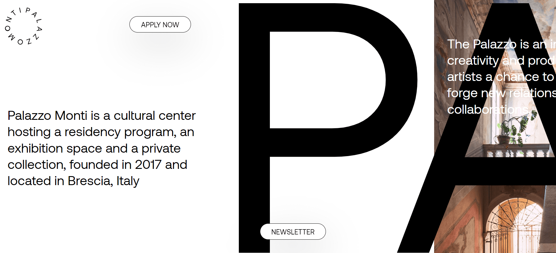
Highlighted Features:
- Horizontal scrolling
- Single-page concept
- Fixed CTAs
Palazzo Monti, a cultural hub in Brescia, Italy, boasts an exhibition space and private art collection, fostering artistic collaboration and inspiring local artists with its extensive library of artifacts, artworks, and books.
The website, designed by Matteo Sacchi, employs horizontal scrolling and a single-page layout to showcase the cultural center’s full value. This innovative and rarely used layout begins with a brief description of the organization.
Different sections of the site – About, Who, Press, Artists, etc. – transition seamlessly into one another. Users can see which section they are in by looking at the bottom of the screen where the section name is displayed.
There is no main menu; the only navigation elements are two fixed CTA buttons, “Apply Now” and “Newsletter.” These buttons blend seamlessly into the surroundings with their white circular design and clear text.
The Longest Road by Pixelfish
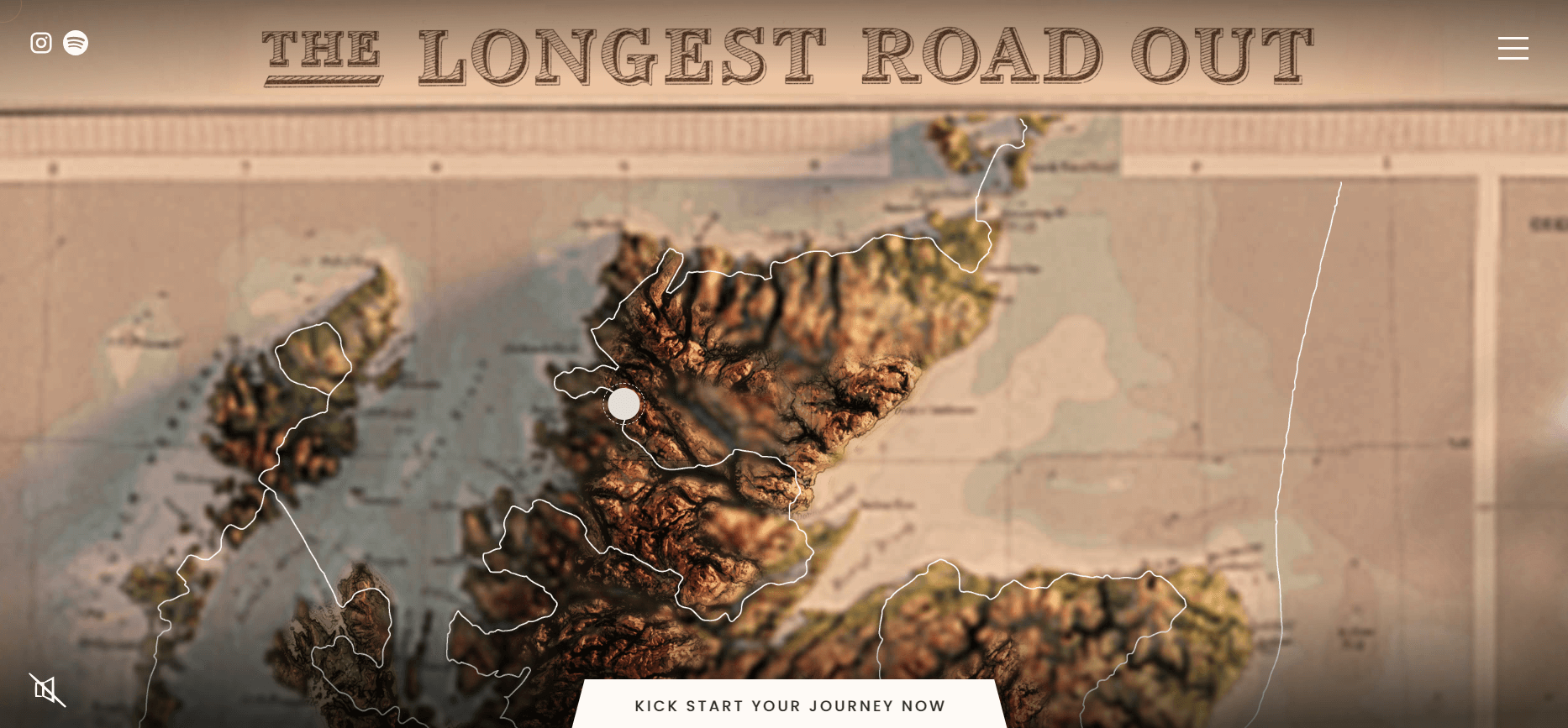
Key Features:
- Interactive map-based website navigation
- Animated elements like clouds on the map
- Aesthetic reminiscent of the group’s target era
The Longest Road features a group of adventurers who embarked on a unique 10,000-mile road trip across the UK in a vintage black Morgan 4/4, reminiscent of outings and picnics from bygone days. They offer similar experiences for curious and enthusiastic travelers.
Their extraordinary website, crafted by the web design company Pixelfish, mirrors the adventurous and ambitious nature of The Longest Road’s journey. Essentially, it’s a giant interactive map of the UK, showcasing the group’s exact route, roads traveled, and locations visited.
This map is a detailed replica of an old Atlas: 3D terrain, distinctive fonts for seas and mountain ranges, and even the colors—sandy golds and earthy reds—evoke a vintage feel, perfectly aligning with the journey’s historical theme.
Visitors navigate the map-based site by dragging the cursor. Clicking on the white dots at specific landmarks opens a window with a short story about that part of the journey, accompanied by high-quality photos of the location.
Social Educational Website
Alfred Landecker Foundation By Output
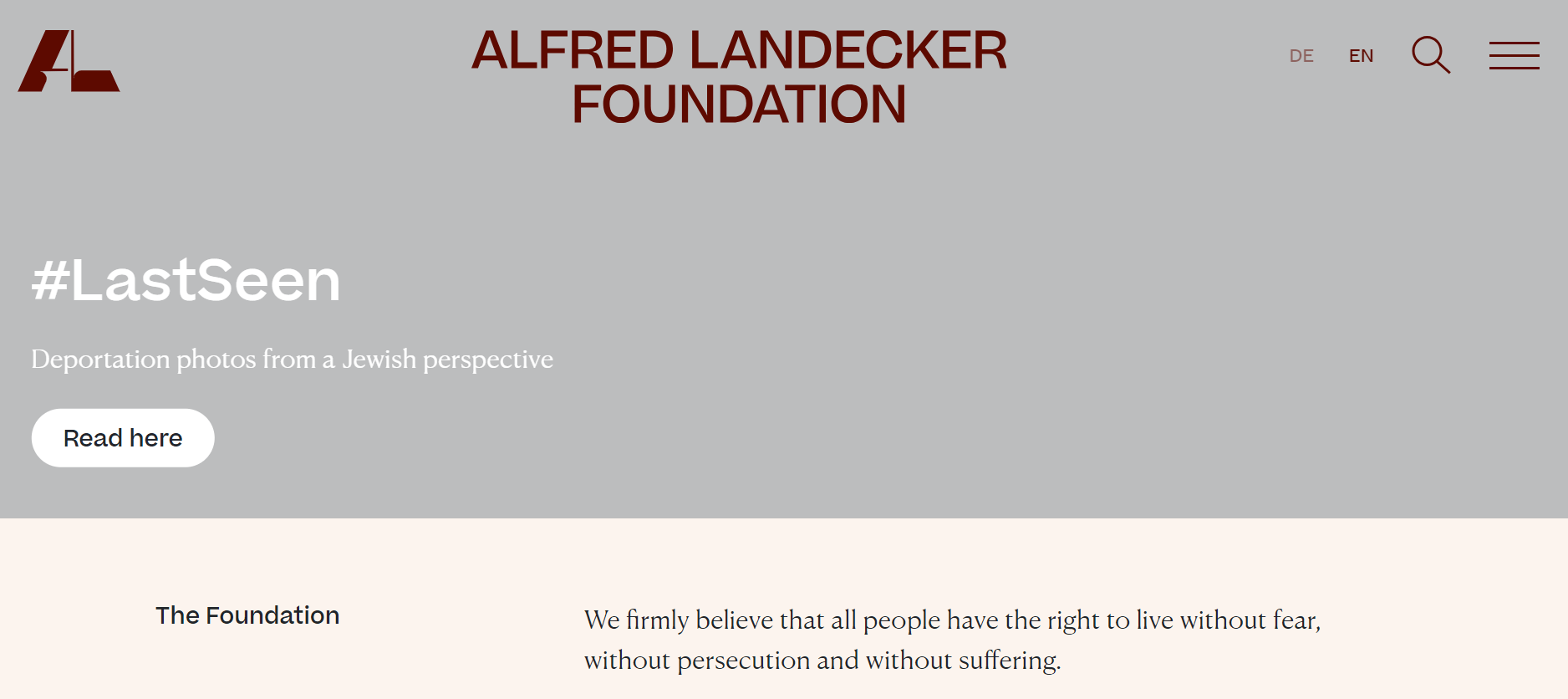
Key Features:
- Projects and missions highlighted with various colors
- Message-focused website
- User-friendly search tool
The Alfred Landecker Foundation is an organization dedicated to fighting all forms of discrimination, from anti-Semitism to sexism, and “promoting the development of democratic societies.”
Developed by the branding firm Output, the foundation’s website is information-rich and message-oriented, which aligns well with their mission and goals. Although primarily educational, the site presents content concisely, supported by custom images, icons, and videos.
The website opens with a full-screen video message about the organization’s latest initiatives. The hamburger menu icon on the right reveals a neatly categorized navigation panel that explains the foundation’s purpose and context.
Take Me To The Club By Phantom
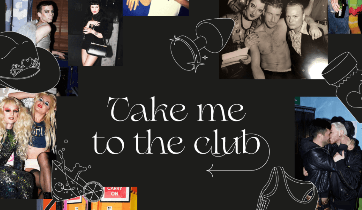
Highlighted Features:
- Custom typography
- Single-page concept for each location
- Dark mode with white text content
“Take Me To The Club” is a website dedicated to documenting and commemorating iconic LGBT+ venues in London that have closed. The purpose of this website goes beyond mere nostalgia; it emphasizes the importance of preservation and shows support for the city’s gathering places for the LGBTQ+ community.
Designed and developed by the creative agency Phantom, the website opens with a unique custom typography welcome screen. Moving the mouse cursor around reveals images of the venues and visitors appearing and disappearing in an instant.
Scrolling down the page reveals more images of the club and some memories quoted by regulars who frequented it. A brief summary about the significance of the venue to the LGBT+ community concludes each club’s dedicated page.
Youth Justice Network By Purple Bunny
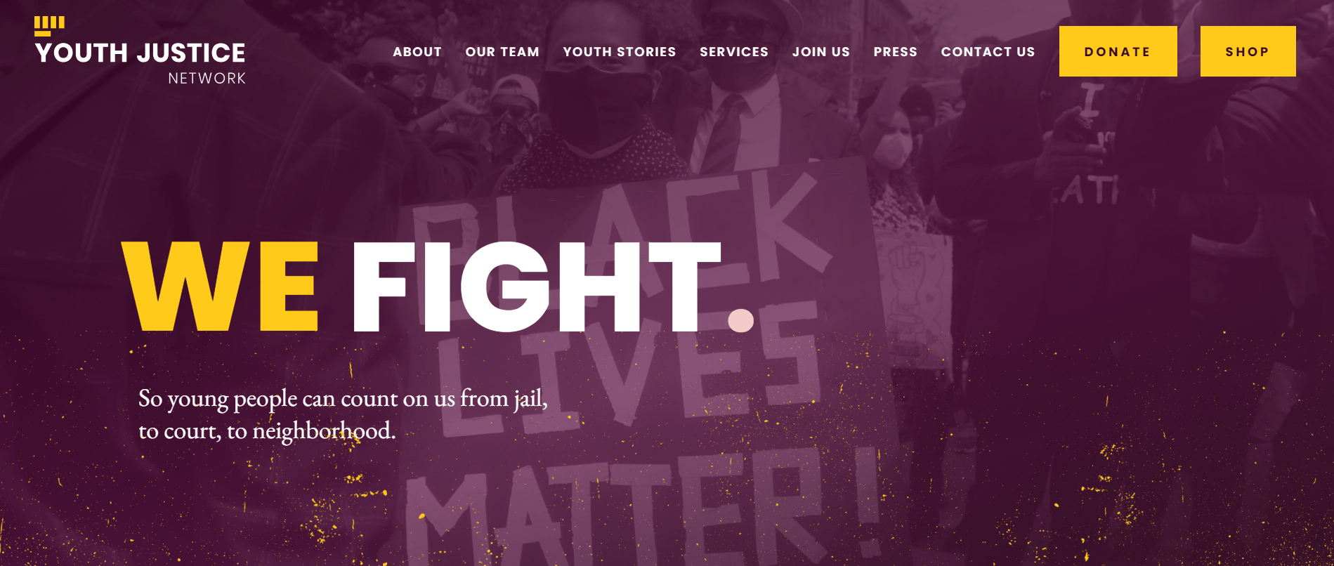
Key Features:
- Consistent color palette
- Concise messaging
- Fixed main navigation
The Youth Justice Network is dedicated to creating a society that empowers today’s youth to thrive in a fair and equitable environment. Their website, designed by the web development firm Purple Bunny, embodies this mission.
With a striking purple-yellow-white color scheme, the site opens with a detailed homepage that takes visitors on an educational journey. Purple-toned images of young protesters highlight the network’s mission, alongside clear statistics illustrating the state of racial justice in the United States.
The main navigation menu is “sticky,” following UX best practices. It includes links to the primary pages on the site, arranged in a sequence that matches the natural user journey. A prominent yellow Donate button is also featured here.
How to make an educational website design outstanding?
Designing an educational website is an art. To create an exceptional educational website, several key design principles need to be considered.
Balance in Educational Website Design
Educational websites must contain engaging information, so users shouldn’t have to scroll endlessly through half-empty pages. However, there’s no need to use heavy fonts or overcrowd the homepage with numerous buttons. Opt for easily readable fonts on bold buttons. Present compelling information in an understated way, making it easy for users to find what they need. Your website should be informative and helpful, but a balanced design provides a better user experience and a cleaner interface.
Pay Attention to Information Hierarchy
The best university website designs prioritize the hierarchy of information. If an educational institution structures its website information and filtering system well, it reflects a structured and well-planned educational process. When creating an educational website, ensure that all important sections are accessible from the homepage.
Use Relevant and Engaging Content
Great educational websites are perfect platforms for hosting visual and audio content. Many people prefer visual materials over traditional text. Upload useful guides, tutorials, and lectures to engage students. Additionally, use your website as a library where you provide students with course materials, reading lists, and even communicate with them through internal forums. Create engaging videos to leverage social media sharing to convey your message.
Don’t Forget Accessibility Requirements
Accessibility is not just a major trend but a legal requirement for all digital products, including e-learning platforms. Your educational website design should consider that some users might have certain limitations. Therefore, your development team should be familiar with accessibility requirements and implement them in the design.
Flexibility is Key
In other words, make your website adaptable. Trends change quickly, so it’s essential to constantly test and optimize to find which information layouts work best to retain viewers. Introducing materials on pages specifically designed for them can also be a good idea.
Global Accessibility for Students Worldwide
From a design perspective, this means considering various factors. For example, always having English/Spanish/Chinese/Arabic/Russian/French versions of a website in addition to the local language version. A multilingual website increases the number of foreign students and teachers, providing access to the global education market.
Additionally, there should be two ways to present website information—one for local students and one for international students. This can give the website a competitive advantage on the international stage.
Summary
Designing an outstanding educational website involves a delicate balance between aesthetics, functionality, and user experience. The examples highlighted in this article demonstrate how thoughtful design can enhance engagement, improve accessibility, and convey the right message to a diverse audience. By incorporating features like visually appealing layouts, personalized authentication, intuitive dashboards, effective content management systems, and global accessibility, these websites set a benchmark for excellence. As educational institutions continue to evolve, embracing these design principles will be crucial in creating platforms that not only educate but also inspire and connect learners worldwide.

Summer is the CMO and Digital Commerce Solution Expert with 10+ years of experience. She specializes in Magento, Shopify, ERP, CRM, AI, and Blockchain, delivering strategic solutions that transform businesses. With a deep understanding of digital commerce, she helps brands scale and stay ahead in a competitive market.
Related Post

Adobe Commerce SaaS or Magento 3? The Future of Magento
Discover how Adobe Commerce SaaS is reshaping the future of Magento. Learn the key differences, what Magento 3 really means, and what merchants should expect next.
Magento 2.4.8 Official Release: What's Updated?
In this article, we’ll explore the standout new features and enhancements that make the Magento 2.4.8 official version truly special.
Mageplaza Announces Official Separation from Avada Group
Mageplaza is pleased to announce a significant milestone in our journey as we officially separate from the Avada Group to operate as an independent company.
& Maintenance Services
Make sure your store is not only in good shape but also thriving with a professional team yet at an affordable price.
Get Started