10+ Best Government Website Design Examples in 2024
Summer Nguyen | 08-15-2024
In 2024, the landscape of government website design reflects a transformative shift towards user-centricity and aesthetic appeal. As governments worldwide embrace digital innovation, the evolution of these platforms stands as a testament to their commitment to transparency, accessibility, and efficient service delivery. Let’s explore some of the standout examples that redefine what it means to create compelling government websites in today’s digital age.
Key Elements of Government Website Design
To build an effective government website in 2024, several key factors need to be implemented:
- Engaging interface design: Utilize elements such as high-quality images and videos, brand-appropriate colors, and visual components like motion graphics to attract users and convey a professional image.
- Simplicity and usability: Ensure the website is easy to navigate, with a fixed menu and clean layout, facilitating quick and straightforward access to information.
- Effective message delivery: Use concise, focused text to clearly communicate information, minimizing complex language and unnecessary descriptions. This enhances transparency and trust in government services and initiatives.
These criteria not only improve user experience but also strengthen the relationship between the community and government, fostering citizen engagement and enhancing the effectiveness of public projects.
Read more: Website Development Cost: Everything You Need to Know
Free 1-1 consultation: Website Design Service

10+ Best Government Website Design Examples in 2024
Sterling Charity Donation by UPQODE
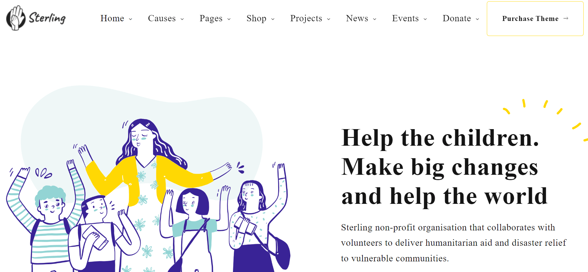
Highlighted Features:
- Engaging illustrations
- Brand-aligned color palette
- Strategic use of negative space
Sterling, a NGO collaborating with volunteers to provide humanitarian aid and disaster relief to vulnerable communities worldwide, had its website designed by UPQODE. The site features visually appealing layouts, playful illustrations, and a brand-consistent color palette.
The website’s key aspect is its messaging. It avoids lengthy, redundant descriptions in favor of concise, focused paragraphs that clearly convey the organization’s mission while maintaining a gentle tone.
For instance, the government’s website design uses alternating blocks of purple and white to highlight each content section.
Gineko by Mood Works
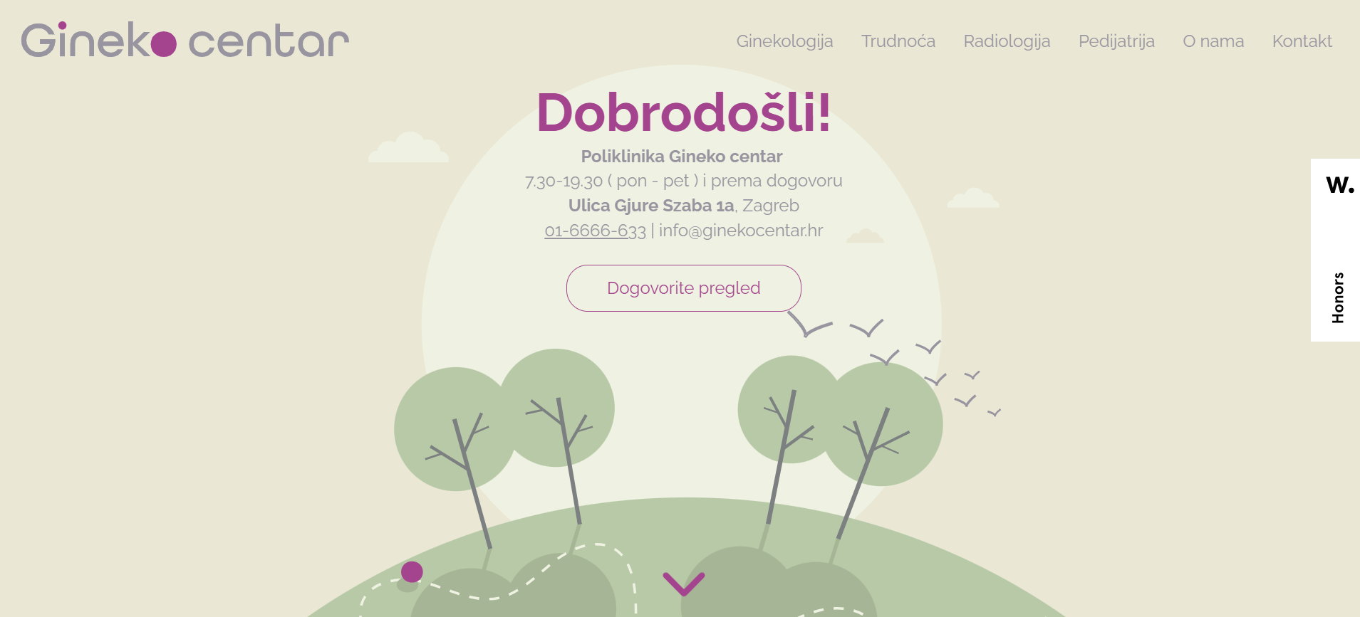
Highlighted Features:
- Creative scrolling
- Pastel color palette
- Positive inspiration
As noted by the agency Mood Works, “Medicine is a serious business, but can it be approachable?”. Like seasons, life unfolds in cycles as we grow and age, raising our own children; then we watch them grow up and age and have their own children. This journey is wonderful but can be daunting, especially concerning health and medical needs.
That’s why Mood Works, when designing the website for Gineko, a pediatric and obstetric clinic in Zagreb, Croatia, aimed to make the user journey reflect the stages we go through in life. By using this highly creative scrolling feature and synchronizing it with menu navigation, they presented future patients with a familiar face to hold their hand and guide them through each stage of the cycle.
Town of Occoquan by Imagine Design Creative and Marketing
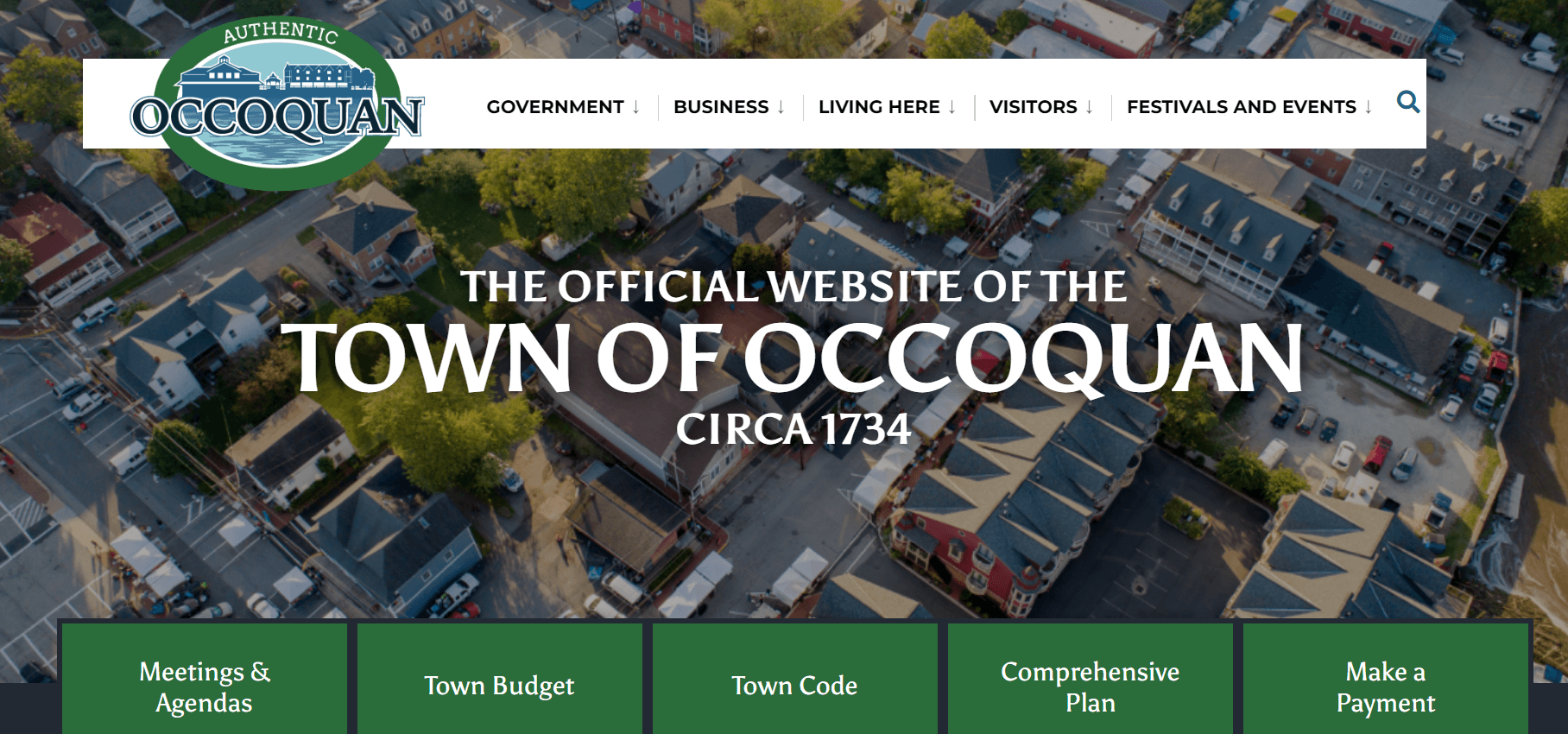
Highlighted Features
- Fixed navigation menu
- Smart use of color and typography
- Fast-loading pages
The official website of Occoquan Town, Virginia, designed by Imagine, exemplifies simplicity combined with stunning imagery in government web design.
This “less is more” approach immediately captures attention through subtle color categorization enhancing the aerial landscape of the homepage. The design emphasizes Occoquan as a quaint town (with fewer than 1,200 residents) with many attractions.
Top UX practices dictate that the menu should remain at the top as users scroll. Adorned with the town’s official logo, this menu is clean and practical. It swiftly drops down sub-menus as visitors hover over different sections, minimizing chances of navigation confusion.
Respektiere deine Grenzen by Baschnegger Ammann Partner

Highlighted Features:
- Interactive map
- User journey guidance
- Mobile-first design
The “Respektiere deine Grenzen” initiative, also known as “Respect Your Limits,” centers on advocating for the proper treatment of nature and wildlife. Forests, mountains, meadows, and water bodies are habitats for animals and plants that are becoming scarcer due to the expanding “civilization.”
Sponsored by Baschnegger Ammann Partner, this website acts as a problem-solving notice board, providing a consistent public information campaign to enhance awareness through creative brand-building strategies.
On this initiative’s website, outdoor enthusiasts will find comprehensive information on nature conservation, useful tips for planning excursions through an engaging interactive map, and handbooks with essential behavioral guidelines.
Dzanga-Sangha Protected Area by Buro des Prasidenten
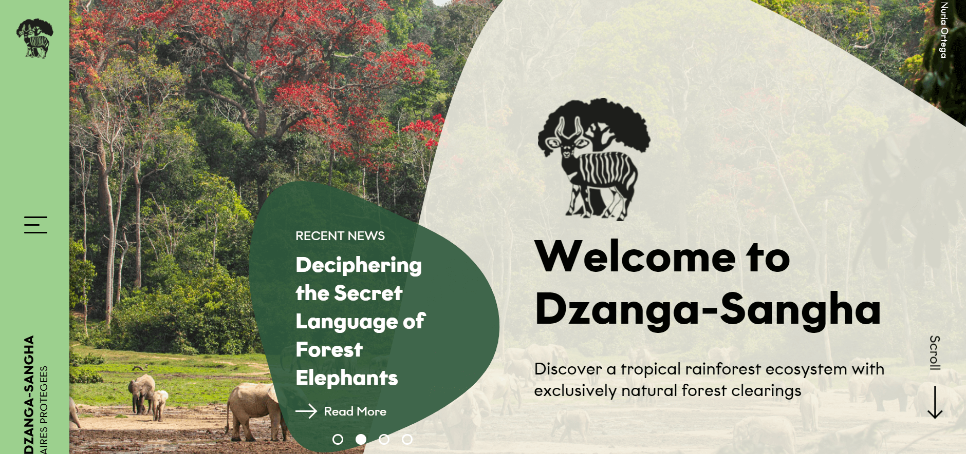
Highlighted Features:
- Innovative menu
- Beautiful imagery
- Compelling and informative
Based in 1990, the Dzanga Sangha Protected Area (DSPA) lies in the remote southwestern territories of the Central African Republic (CAR), on the northern border of the Congo Basin rainforest. Widely recognized for its unique biodiversity, it is the largest staying unbroken rainforest in the country.
Developed by Burodes Prasidenten for WWF Germany, the Dzanga-Sangha website serves as an effective model of communication and interaction, adhering to some of the best government website design principles.
On one hand, it provides relevant information about the unique flora and fauna deserving meticulous conservation efforts. It also addresses tourism geared towards conservation by offering lodging options, transportation choices, and local activities.
Hispanic Police Officers Association by Decographic
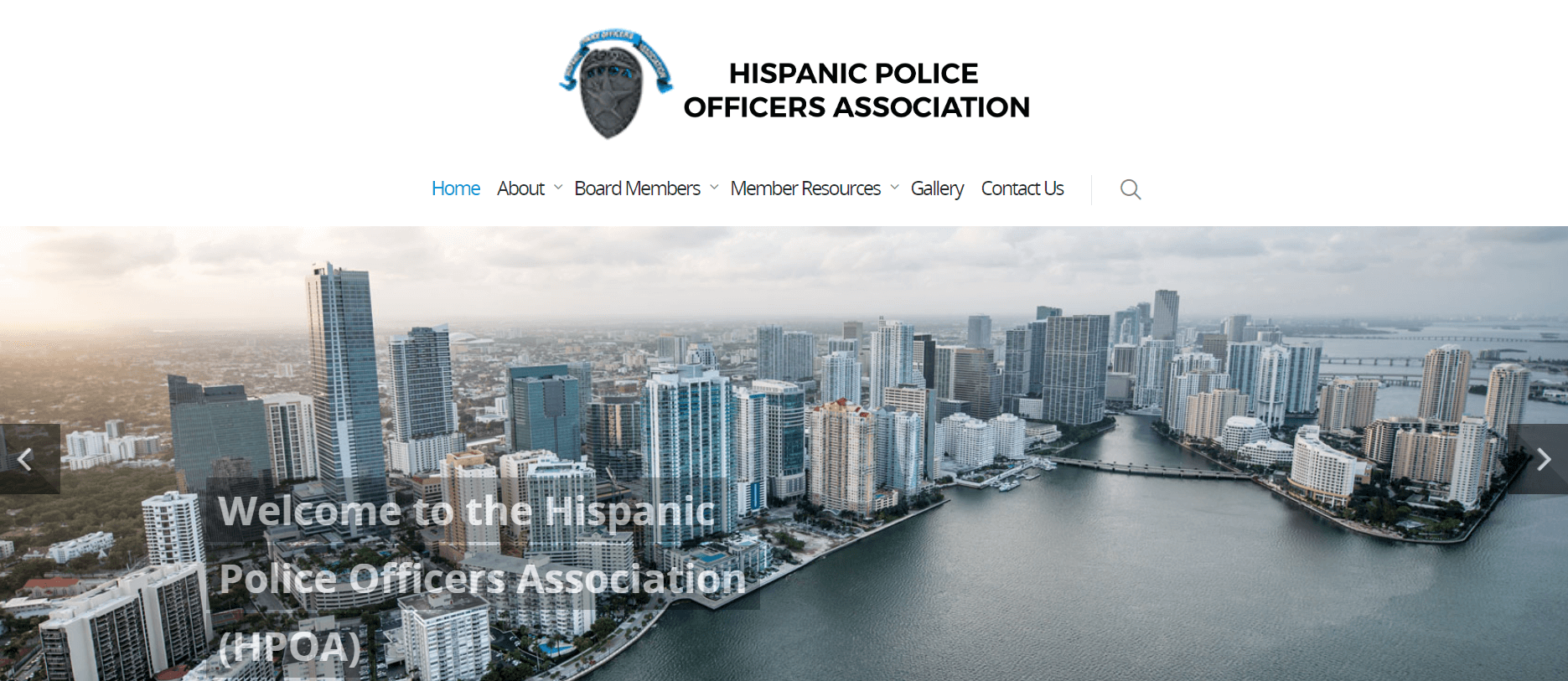
Highlighted Features:
- Dynamic logo
- Fixed navigation menu
- Strategic placement of key information
The Hispanic Police Officers Association (HPOA) is a non-profit brotherly organization based in Miami, serving active and retired Latino law enforcement members.
HPOA aims to inform, educate, unify, and promote its members through various charitable organizations, training programs, legal assistance, and events, a mission reflected precisely in this government website’s design.
To create a unified platform for all members, HPOA enlisted Decographic, a Miami-based company with a proven track record in meaningful digital solutions for local organizations.
While predominantly static, the website still injects vitality with its dynamic spinning logo (reminiscent of a police badge). This enhances user interaction and underscores the organization’s vigilant oversight within the city of Miami.
Wildlife Coexistence by IndieTech Solutions
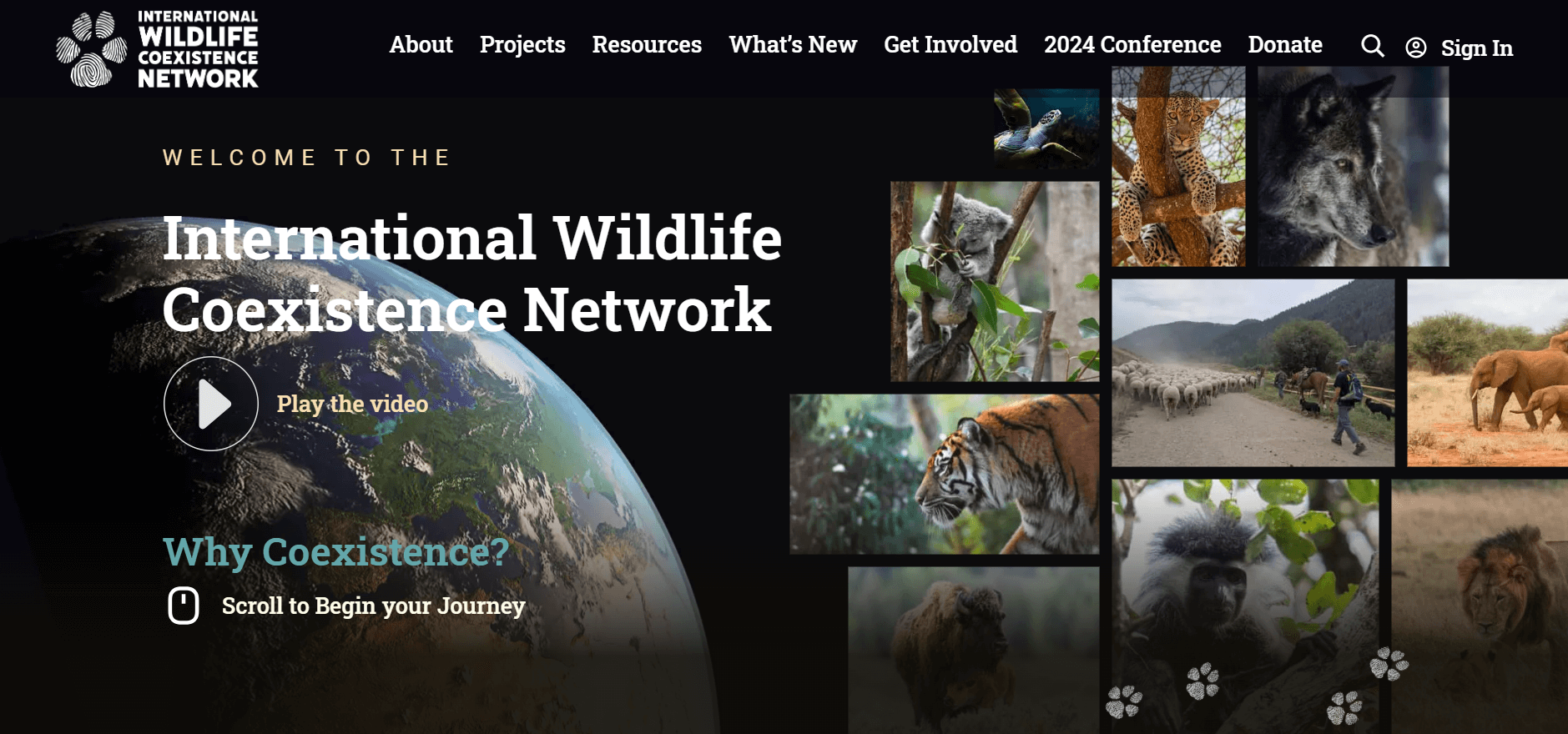
Highlighted Features:
- Engaging introductory video
- Interactive user interface
- Micro animations
The Global Wildlife Network is a worldwide initiative connecting communities and wildlife experts globally.
Their website, crafted by IndieTech Solutions, a rising star in web design firms, achieves what words alone cannot adequately describe or convey — it creates change, first in design and, ideally, in global conservation awareness.
The website’s unconventional journey begins with a captivating, soul-stirring video that narrates the brand’s entire story using a technique known as “scrollytelling”. In essence, it transforms long-form storytelling into a highly interactive experience as users scroll through the website, while the video adds an engaging visual layer.
IDI – Institut Dental Inca by Miguel Trias

Highlighted Features:
- Rotating introductory video
- Both artistry and replica highlight the brand’s USP
- Micro animations
IDI is an advanced dental institute based in Mallorca, striking a perfect balance between high-tech clinics and family businesses. The website, developed by Miguel Trias, an independent design studio also based on the same Spanish island, blends usability, pleasing aesthetics, and sustainable future-proof design.
Technically advanced, it excels with intricate details and subtle micro animations that enhance the navigation experience significantly. The smooth journey not only facilitates easy exploration of IDI’s services and appointment scheduling but also subconsciously links satisfaction with them.
The website’s approach to video design is particularly engaging. While the looping video on the homepage makes a strong initial impression, clicking into the video takes you on a journey starting from afar, inside a dental clinic.
ASCE by Ironistic
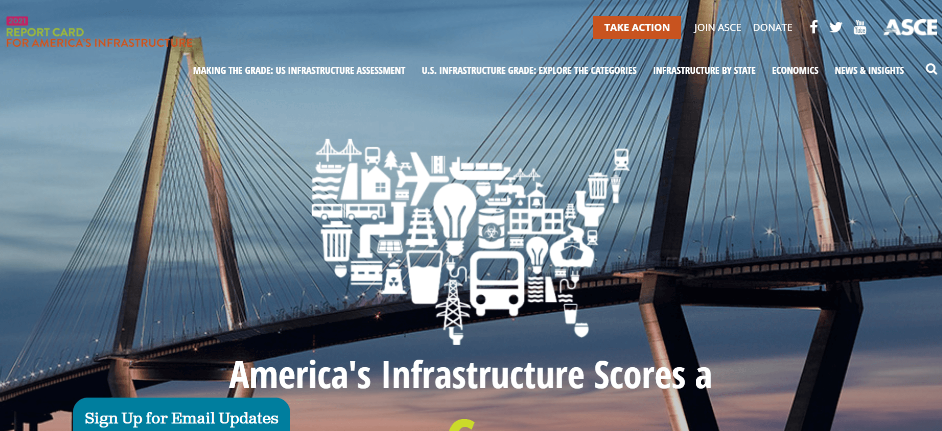
Highlighted Features:
- Detailed mission messaging
- Interactive status map
- Well-structured segments
The American Society of Civil Engineers (ASCE) has long supported for the care of U.S. infrastructure. Since 1998, they have given a quadrennial Report Card on America’s Infrastructure. With almost a decade of cooperation with ASCE, Ironistic was the natural choice for redesigning the 2021 report website.
The updated website’s primary goal was to modernize design and refine content to effectively present critical report information to its target audience, aligning with best government web design practices for clear communication and interaction.
Ironistic opted for a content-focused layout, integrating colorful imagery and alternating messages across all main landing pages. The aim was to present data simply and effectively.
Elementary Teachers’ Federation of Ontario by Inorbital
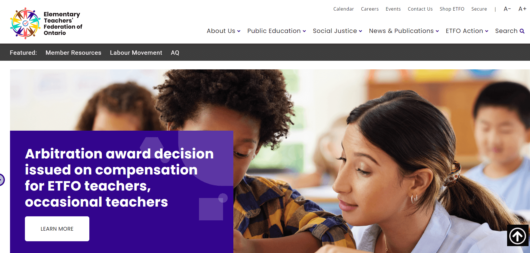
Highlighted Features:
- Vibrant imagery
- Colorful website
- Clean and straightforward
The Elementary Teachers’ Federation of Ontario (ETFO) is an experienced community signifying over 83,000 teachers and education workers in Ontario’s public elementary schools.
Their government website, designed by Inorbital, serves as a crucial communication platform to inform members and engage media, parents, and the public on critical public education issues in Ontario.
Targeting a specific audience, ETFO’s website is notably engaging. Beyond its fresh and accessible design, the site employs a simple content structure and layout that makes navigation across pages straightforward.
To reduce bounce rates and keep users engaged, Inorbital developed a smart custom search feature with intuitive filters and tagging. This search function is tailored based on user journeys and the content most frequently sought by users.
Umag by ALT
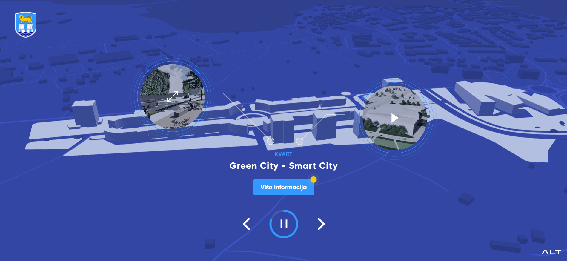
Highlighted Features:
- Interactive 3D map
- Modern and forward-looking
- Fluid transformation
Future of Umag is an interactive government program by ALT for the City of Umag, showcasing the coastal development plans for Croatia in the next decade. Through this platform, local authorities aim to detail and engage residents and tourists in the most realistic view of upcoming plans.
The primary goal of this platform is to engage with citizens, employing best practices in government website design to enhance public participation and transparency.
Callshop Radio by Kilian van de Water
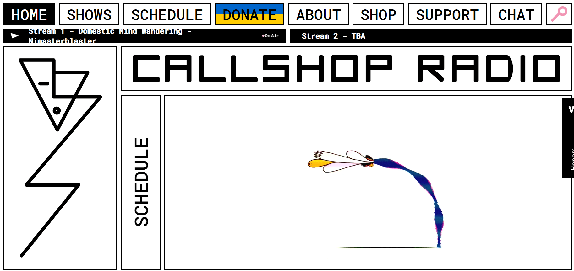
Highlighted Features:
- Dynamic motion graphics
- Playful and creative execution
- Live chat functionality
Callshop Radio is an independent community radio station based in Dusseldorf, Leipzig, and Paris. Focused on local indie artists in each city, the station aims to break all rules and boundaries.
This “express yourself” ethos permeates every aspect of their website or online radio, designed by graphic and motion artist Kilian van de Water. Visually, the design approach is uniquely aesthetic: sharp lines and angles reminiscent of 80s music industry artists, alongside vibrant and smooth motion graphics.
By disregarding norms and conventions, Callshop Radio strives to connect intimately with its listeners. In addition to live broadcasts and schedules, the site features a dedicated chat room that attracts a growing community to interact and maintain cohesion between “performances”.
Frontline by Olson
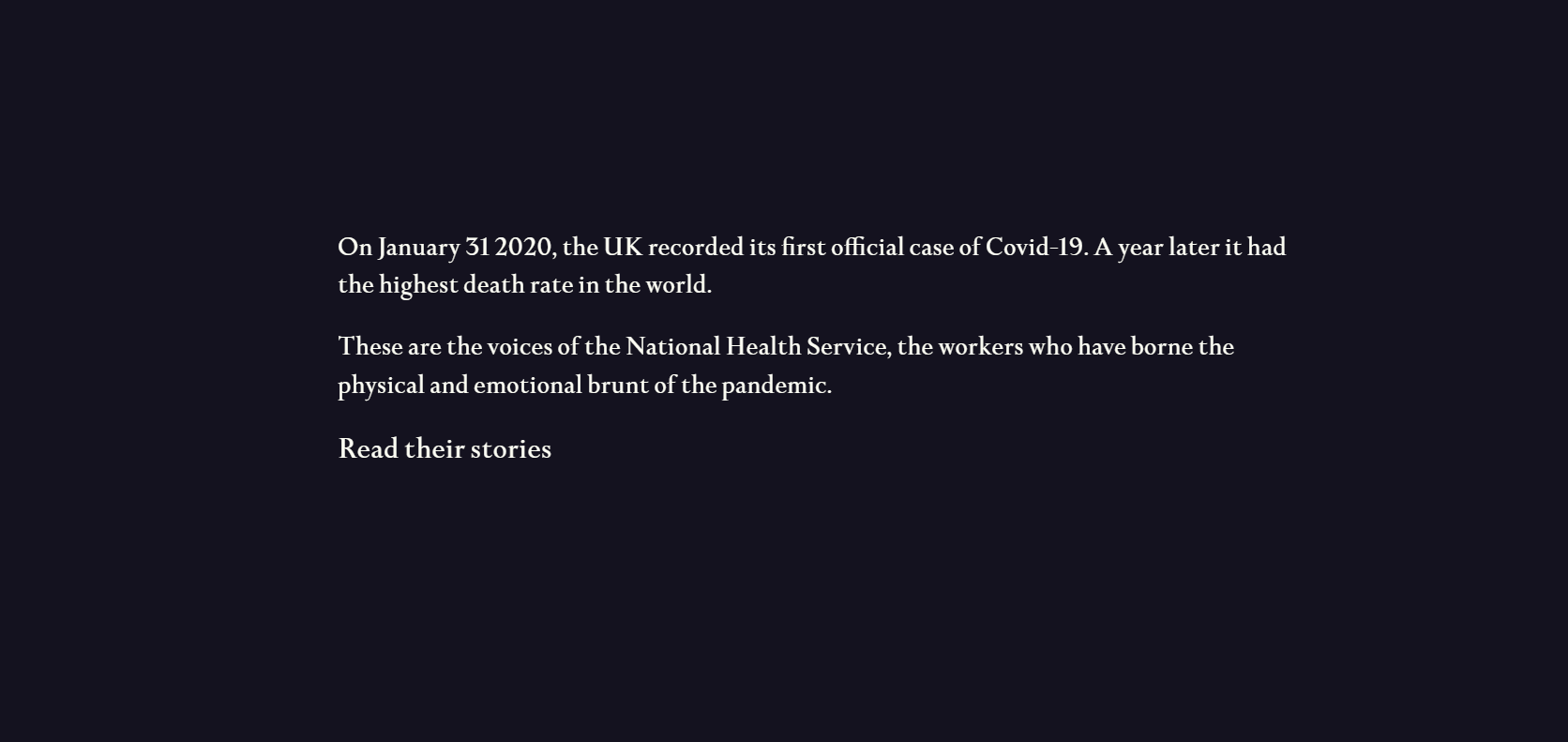
Highlighted Features:
- Story-driven layout
- Emotional impact
- Minimal content, excluding stories
Frontline, a website developed by Olson, tells untold stories of doctors and healthcare workers on the frontlines battling COVID-19, enduring physical and emotional exhaustion. The website’s layout prioritizes their stories, allowing users to scroll through and select a story simply by hovering the mouse cursor over the screen.
Clicking on the headline of a story opens a pop-up window displaying the entire narrative. Each story’s quotes are elegantly presented in serif font against a deep blue background. The About and Index pages detail the website’s mission to raise awareness and list notable doctors.
Minnesota State Transportation Center of Excellence by 8bitstudio

Highlighted Features:
- Innovative main menu
- Large fonts, images, and videos
- Layout based on surprise elements
Designed by 8bitstudio, the Minnesota State Transportation Excellence Center’s website opens with a fullscreen, high-resolution video featuring prominent text and displaying the UVP on the screen. The main menu at the top of the screen unfolds into a visually stunning interactive display with aviation navigation tools in the center.
Below the homepage, there’s a blend of imagery and text presented in a modern style, featuring large fonts, prominent images, and diagonal sections. This creative approach aligns with some of the best government website designs aimed at engaging users through compelling visuals.
Hukoomi by Lollypop Design
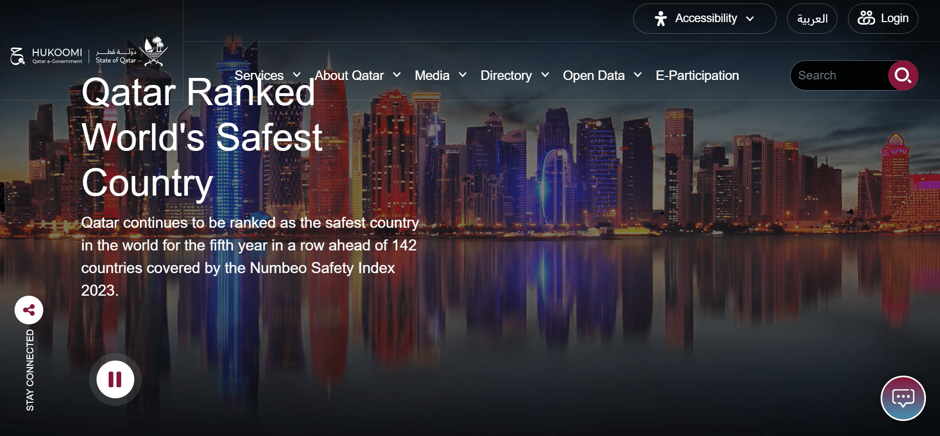
Highlighted Features:
- Effective use of national colors
- Two-tiered navigation menu
- User option to hover to the right
Lollypop Design’s Hukoomi Qatar eGovernment website employs Qatar’s national colors — dark red and white — as the foundation for its interface. White predominates, enhancing readability and clarity, while red serves as an accent color for buttons.
The complexity of public services is clearly reflected in the two-tiered main navigation menu, consistently present across the site. This approach, common in engaging government website designs, aims to ensure easy navigation through extensive information.
Recap
In conclusion, the government website design examples highlighted here not only showcase creativity and functionality but also set a benchmark for future endeavors in public sector digital transformation. By prioritizing intuitive navigation, engaging visuals, and robust user experiences, these websites exemplify how technology can enhance governance, foster transparency, and empower citizens globally. As we look ahead, the ongoing evolution of government websites promises continued innovation and improved accessibility, ensuring that public services remain accessible and efficient for all.

Summer is the CMO and Digital Commerce Solution Expert with 10+ years of experience. She specializes in Magento, Shopify, ERP, CRM, AI, and Blockchain, delivering strategic solutions that transform businesses. With a deep understanding of digital commerce, she helps brands scale and stay ahead in a competitive market.
Related Post

Mageplaza Announces Official Separation from Avada Group
Mageplaza is pleased to announce a significant milestone in our journey as we officially separate from the Avada Group to operate as an independent company.
Magento 2.4.8 Release: What's New In This Latest Enhancements?
In this article, we’ll explore the standout new features and enhancements that make the Magento 2.4.8 Beta version truly special.
Explore the latest from Mageplaza in January 2025, with new modules and updates designed to enhance your Magento e-commerce experience.
AngularJS and ReactJS: Which Framework Should We Use?
AngularJS vs ReactJS: Which framework is right for your project? In this article, we aim to discover strengths, weaknesses, and best use cases of them.
& Maintenance Services
Make sure your store is not only in good shape but also thriving with a professional team yet at an affordable price.
Get Started