
Discover 15 Best Health Care Web Design Examples in 2024
Summer Nguyen | 08-15-2024
As the digital landscape persists to evolve, healthcare websites are becoming more critical than ever in providing information, services, and support to patients. A beautiful website not only enhances user experience but also builds faith and steadfastness in the healthcare provider. This article highlights 15 top healthcare website designs for 2024, showcasing ingenious procedures and effective strategies that set these websites apart. Whether you’re looking to redesign your current site or seeking stimulation for a new project, these examples emphasize key details and best practices that can elevate your online presence.
Free 1-1 consultation: Website Design Service

15 Best Health Care Web Design Examples
Altus Emergency Centers
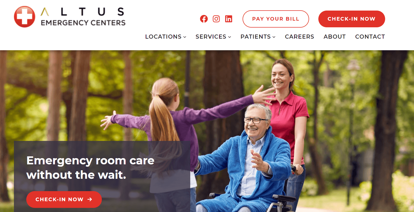
Altus Emergency Centers employs a striking white and red color scheme throughout their well-organized website. The red CTAs are highly effective at grabbing visitors’ attention and encouraging quick decisions that could potentially save lives.
For example, in the hero section, the sliding images feature the headline, “Average Wait Time: 5 Minutes,” with a red button urging people to call the center immediately.
Altus recognizes that some visitors browsing their site may need emergency healthcare services, so they aim to prompt these individuals to “Call Now.”
As you scroll down the homepage, Altus provides several reasons why you should trust them with your healthcare needs and what to expect from their emergency facilities.
What we like: Altus also lists the locations of their facilities and provides phone numbers for contacting the nearest centers for more information.
Tia
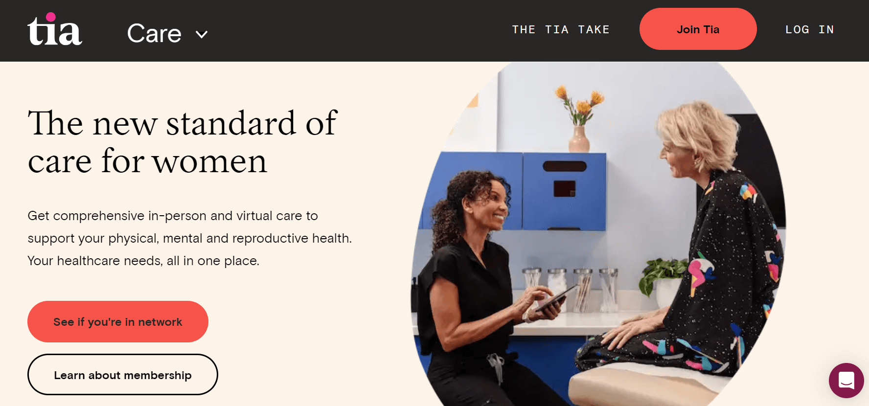
The Tia website has a beautifully cohesive design. Its neutral colors create a warm and inviting atmosphere.
From the outset, Tia’s website is designed to appeal specifically to women and individuals assigned female at birth (AFAB). They also clearly outline the types of care they offer — gynecology, primary care, mental health, and overall wellness.
While the site predominantly features soft tones, bold colors like yellow, orange, and purple are used to draw attention to key information about Tia.
What we like: The illustrations and photography further reinforce the brand’s identity, creating a comfortable and cheerful environment that makes Tia feel both professional and approachable.
Kindbody
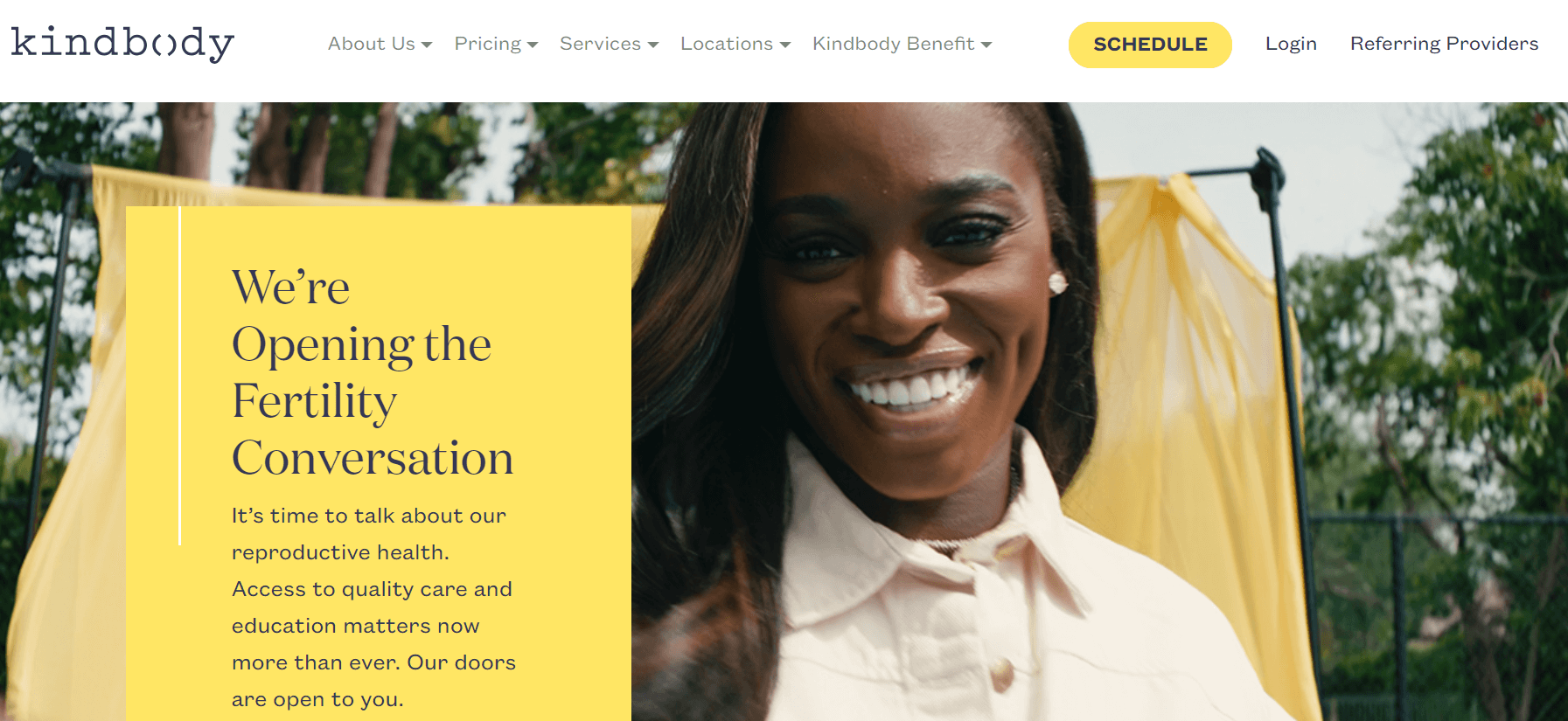
The combination of deep purple and yellow on the Kindbody website is visually striking.
This fecundity clinic offers a range of services from IVF to egg freezing. The clinic uses a warm color palette and beautiful imagery to welcome visitors and make them feel at ease while exploring the detailed descriptions of Kindbody’s services.
What we like: Kindbody builds trust with its clients by showcasing its extensive team of specialists and featuring positive quotes from reputable publications like CNN, Well & Good, and CNBC.
One Medical
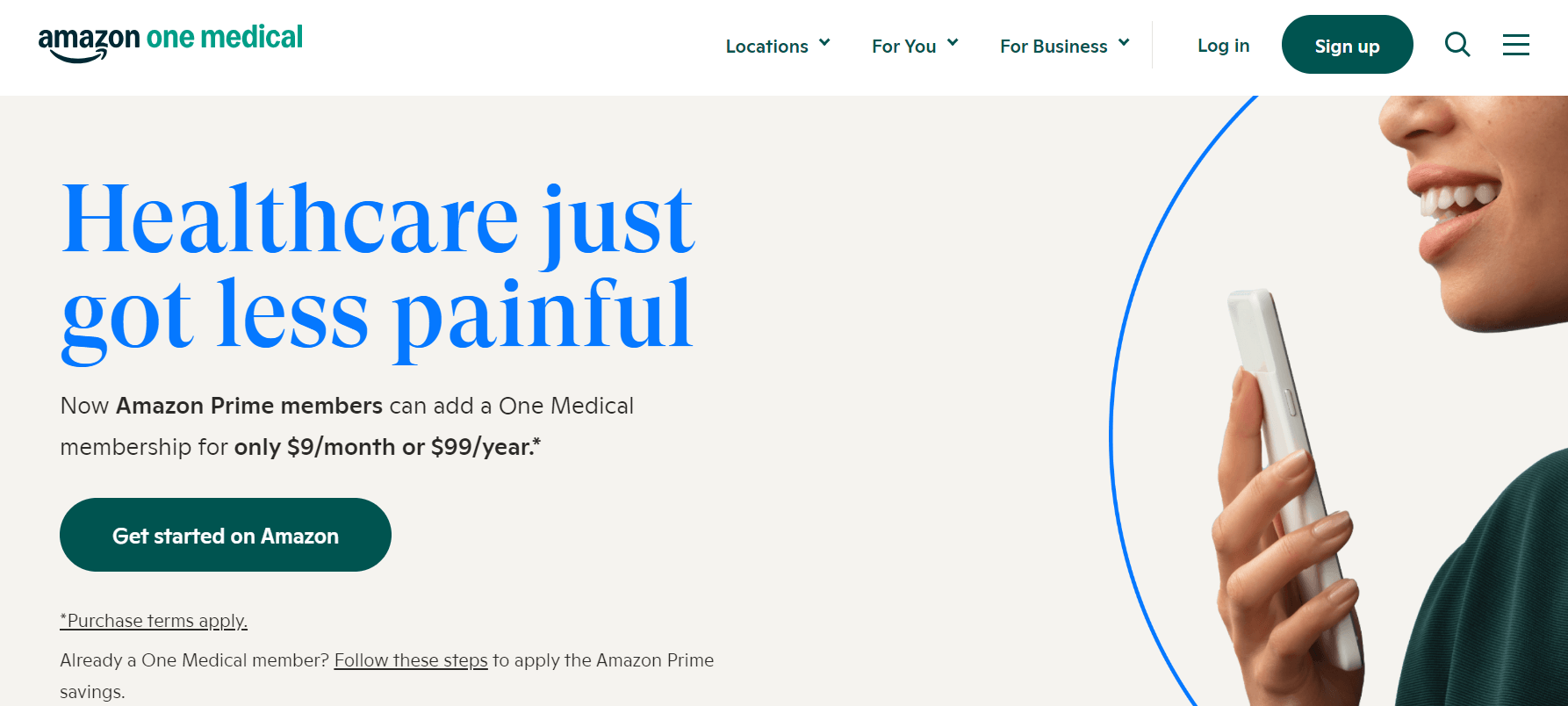
With its elegant design, One Medical uses bold headings to convey important information to visitors in a welcoming manner. We’ve seen other medical websites like Maven and Mercy Health also use green to signify good health and growth.
One Medical employs both green and yellow on their site to create a calming effect, a goal many healthcare companies strive to achieve.
At the top of the homepage, there’s a banner available for adding important links or promoting membership offers. Next to the logo, One Medical provides a link to COVID-19 information for visitors, which is both crucial and timely.
What we like: At the bottom of the page, a video provides visitors with an inside look at One Medical’s medical team and their distinct healthcare approach.
Rush Medical Center
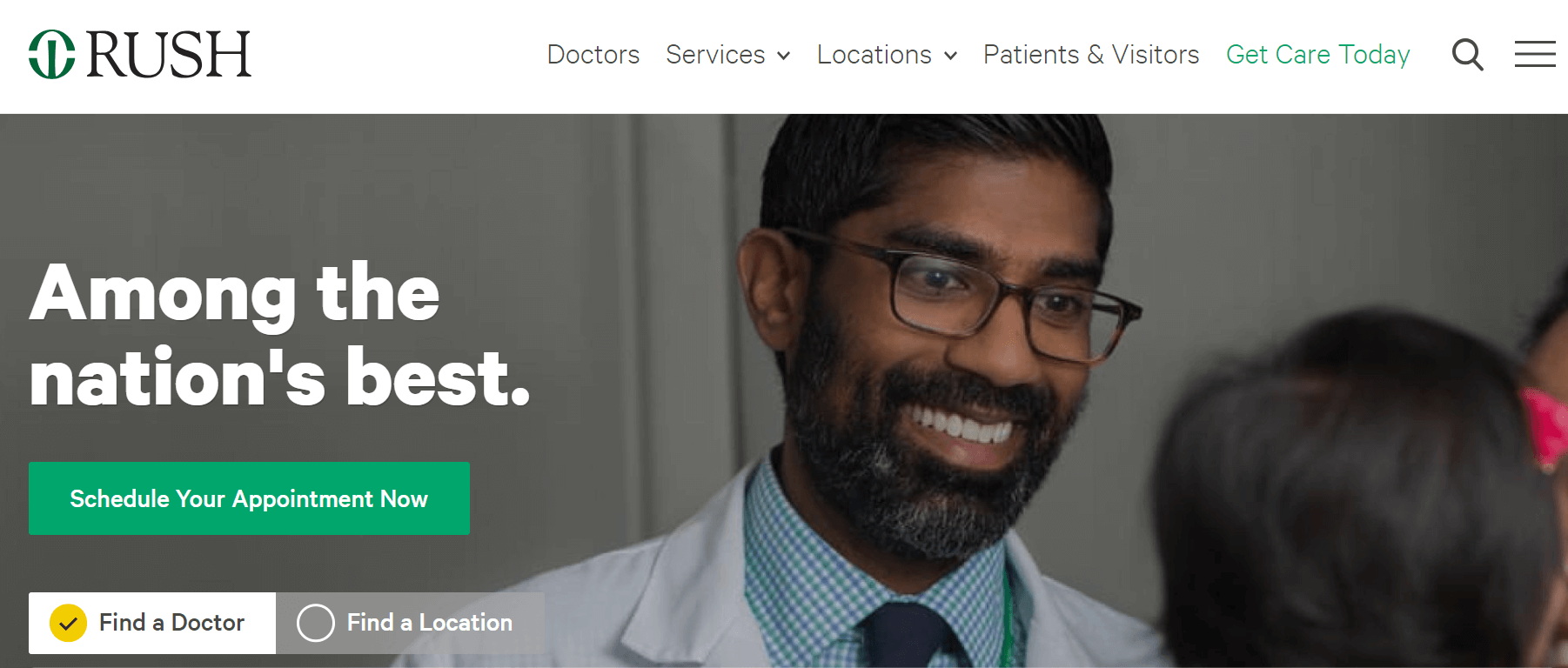
Placed in Chicago, Rush University Medical Center is a recognized hospital with the mission of “transforming health care through education, research, and innovation.”
This intuitive website emphasizes the significance of scheduling doctor assignments, featuring a prominent image of a patient being examined by a doctor. Above the image, the site offers visitors quick access to finding doctors, scheduling appointments, and accessing health information.
What we like: As you scroll down, you’ll find well-written articles highlighting the achievements of Rush University Medical Center.
Rest Assured
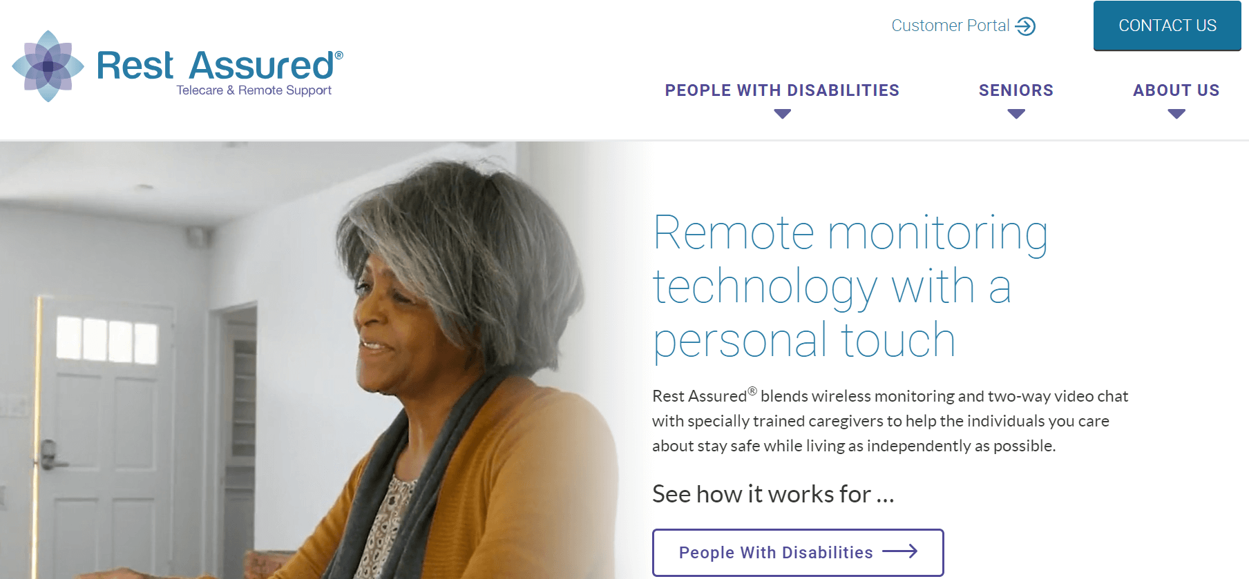
Rest Assured specializes in remote monitoring technology for seniors and individuals with disabilities, and their website clearly communicates this.
Instead of a prominent image, the Rest Assured website features videos of seniors and people with disabilities in various settings (outdoors, dining rooms, schools, etc.), illustrating how the company serves them.
Just below, Rest Assured outlines the benefits of their products and how they can enhance the lives of their target audience.
What we like: The website concludes with heartfelt testimonials from family members of those who use Rest Assured’s products. These testimonials demonstrate that potential customers can trust the company to fulfill its promises.
Benadryl
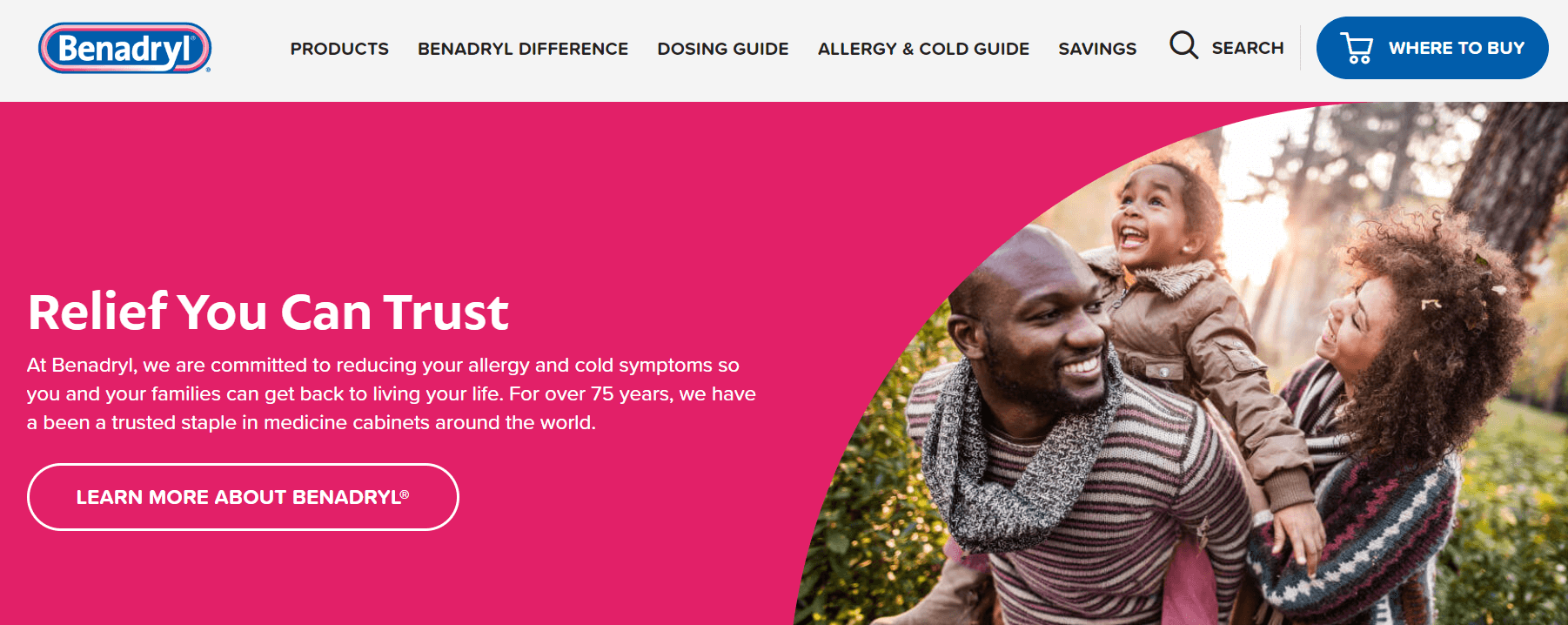
When you think of hospitals or healthcare, dark colors like gray or beige might come to mind. Nevertheless, Benadryl, a corporation particularizing in allergy and itch relief medication, breaks this stereotype by using a vibrant hot pink theme throughout its website.
The bright colors and images of happy families create a welcoming atmosphere for visitors.
Further down, you’ll find a well-organized section displaying all of Benadryl’s products for both adults and children, complete with links to purchase. The layout makes it easy to find the medication you need with just a scroll or a click.
What we like: Below the product section, there are product guides and articles on how to identify, treat, and prevent allergies and itchy skin.
Mayo Clinic
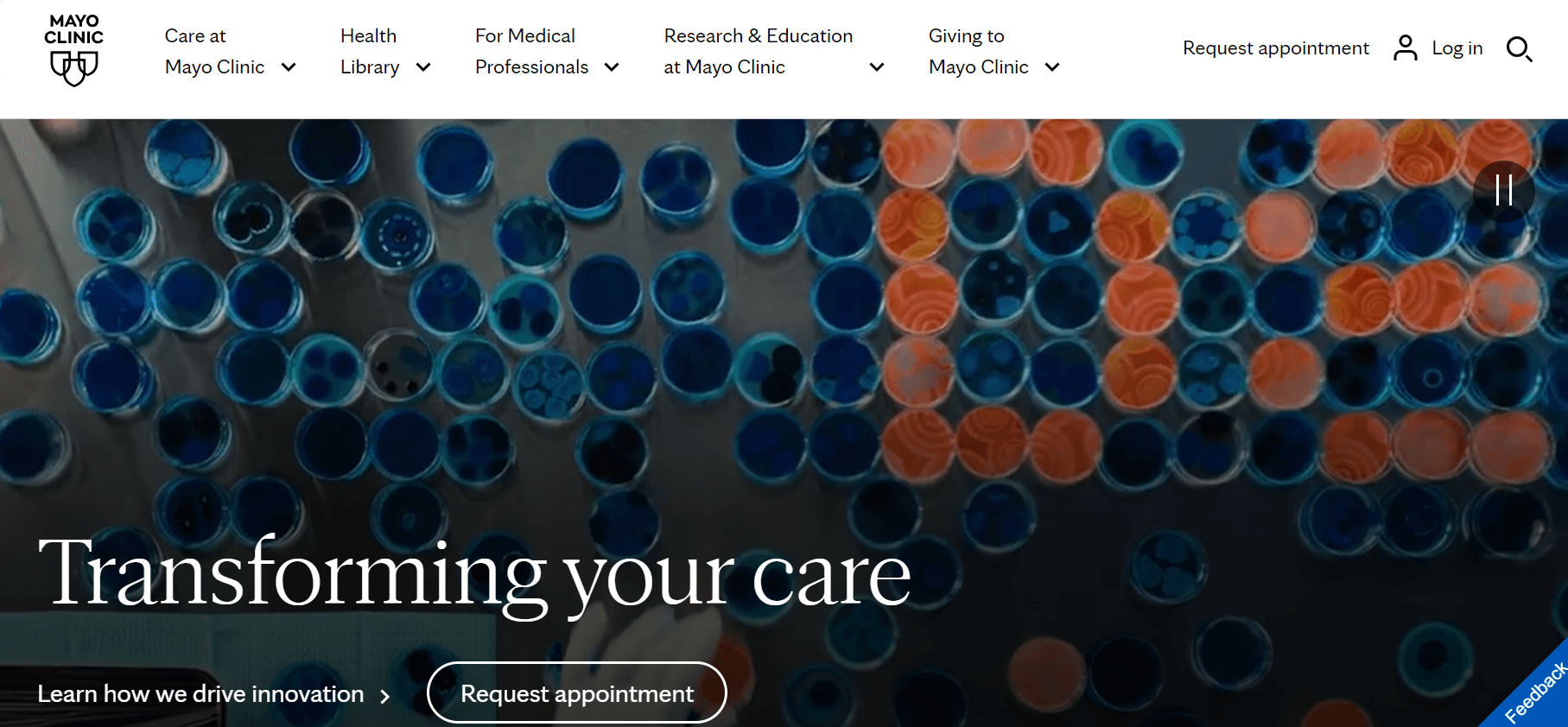
Mayo Clinic has designed its website to provide top-notch medical information to visitors — making it a masterclass in website navigation.
From the beginning, Mayo Clinic utilizes a comprehensive navigation menu to categorize extensive information about their healthcare services, medical conditions, and more. Specifically, the health issues category is alphabetically arranged, making it easy for visitors to find the information they need.
What we like: Below the Diseases & Conditions section, Mayo Clinic lists its clinic locations, complete with links to overviews of each branch, directions, and guidance for navigating the surrounding areas.
WebMD
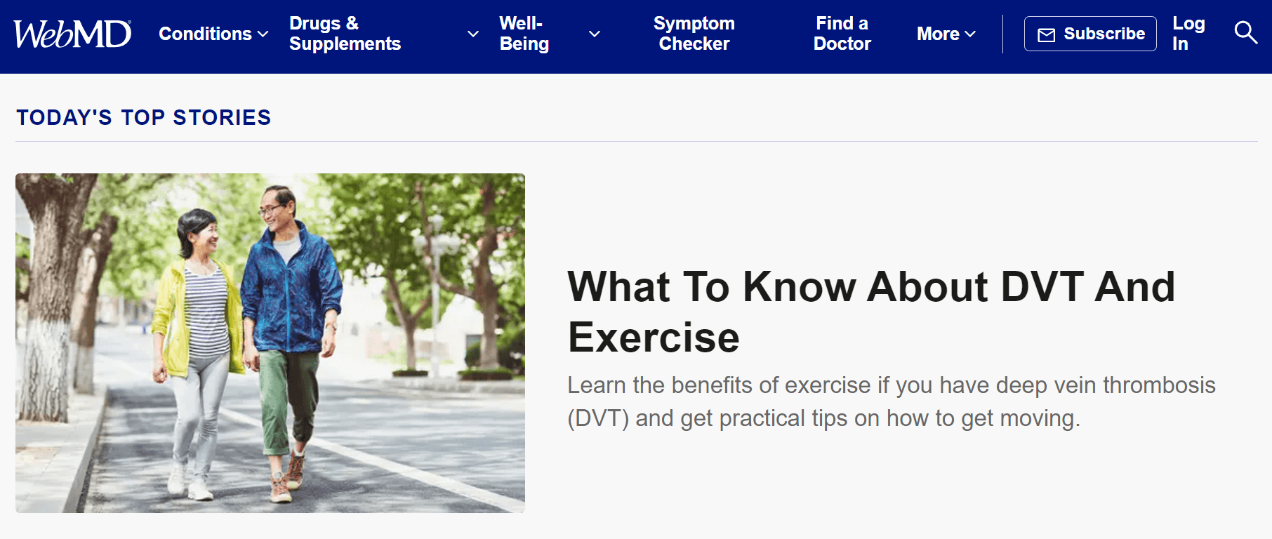
Although not an actual clinic like Mayo Clinic, WebMD is another website primarily focused on providing visitors with the latest health information.
The site uses a contrasting light and dark blue color scheme to outline articles across different categories, such as mental health, healthy aging, fitness, and weight management.
It also features thorough insights from WebMD’s Chief Medical Officer, John Whyte, on topics such as heart disease, sleep, and cancer. Additionally, you can find stories about patients dealing with conditions like sickle cell anemia, opioid addiction, migraines, and more.
What we like: While WebMD organizes health issues alphabetically, the standout feature of this website is its array of free tools — include a BMI calculator, ovulation calculator, pill identifier, pregnancy calendar, drug interaction checker, and more.
Maven Clinic
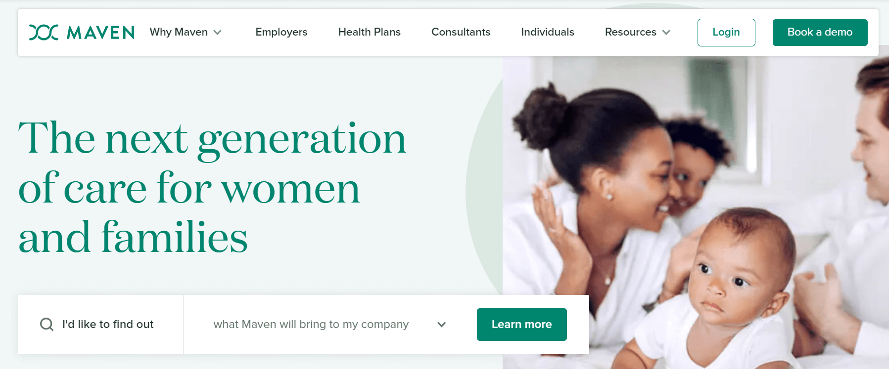
The first noticeable aspect when visiting the Maven website is its soothing green color scheme. In color psychology, green symbolizes nature, fertility, growth, and good health. Research even suggests that green can reduce anxiety and pain.
Maven is dedicated to providing care for women and families, which is reflected through images of healthy families on the site. The content succinctly explains why women and families should choose Maven Clinic for fertility, maternity, pediatric, and even menopause care.
What we like: The website also features testimonials and case studies from past and current clients, detailing the top-notch healthcare services Maven provides throughout their pre- and post-natal journeys.
NextCare Urgent Care
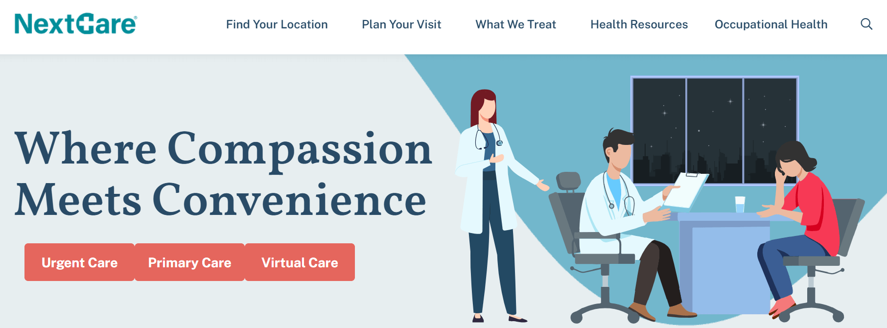
This well-crafted website is clear and concise. In the hero section, above an animated image of a patient in a doctor’s office, the headline says: “Your Healthcare, Answered.” In just three words, NextCare informs visitors that they can find the relevant health information they need.
Directly beneath the hero section, NextCare elaborates on its services and why individuals should consider their clinics for treatment. Near the bottom of the homepage, you’ll find links to NextCare’s urgent care services, including virtual care, injury treatment, vaccinations, and pediatrics.
What we like: Throughout the site, NextCare actually uses ample white space, letting visitors to focus on the information without distractions.
SonderMind
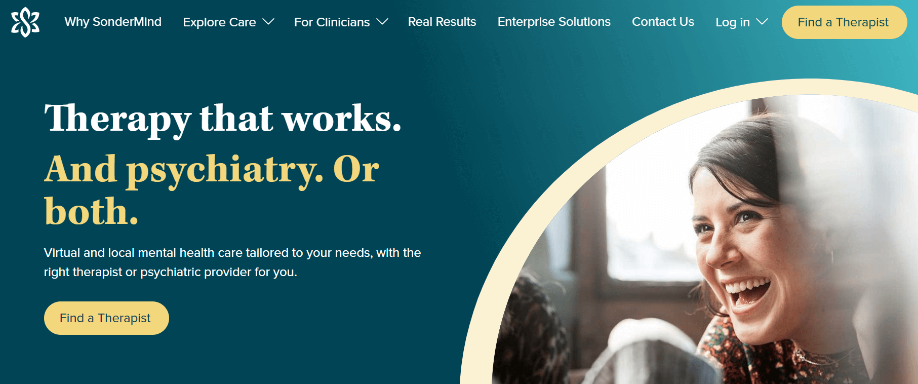
In contrast to many other healthcare websites, Sondermind refrains from overwhelming visitors with an abundance of information. Instead, it uses a few words to convey its primary service: therapy — followed by a clear call to action (CTA).
Halfway down the page, SonderMind offers insurance details, providing reassurance to its visitors. At the bottom of the page, there are explanations for frequently asked questions (FAQs) that guests might have.
What we like: Everything from the color scheme, messaging, and use of white space to the awareness to detail reveals that SonderMind’s website is created to deliver a pleasant user experience.
The College Nutritionist
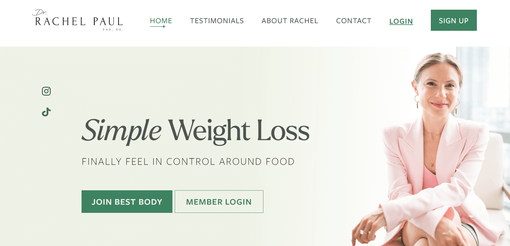
The College Nutritionist website promotes Dr. Rachel Paul’s healthy weight loss services. The site’s neutral color palette, combined with the storytelling format of its copy, creates a cohesive brand identity.
Upon arriving at the site, visitors are welcomed by an image of a smiling Dr. Paul, along with the promise to “finally feel in control of food.”
Below the hero section, Dr. Paul engages her ideal audience by posing questions that visitors can answer. Their responses determine whether they would benefit from Dr. Paul’s Best Body Program.
What we like: Dr. Paul further establishes her credibility by showcasing logos of major publications where she has been featured, including HuffPost, Business Insider, Cosmopolitan, and Daily Mail.
Synergy Private Health
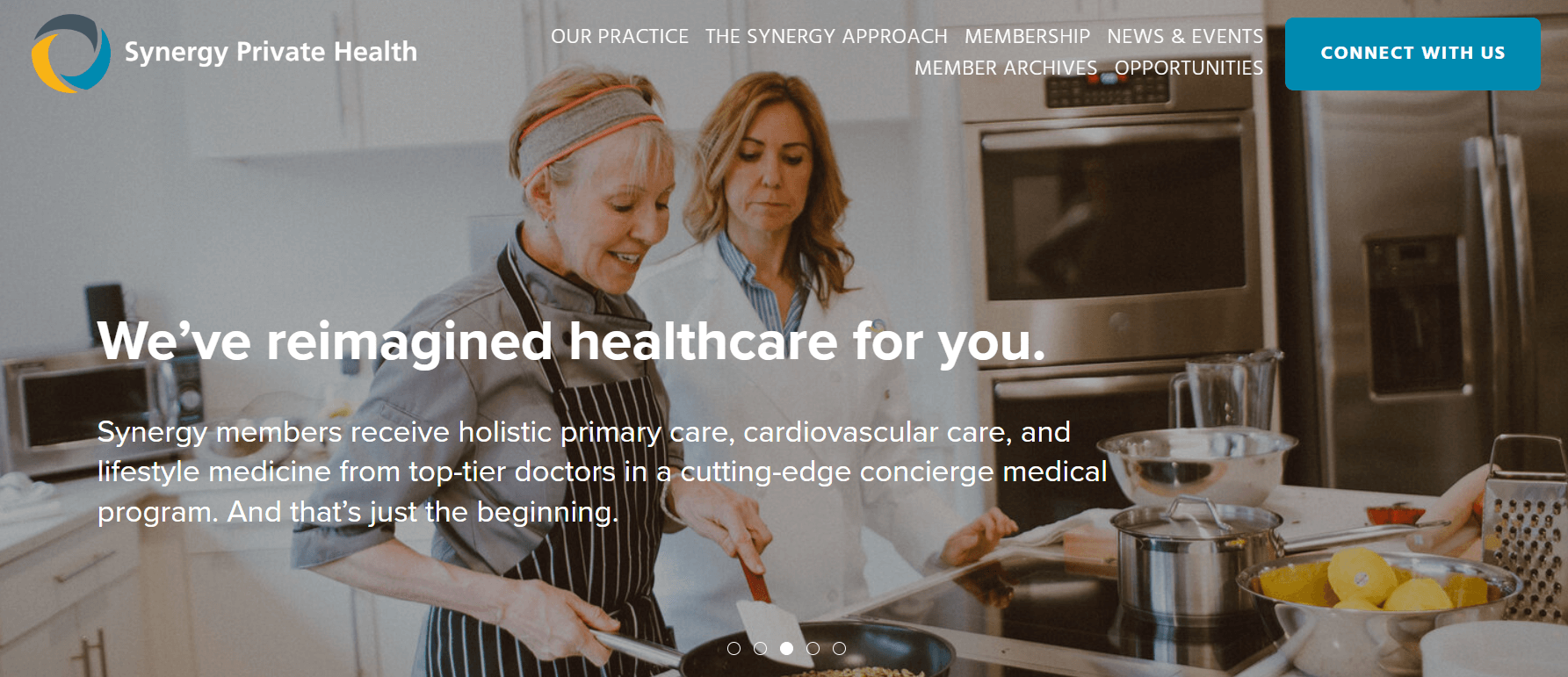
Synergy Private Health is a membership-based medical clinic offering primary care, cardiology, personalized health consultations, and various other services.
Instead of a single main image, the website features five full-screen sliding images showcasing the beautiful interiors and doctors at Synergy’s office. These visuals create a positive first impression and make visitors feel more at ease about receiving treatment there.
What we like: At the bottom of the website, there is a video featuring Dr. Kimberly Parks, a cardiologist and lifestyle medicine physician, explaining the new standard of healthcare that Synergy aims to provide.
Mercy Health
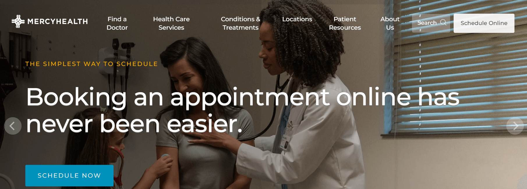
What distinguishes Mercy Health is its use of high-quality, vibrant images and appealing colors to capture visitors’ attention. The carousel beneath the headline fosters a sense of hope, pride, and community — essential elements in healthcare.
Similar to the Maven Clinic website, Mercy Health employs a bright green for its search box, capturing and maintaining visitors’ attention. This makes it easy for users to find doctors and healthcare centers nearby and manage their health information online.
What we like: Further down the page, Mercy Health highlights recent news and encourages visitors to use the chatbot located in the lower right corner of the screen.
Proven Tips To Create A Health Care Web Design
Drawing inspiration from successful healthcare website designs, let’s shift focus to practical tips for enhancing your medical website. Read on as we explore five proven strategies to give your website a fresh, more effective look.
Prioritize User Experience
Above all, make sure your medical website is easy to navigate. Keep the structure simple, enabling visitors to navigate easily, find information quickly, and browse your site without any confusion. A good user experience means smooth, stress-free interactions, which is crucial for a healthcare website. The goal here is to keep everything clear and straightforward.
Ensure Mobile Responsiveness
After addressing user experience, the next vital focus should be accommodating the increasing number of mobile users. With many individuals seeking health information on smartphones and tablets, having a mobile-responsive design is crucial. Your website should look great and function seamlessly on smaller screens. This way, users can access vital health information anytime, anywhere.
Incorporate Clear Visuals
Next, focus on visuals. In healthcare design, clear and engaging elements can enhance accessibility. Think about using diagrams, infographics, and high-quality images to make complex medical information easier to understand. Attractive visuals make your site more informative and appealing, helping to convey your message more effectively.
Maintain a Professional Layout
Another key aspect is layout—the backbone of your website design. To project a professional style, it’s important to make the content as accessible as possible. The primary goal remains the same—achieving the right balance between functionality and aesthetics. This includes streamlining the arrangement of text blocks, images, and navigation elements to create an easy flow and guide users effortlessly.
Implement Strong Calls to Action
Let’s wrap up our tips with a crucial element—a strong call to action (CTA). After establishing a professional layout, it’s vital to guide visitors toward taking action. Effective CTAs act as guides, prompting users to schedule appointments or contact you. Buttons and links serve as the final nudge, encouraging users to engage with your services. Make them clear, concise, and compelling to convert website visits into loyal users.
Trends in Healthcare Web Design
As we navigate through 2024, several trends are incorporate in healthcare web design that center on enhanced user experience and accessibility. Here’s a look at some of the central tendencies:
- Telemedicine Integration:
The expanding popularity of telemedicine has led to the merging of virtual care characteristics directly into healthcare websites. Many sites now offer easy access to telehealth appointments, video consultations, and virtual care resources, enhancing convenience and approachability for patients.
- Accessibility and Inclusivity:
There is a strong focus on making healthcare websites accessible to everyone, involving those with disabilities. This includes compliance with accessibility standards and features like screen reader compatibility and contrasty modes, ensuring that all patients can access essential health information without barriers.
- Engaging Visuals and Content:
Using enchanting visuals like images, videos, and infographics helps communicate complex medical information more clearly and attractively. These elements can make the content more relatable and easier to understand, helping patients better engage with the material.
- AI and Chatbot Integration:
AI and chatbots are being used more recurrently on healthcare websites to give immediate support and answer common questions. These tools can help guide users through the website and offer quick approach to information and services.
- Focus on Wellness and Preventive Caution:
Many healthcare websites are expanding their content to include wellness and protective care information. This helps teach patients on maintaining a healthy lifestyle and managing their health proactively, covering topics like nutrition, fitness, and mental health.
By remain trendy with these trends, healthcare providers can better serve their patients and enhance their online presence.
Summary
In conclusion, the 15 healthcare web design examples spotlighted in this article reveal how a considerately designed website can seriously impact patient attention and pleasure. From prioritizing user experience and mobile responsiveness to containing clear visuals and proficient layouts, these sites exemplify the best practices in healthcare web design. Additionally, strong calls to action are crucial in guiding visitors to take meaningful steps, such as booking appointments or accessing health information. By integrating these elements, healthcare providers can create effective and intelligible websites that meet the needs of their patients and sweeten their digital presence.

Summer is the CMO and Digital Commerce Solution Expert with 10+ years of experience. She specializes in Magento, Shopify, ERP, CRM, AI, and Blockchain, delivering strategic solutions that transform businesses. With a deep understanding of digital commerce, she helps brands scale and stay ahead in a competitive market.
Related Post

Adobe Commerce SaaS or Magento 3? The Future of Magento
Discover how Adobe Commerce SaaS is reshaping the future of Magento. Learn the key differences, what Magento 3 really means, and what merchants should expect next.
Magento 2.4.8 Official Release: What's Updated?
In this article, we’ll explore the standout new features and enhancements that make the Magento 2.4.8 official version truly special.

Mageplaza Announces Official Separation from Avada Group
Mageplaza is pleased to announce a significant milestone in our journey as we officially separate from the Avada Group to operate as an independent company.
Adobe Commerce SaaS or Magento 3? The Future of Magento
Discover how Adobe Commerce SaaS is reshaping the future of Magento. Learn the key differences, what Magento 3 really means, and what merchants should expect next.
Magento 2.4.8 Official Release: What's Updated?
In this article, we’ll explore the standout new features and enhancements that make the Magento 2.4.8 official version truly special.
Mageplaza Announces Official Separation from Avada Group
Mageplaza is pleased to announce a significant milestone in our journey as we officially separate from the Avada Group to operate as an independent company.
& Maintenance Services
Make sure your store is not only in good shape but also thriving with a professional team yet at an affordable price.
Get Started