
2 mins read
|
04-30-2026
14+ High-Converting Landing Pages You Need to See
Summer Nguyen | 09-13-2024
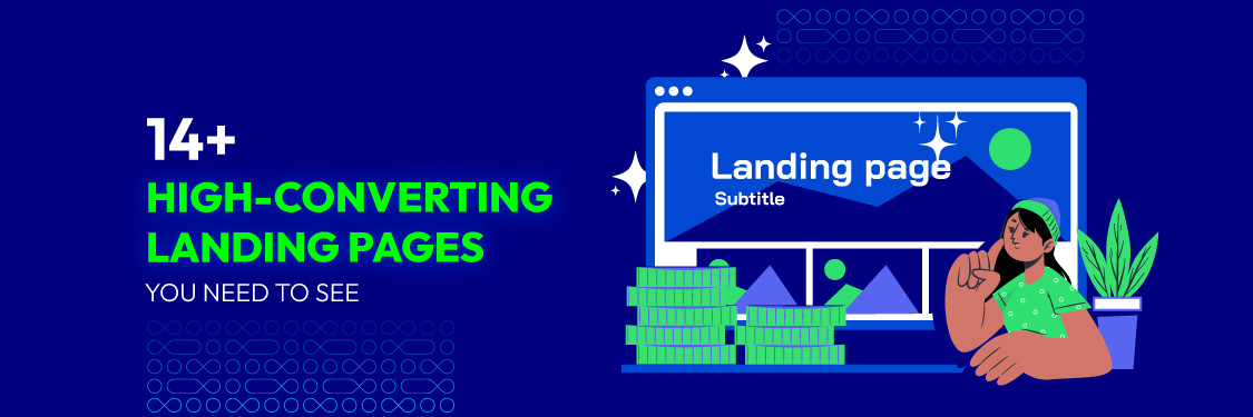
Let’s face it: We all want our websites to do more than just look pretty. We want them to work hard for us – bringing in leads, boosting sales, and getting people excited about our events. That’s where high-converting landing pages come in. These aren’t your average web pages; they’re meticulously designed to persuade visitors to take action. Think of it like a friendly salesperson gently guiding customers toward the checkout counter.
With this goal in mind, let’s explore 14 high-converting landing page examples, each with unique charm and persuasive power, to inspire your next creation.
What is a High-converting Landing Page?
A high-converting landing page is a meticulously crafted web page to persuade visitors to take a specific, desired action. These actions can range from:
- Lead generation: Capturing valuable contact information through compelling content or exclusive offers.
- Sales: Directly driving purchases of your products or services.
- Event registration: Boosting attendance at webinars, conferences, or workshops.
- Click-through: Effectively guiding visitors from advertisements to deeper engagement with your website.
- Brand awareness: Providing a focused platform to showcase your brand’s unique message and identity.
- Customer acquisition: Attracting and converting new customers through enticing free trials or demos.
- Content promotion: Increasing visibility and engagement with specific content pieces.
Related topic: Best practices for optimizing a Landing Page to boost conversions
Top 14+ High-Converting Landing Page Examples
A. Lead generation landing page
-
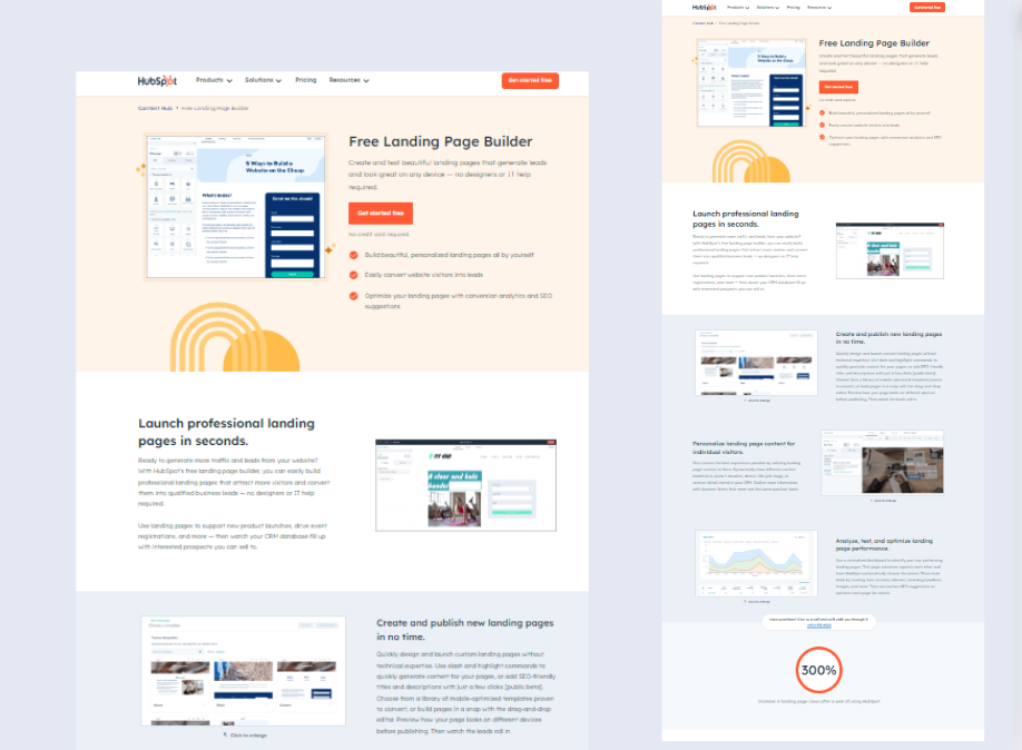
HubSpot
HubSpot’s landing pages are meticulously crafted to generate leads effectively. Benefit-driven headlines like “Get start free” immediately communicate the value proposition to visitors. The copy is concise and focused, highlighting the key takeaways and benefits of the resource without overwhelming the reader.
Additionally, HubSpot utilizes multi-step forms to break down the information-gathering process, making it less daunting for users. Moreover, testimonials and case studies further reinforce the offer’s credibility, building trust and encouraging conversions.
-
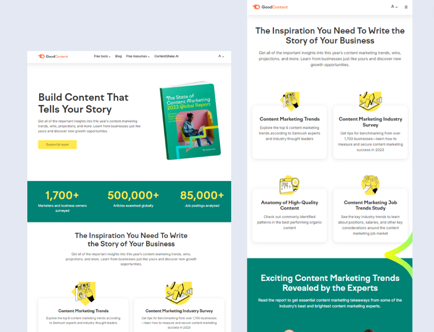
SEMrush
SEMrush’s report landing page on the “State of Content Marketing 2023” features a clean, modern design with a professional look aligned with Semrush’s brand identity. Using contrasting colors, typically a mix of whites, greens, and yellows, helps essential elements like the call-to-action (CTA) buttons stand out.
The layout is structured to naturally guide the user’s attention, from the introduction of the report to the benefits of downloading it, followed by snippets of the report’s insights.
The CTA is prominently placed and repeated at multiple points throughout the page. The primary CTA button might say “Explore the Full Report”. These buttons are designed to be highly visible and usually lead to a form where users must input their details, like name, email, and company information, to receive the report. The language used around the CTA emphasizes the value and exclusivity of the report, encouraging immediate action.
B.Sale landing page
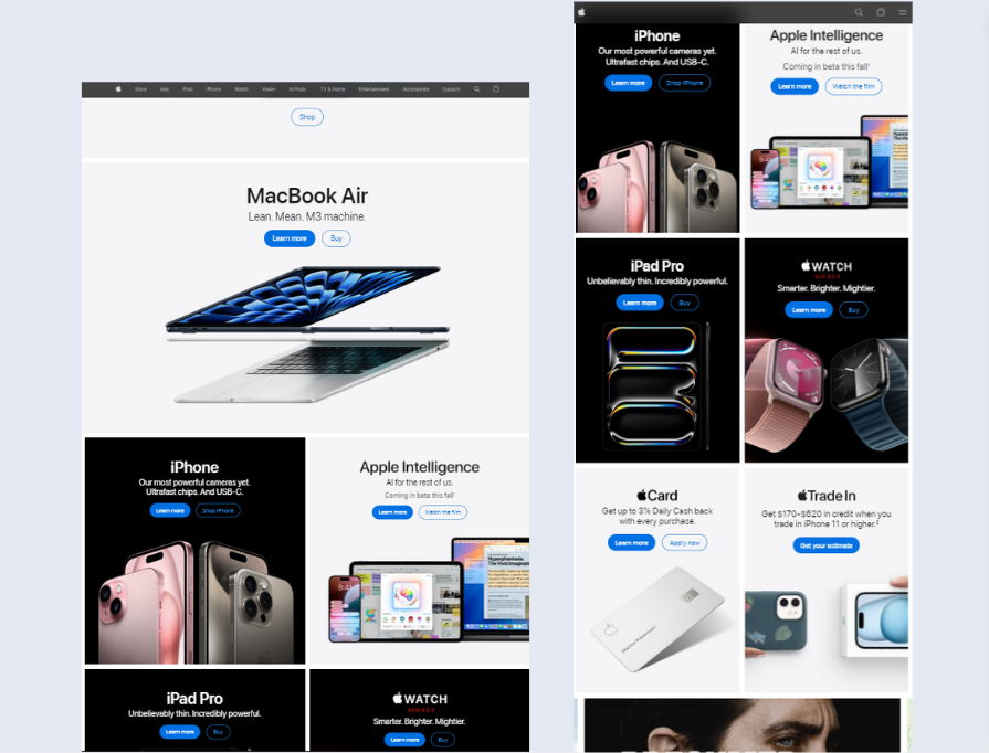
3. Apple
Apple’s landing pages are a testament to the power of visual storytelling. They immerse visitors in the product experience through high-quality product photography and videography, showcasing the design and functionality in detail. The copy is minimalist but impactful, focusing on the product’s key features and benefits.
Interactive elements like demos and 360° views allow visitors to explore the product virtually. Finally, the simplified checkout process minimizes friction, ensuring a smooth and seamless purchase experience.
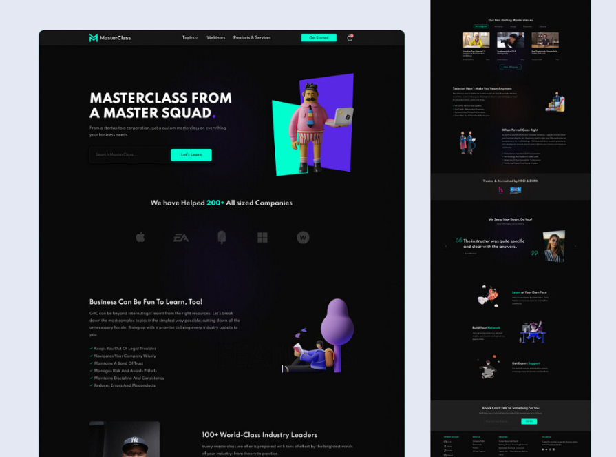
4. MasterClass
MasterClass leverages the fame and expertise of its celebrity instructors to attract potential subscribers. Landing pages heavily feature the instructors, highlighting their accomplishments and unique teaching styles. High-quality trailers and video clips showcase the courses’ production value and educational quality. Testimonials from satisfied students further reinforce the value proposition.
Moreover, MastetClass fosters community through discussion forums and social sharing, encouraging engagement and sign-ups.
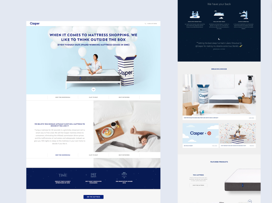
5. Casper
Casper’s landing pages exude a clean, trustworthy aesthetic with a minimalist design and calming color palette. The copy focuses on the benefits of better sleep and the science behind their mattress design, appealing to consumers’ desire for comfort and well-being. The 100-night risk-free trial is a powerful incentive, alleviating purchase anxiety and allowing customers to experience the product before committing.
Furthermore, a comprehensive FAQ section and live chat option address any questions or concerns, providing additional support and building trust.
C.Event registration landing page
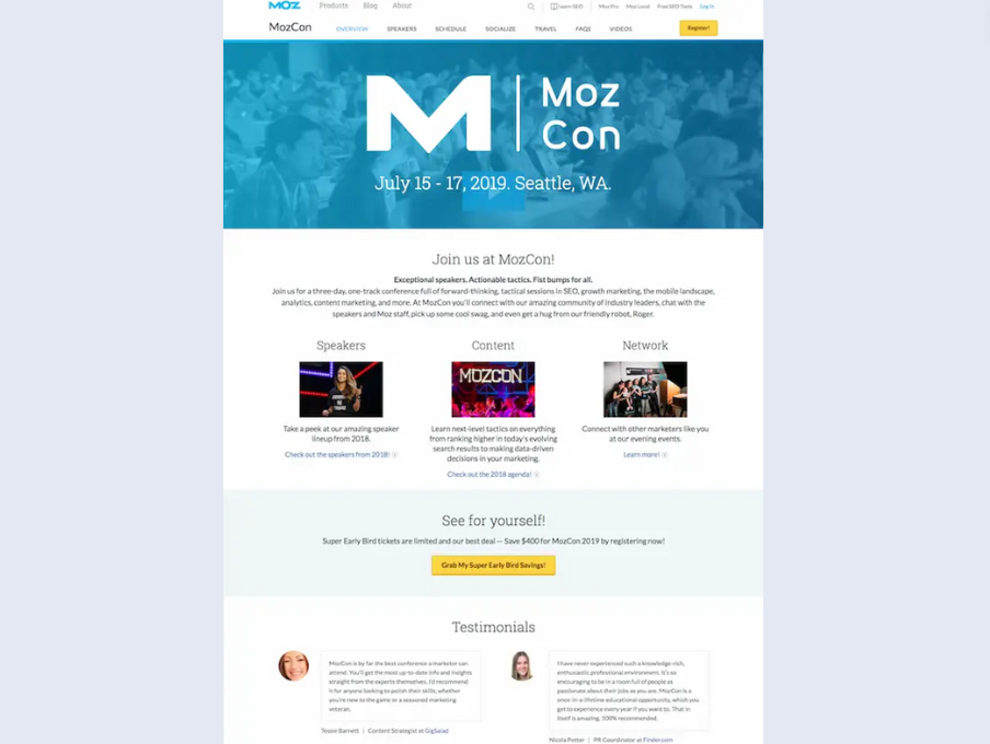
6. MozCon
The MozCon conference landing page expertly fosters a sense of community and excitement. The hero section often features a captivating image of past attendees, showcasing the energy and camaraderie of the event. The copy highlights the unique networking opportunities, renowned speakers, and cutting-edge topics covered, enticing industry professionals to register.
Moreover, the detailed agenda, often presented in an interactive format, allows potential attendees to explore the schedule and sessions, making it easier for them to plan their experience and see the value in attending.
7. TED
TED Talk landing pages are masterclasses in speaker-centric design. Each page focuses on the individual speaker, highlighting their expertise, unique perspective, and the core message of their talk. Short, impactful video previews offer a tantalizing glimpse into the talk’s content, sparking curiosity and encouraging registration.
The registration process is streamlined as well as user-friendly, ensuring minimal friction between the viewer’s interest and their commitment to attend.

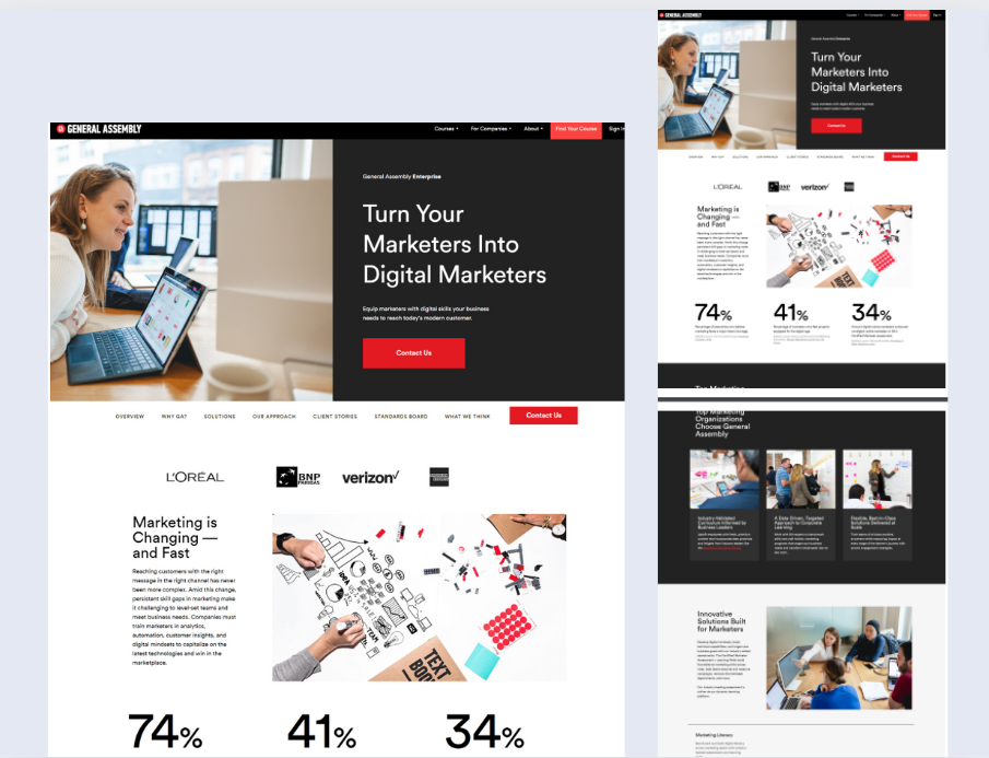
8. General Assembly
General Assembly’s workshop landing pages cater to specific skill-based learning needs. The headline and subheading communicate the workshop’s topic and the skills participants will acquire. The page features detailed information about the instructor’s credentials and experience, building trust in the quality of instruction.
Furthermore, they emphasize the practical application of the skills learned, showcasing the tangible benefits for attendees’ careers.
D. Click-through landing page
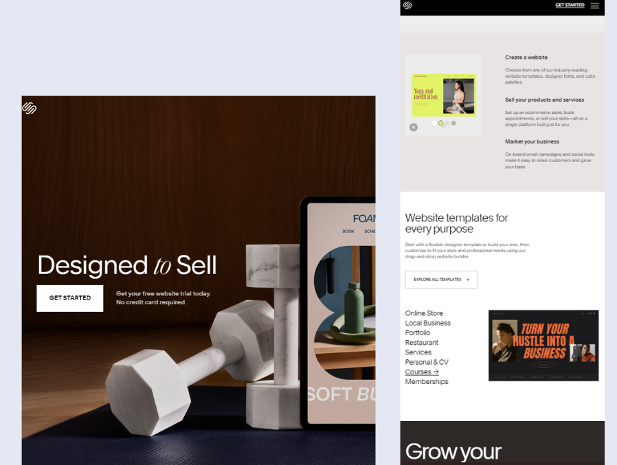
9. Squarespace
Squarespace’s ad landing pages are visually stunning and incredibly user-friendly. They showcase a curated selection of beautifully designed templates, instantly demonstrating the platform’s potential for creating professional websites.
The call-to-action button, often a simple “Get Started” or “Create Your Website,” is prominently displayed and encourages immediate action. Moreover, the option for a free trial further reduces the barrier to entry, allowing users to explore the platform’s features risk-free.
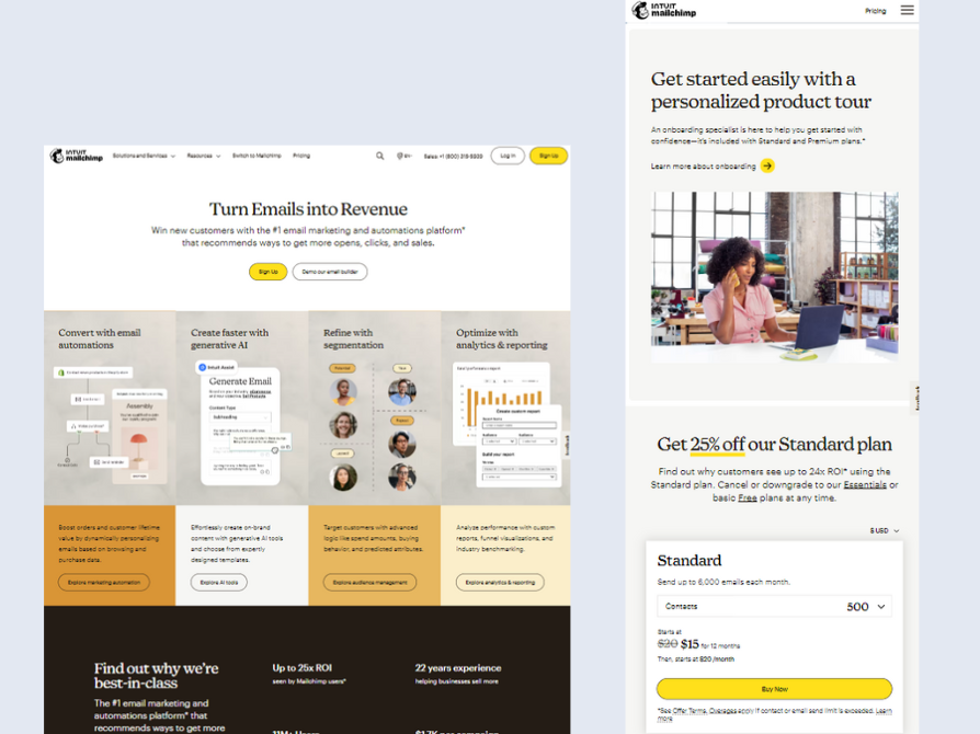
10. Mailchimp
Mailchimp’s ad landing pages are laser-focused on the specific benefits of their email marketing platform. Each page highlights a single feature or advantage, such as ease of use, automation, or analytics, catering to different user needs.
Clear and concise copy explains the value proposition, while testimonials and case studies reinforce the platform’s effectiveness. The call-to-action is always clear and compelling, guiding users to the follow-up step in the conversion funnel.
E. Brand awareness landing page
11. Nike
Nike’s “Just Do It” campaign landing pages are more than just product advertisements; they are emotional experiences. Powerful imagery of athletes pushing their limits, combined with inspiring stories of perseverance and determination, evoke strong emotions in the viewer.
The copy is minimal but impactful, focusing on the brand’s core values of athleticism, innovation, and social responsibility. These landing pages go beyond promoting products; they create a lasting impression and reinforce Nike’s position as a global leader in sports and fitness.

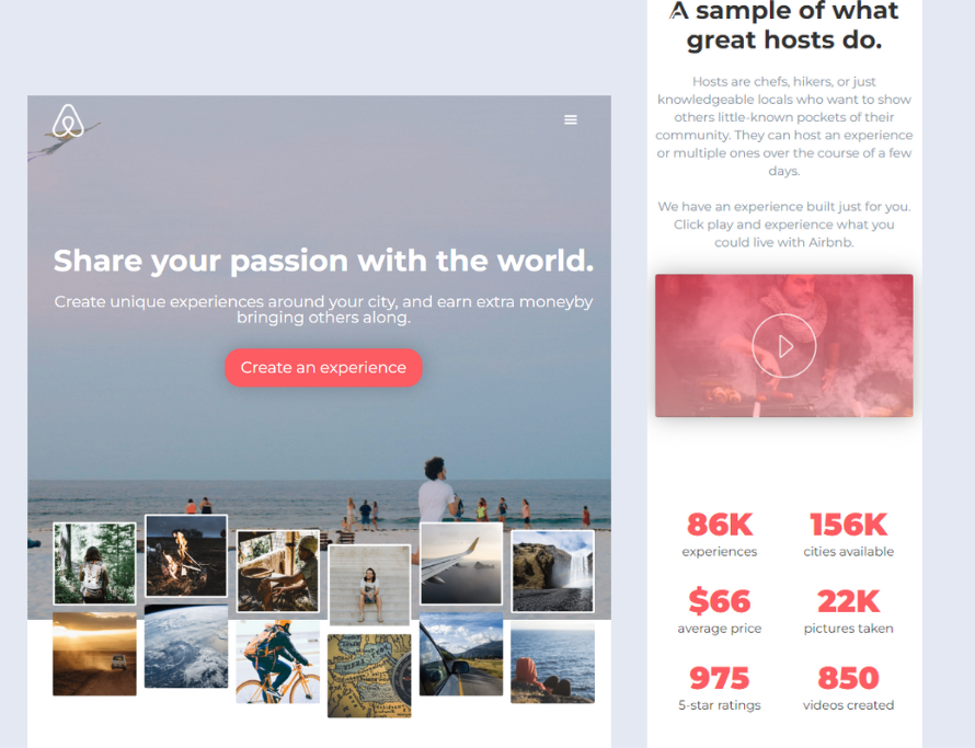
12. Airbnb
Airbnb’s landing pages transport visitors to unique destinations and experiences around the world. They showcase the diversity of accommodations available, from cozy apartments to luxurious villas, emphasizing the human connection and authenticity that sets Airbnb apart from traditional hotels.
The focus on hosts and their personal stories creates a sense of community and trust. Furthermore, the aspirational imagery and storytelling invite users to explore the world on their own terms. This fosters a strong emotional connection with the brand.
F. Customer acquisition landing page
14. Netflix
Netflix’s landing page immediately highlights the huge library of movies, TV shows, and documentaries available on its platform. The promise of unlimited viewing, personalized recommendations, and the ability to cancel anytime appeals to potential subscribers.
The emphasis on convenience and flexibility removes barriers to entry and encourages users to sign up for a free trial.

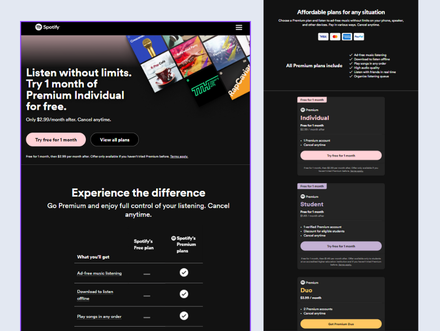
15. Spotify
Finally, Spotify’s landing pages for their premium subscription focus on the exclusive benefits that set it apart from the free version. Offline listening, ad-free music, and unlimited skips are just some of the perks highlighted to entice users to upgrade.
The promise of a personalized music experience, curated playlists, and early access to new releases further incentivizes potential subscribers. The limited-time free trial offers a risk-free way to experience the premium features, making the upgrade decision easier.
Key Takeaways from the High-converting Landing Page Examples
The analysis of the top 14 high-converting landing page examples provides several key insights into what makes a landing page effective, including:
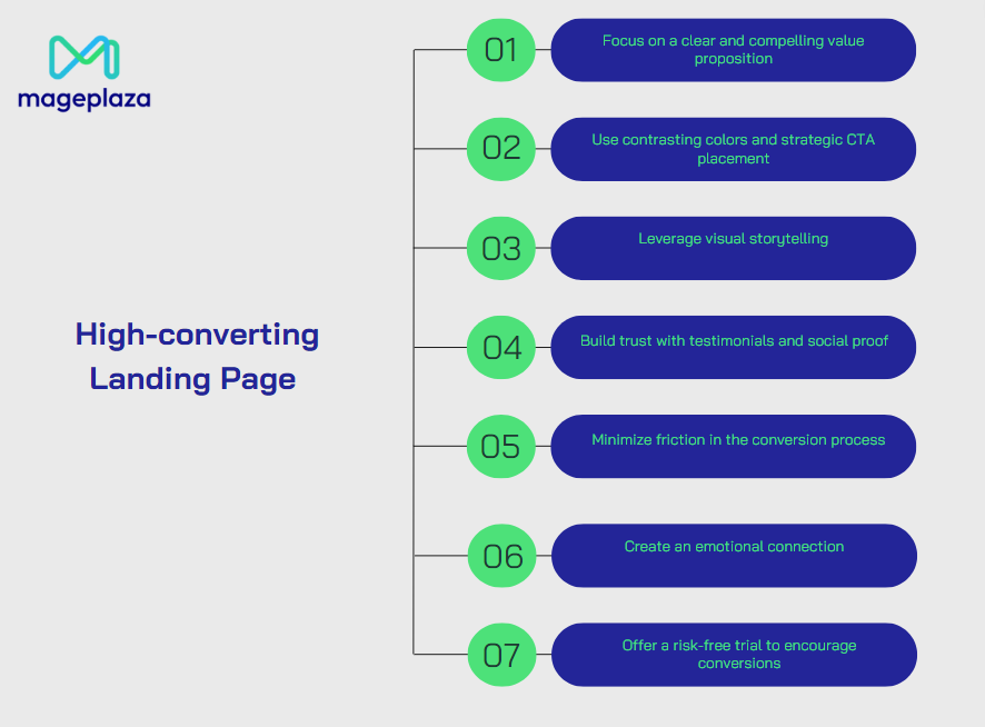
Focus on a clear and compelling value proposition
Your landing page must immediately communicate the value of your offer. A concise, benefit-driven headline helps visitors quickly understand what’s in it for them. HubSpot, for instance, uses a headline like “Get Started Free” to convey the benefit, making it easier for users to grasp the value proposition and take action.
Use contrasting colors and strategic CTA placement
Effective landing pages use contrasting colors to make CTAs stand out and place them strategically for maximum visibility. SEMrush’s report page uses a clean design with contrasting colors that draw attention to the CTA, which is repeated throughout the page. This encourages users to act at multiple points.
Leverage visual storytelling
High-quality visuals can captivate visitors and create an immersive experience that highlights your product’s features. Apple’s landing pages are prime examples of this approach. They use stunning imagery and interactive elements like 360° views to showcase their products, engaging visitors and encouraging them to explore further, finally leading to higher conversions.
Build trust with testimonials and social proof
Inserting testimonials and case studies on your landing page can significantly boost credibility. Seeing others share positive experiences with your product or service increases the likelihood of potential buyers making a purchase.
HubSpot and Mailchimp are both adept at incorporating social proof into their landing pages. HubSpot includes testimonials and case studies highlighting real-world successes, making the offer more relatable and trustworthy. Similarly, Mailchimp’s landing pages often feature user testimonials and success stories that reinforce the platform’s effectiveness.
Minimize friction in the conversion process
Reducing friction in the conversion process is crucial for maximizing landing page effectiveness. This involves simplifying the steps users need to take to complete the desired action, whether it’s making a purchase, signing up for a trial, or downloading a resource. Complex or lengthy processes can deter users and result in lost conversions.
Apple’s landing pages, for example, feature a streamlined checkout process that minimizes obstacles, ensuring a smooth and efficient purchase experience. Similarly, Netflix emphasizes convenience and flexibility, such as offering the ability to cancel subscriptions easily, which reduces commitment anxiety and encourages sign-ups.
Create an emotional connection
Emotional appeal can enhance a landing page’s effectiveness by creating a deeper connection with visitors. Nike’s “Just Do It” campaign landing pages are excellent examples of this strategy in action. They go beyond simple product promotion by using powerful imagery and stories that evoke emotions like determination, perseverance, and achievement.
Offer a risk-free trial to encourage conversions
Offering a risk-free trial is a highly effective method of lowering the barrier to entry and encouraging conversions. When users know they can try a product or service without immediate commitment, they are more likely to take the plunge.
Platforms like Squarespace and Spotify effectively use this approach on their landing pages. Squarespace, for example, offers a free trial that lets users explore their website-building tools without any financial commitment, which helps ease concerns and builds confidence. Similarly, Spotify promotes its premium subscription with a limited-time free trial. This allows users to experience the benefits of ad-free music and offline listening before deciding to upgrade.
Recap
We’ve taken a peek behind the curtain of some of the best high-converting landing pages out there – from HubSpot’s clear and concise lead generation pages to Nike’s emotionally charged brand awareness campaigns.
These examples show us that a successful landing page isn’t just about flashy design, it’s about understanding your audience and speaking directly to their needs. It’s about removing any obstacles that might prevent them from taking that final step, whether it’s a purchase, a sign-up, or a download. Hope these examples can help you!
Table of content

Summer is the CMO and Digital Commerce Solution Expert with 10+ years of experience. She specializes in Magento, Shopify, ERP, CRM, AI, and Blockchain, delivering strategic solutions that transform businesses. With a deep understanding of digital commerce, she helps brands scale and stay ahead in a competitive market.
Related Post

1 min read
|
03-30-2026
Magento 2.4.9 Beta Release: What's New?
Magento 2.4.9 beta is here. Stay up to date with every release milestone with this regularly updated guide.
11 mins read
|
03-17-2026
Google Analytics Website Traffic: The A–Z Guide for Magento 2 Store Owners
Learn how to analyze website traffic in Google Analytics 4, identify high-quality traffic sources, and grow your Magento 2 store with data-driven insights.
18 mins read
|
03-17-2026
The Complete Guide to UTM Parameters & Google Analytics for Magento website
Master UTM parameters and Google Analytics for Magento. Track traffic sources, measure campaign performance, and practical tips to use it for better business decisions.
9 mins read
|
10-05-2025
How to implement Cookie Consent for GTM & Google Analytics in Magento Under GDPR?
Implement cookie consent for GTM & GA4 in Magento under GDPR. Step-by-step guide using Google Consent Mode v2 to avoid fines and maintain analytics.
15 mins read
|
02-27-2026
2 mins read
|
04-30-2026
1 min read
|
03-30-2026
Magento 2.4.9 Beta Release: What's New?
Magento 2.4.9 beta is here. Stay up to date with every release milestone with this regularly updated guide.
11 mins read
|
03-17-2026
Google Analytics Website Traffic: The A–Z Guide for Magento 2 Store Owners
Learn how to analyze website traffic in Google Analytics 4, identify high-quality traffic sources, and grow your Magento 2 store with data-driven insights.
18 mins read
|
03-17-2026
The Complete Guide to UTM Parameters & Google Analytics for Magento website
Master UTM parameters and Google Analytics for Magento. Track traffic sources, measure campaign performance, and practical tips to use it for better business decisions.
9 mins read
|
10-05-2025
How to implement Cookie Consent for GTM & Google Analytics in Magento Under GDPR?
Implement cookie consent for GTM & GA4 in Magento under GDPR. Step-by-step guide using Google Consent Mode v2 to avoid fines and maintain analytics.
15 mins read
|
02-27-2026