

2 mins read
|
04-30-2026
15 Best Mega Menu Examples That Are Well-Designed!
Summer Nguyen | 08-14-2024
An effectively designed mega menu can significantly enhance website navigation and user experience. In this article, we will examine 15 of the top mega menu examples. These menus are designed smartly and organized clearly, making it simple for users to locate desired items.
Why Is A Mega Menu Important?
Mega menus play a pivotal role in enhancing website navigation and user experience due to several key advantages:
- Simplified Wayfinding: Mega menus consolidate a vast array of choices into a single, organized view. This streamlines the navigation process, enabling users to effortlessly locate specific pages or categories without excessive clicking.
- Enhanced User Experience: By presenting information in a clear and structured manner, mega menus empower users to quickly find what they seek. This efficiency significantly improves their overall site experience, leading to increased satisfaction and engagement.
- Improved Structure: For complex websites with numerous categories and subcategories, mega menus offer a structured solution. They bring clarity to the site’s organization, making it easier for users to understand the hierarchy and navigate through different sections.
- Boosted Engagement: The expansive nature of mega menus encourages exploration by showcasing a wider range of options. This can lead to increased user interaction and longer site visits as users delve into various sections they might not have discovered otherwise.
- Aesthetic Appeal: Mega menus provide ample space for incorporating visual elements like images, icons, and other design flourishes. This elevates the menu’s aesthetic appeal, making it a visually engaging component of the website.
- Highlighted Key Sections: Mega menus serve as a platform for showcasing important sections of the website, such as best-selling products, exclusive deals, or recent additions. This strategic placement directs users’ attention to these areas, potentially driving conversions and increasing sales.
- SEO Advantages: By providing clear pathways to different pages, mega menus aid search engines in understanding the website’s structure and content relationships. This enhanced clarity can contribute to improved search engine optimization (SEO), potentially boosting the site’s visibility in search results.
Key Elements Of A Mega Menu
To create a mega menu that enhances user experience and boosts website navigation, consider these key components:
Clear and Intuitive Structure:
- Logical Grouping: Organize menu items into well-defined categories and subcategories, ensuring a natural flow that aligns with user expectations.
- Headers and Separators: Employ descriptive headers to clearly differentiate between sections and utilize visual separators (lines, spacing) to delineate item categories, promoting a clean and organized layout.
Visual Hierarchy:
- Typography: Leverage varying font sizes and weights to establish a clear hierarchy, with main categories appearing more prominent than subcategories. This guides users’ attention and facilitates scanning.
- Icons or Images: Integrate relevant icons or images to visually represent categories, making them instantly recognizable and enhancing the menu’s overall aesthetic appeal.
User-Friendly Navigation:
- Hover or Click Activation: Choose an activation method (hover or click) that aligns with your website’s design and user preferences. Ensure the menu is responsive and easy to access regardless of the chosen trigger.
- Search Bar: Incorporate a search bar within the mega menu to empower users to quickly find specific items, especially on content-rich websites.
Responsive Design:
- Mobile Optimization: Prioritize a seamless experience across devices by ensuring the mega menu adapts gracefully to smaller screens. Implement techniques like condensing the menu into an accordion style or providing an alternative mobile navigation option.
- Touch-Friendly Elements: Design menu items with ample spacing and large enough touch targets to accommodate easy tapping on touchscreens, particularly for mobile users.
Consistent Branding:
- Visual Cohesion: Maintain a consistent visual identity by aligning the mega menu’s design with your website’s overall color scheme, typography, and style guide.
- Branding Elements: Integrate your website’s logo or other brand elements within the menu to reinforce brand recognition and create a cohesive look and feel.
15 Mega Menu Examples That Are Well-Designed
InVision
InVision is a well-known website providing a concentrated project management solution for workflows. The mega menu is efficiently structured to connect numerous important internal pages. In the Product menu, there are three categories of pages shown: Product Overview, Freehand, and For Teams. There is also a section dedicated to product updates. This large menu makes it easy for users to navigate the website.

Key Takeaways:
- Structured Hyperlinks: Grouped into sections for convenient browsing.
- Updates for products: Fast access to new information.
- Easy to use: Makes it easier to locate important pages.
Transchem Group
When you hover over the solutions tab on Transchem Group’s website, you will see a two-part mega menu. Created by Wanderland Agency, this menu combines text links and images to make navigation easier. Vertical links on the left side allow for fast scanning of categories. There are five brand images on the right side, which assist users in identifying brands more quickly.

Key Takeaways:
- Simple way to move around: Integrates written links and visuals.
- Effective Search: Vertical connections for different sections.
- Brand Recognition: Includes brand visuals for easy identification.
Dribbble
Dribbble is a well-liked platform where designers can display their work. It includes a carefully crafted mega menu that improves the user’s browsing experience. The Marketplace menu entry features an icon, a hyperlink, and a concise summary of the page. Additionally, there is a segment displaying distinct classifications. This menu exemplifies effective design.

Key Takeaways:
- Easily comprehensible design: Icons and descriptions for clear understanding.
- Category Display: Displays designated categories for easy and fast navigation.
- Easy to use: Improves ease of navigation and enjoyment.
weDevs
weDevs provides various WordPress products, such as the Dokan Multivendor Marketplace plugin. The mega menu is neat and uncomplicated. In the Products section, you can locate many products featuring logos and short taglines. There is an extra option to see all products. The responsive menu functions effectively on smaller devices.
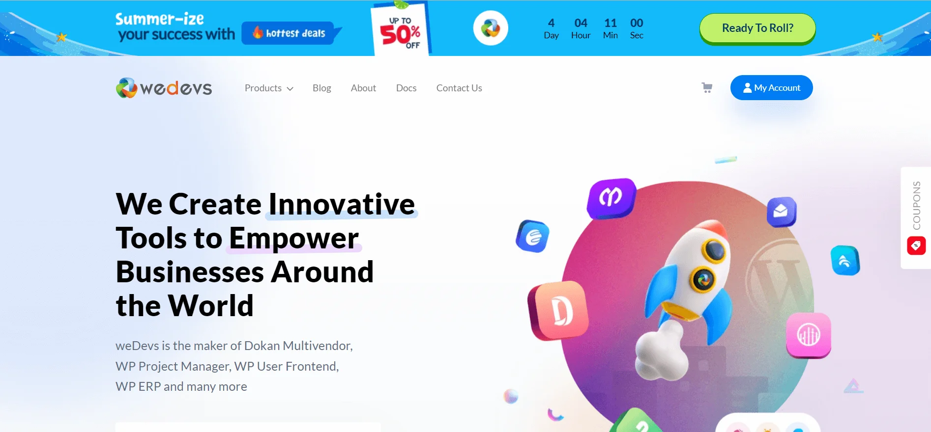
Key Takeaways:
- Visible Presentation: Brand logos and slogans.
- Option to see all products: Convenient way to view the complete range of products.
- Responsive design functions effectively on smartphones.
Jordan Lee
Jordan Lee, a designer, utilizes a mega menu on his portfolio website to prove the versatility of these types of menus. The menu is separated into three sections. One for discovering more about her, one for her primary abilities, and one for her cooperative approach. This arrangement allows convenient access to all crucial data without requiring any scrolling.

Key Takeaways:
- Three categories: background, skill, and method.
- Full access: Easily view all essential information.
- Efficient Navigation: Scroll not necessary.
Adidas
Adidas, a top sports brand, showcases a highly-structured mega menu on its website. Within the 3 STRIPE LIFE section, there are six different divisions. They are: What’s New, Collaborations, Our World, Sports, Originals, and Collections. Every section starts with a picture and contains many pages within.

Key Takeaways:
- Six divisions: Distinct categories for various interests.
- Image-centric: Every section commences with a visual representation.
- Organized format: Internal pages are easily accessible.
Flowbase Mega Navigation
Flowbase‘s Webflow Mega Navigation is a duplicatable mega menu. It is perfect for websites with straightforward product or service layouts. The different genres are displayed in the top navigation bar, with each mega menu containing sample options. Engaging thumbnails are provided for every item, enabling easy and quick product identification. Adapting this user-friendly menu for an online shop with limited but high-quality products is simple.

Key Takeaways:
- Design that can be cloned easily to suit various websites.
- Thumbnails improve the user experience by adding visual appeal.
- Simple layout: Great for basic product categories.
Figma
Figma employs a distinctive mega menu on their website to showcase important content, making it a popular design tool. This menu is distinct because it uses infographics to improve user experience. Furthermore, solid borders are used to divide menu sections to improve organization.

Key Takeaways:
- Infographics improve user experience.
- Strong outlines: Clearly divide menu categories.
- Crucial Content: Effectively showcases important website information.
Asana
Asana‘s large menu is thorough and simple to use. It utilizes basic icons, an easy-to-follow link layout, and a noticeable right-hand side. Matías Pitters presents an easily duplicable version featuring distinct headings, icons, and short explanations. This makes it clear what each link is for. This design is particularly beneficial for companies launching new services or products. This is because it efficiently clarifies unknown categories for visitors.

Key Takeaways:
- Easy-to-read design: Headers, icons, and descriptions help make links clearer.
- Simple to navigate: Intuitively arranged links.
- Beneficial for distinctive items: Aids in clarifying unfamiliar classifications.
Brix Templates
Brix Templates provides five mega menu clones suitable for different design requirements. Utilizing text and large icons, the v1 and v4 versions create a visually appealing and clearer design with three or four columns. The simplified choices (v3 and v5) use dropdowns in one column with the option of adding icons for a more polished appearance. A medium-sized variation (v2) features a pair of columns with explanations. This helps find a balance between intricacy and straightforwardness. These designs are appropriate for websites with clear page structures.

Key Takeaways:
- Various choices: Five diverse designs for different requirements.
- Extensive Menu Options: Columns containing both icons and text.
- Simplified Formats: One-column layout for a neat appearance.
- Balanced Layout: Detailed descriptions in a two-column format for simplicity.
Pixel Geek
Nelson Abalos Jr., the Pixel Geek designer, creates a mega menu that successfully combines style and usability. It includes a prominent picture, headings, summaries, category titles, and thorough link descriptions with no mess. This layout is perfect for small online shops, displaying each product efficiently. Nelson’s purple color palette can be personalized to align with your brand in Webflow.

Key Takeaways:
- Harmonious design: Merges visual appeal with practicality.
- Efficient Exhibition: Showcases products without any mess.
- Tailor: Change the color scheme to align with your brand.
Austen
Austen Redinger‘s Super Menu includes a captivating animation. The menu on the left descends from the top as the links move in from the right. This design captures user interest. This makes it ideal for smaller online stores wanting to differentiate themselves. The color gradient attracts attention and directs the user’s gaze. Meanwhile, the legible font guarantees readability. This layout assists in arranging content and showcasing distinctive items.

Key Takeaways:
- Exclusive Animation: Captures user’s focus.
- Captivating Design: Color gradient directs attention.
- Clear text visibility is guaranteed by using a readable font.
Webflow
The Webflow homepage showcases a sophisticated mega menu that is well-structured. Separators differentiate various segments, while user-friendly symbols help with quickly scanning. Newcomers are aided by brief explanations found under link headings such as “Marketplace” and “Made in Webflow.” The menu features a sidebar in gray that provides convenient access to tutorials from Webflow University. Moreover, the lower right corner acts as a support area for users who need help with the software.

Key Takeaways:
- Concise layout: Dividers and symbols for straightforward movement.
- Useful Explanations: Make unclear link titles easier to understand.
- Quick access to tutorials and help provided through resource links.
Tips for Designing and Implementing Mega Menus
Designing and implementing effective mega menus require careful consideration of various factors to enhance user experience and navigation on your website. Here are some essential tips:
- Prioritize User Experience (UX): Always design with the user in mind. Conduct user research to understand your target audience’s needs, preferences, and how they interact with mega menus. Organize content logically, grouping related items and using clear labels. Use visual cues like icons and images to guide users. Ensure accessibility by making your mega menu compatible with keyboard navigation and screen readers.
- Maintain Clarity and Simplicity: Avoid overwhelming users with too many options. Keep the design clean and uncluttered, using white space effectively. Limit the number of levels within the mega menu to prevent confusion. Choose a font that is easy to read and visually appealing. Use descriptive labels for menu items, avoiding jargon or overly technical terms.
- Optimize for Responsiveness and Performance: Your mega menu should adapt seamlessly to different screen sizes and devices, including desktops, tablets, and smartphones. Test your mega menu on various browsers and devices to ensure consistent performance. Optimize images and other media to reduce loading times and improve overall website speed. Consider using lazy loading for images or videos within the mega menu.
- Test and Iterate: Conduct usability testing to gather feedback from real users and identify areas for improvement. Analyze user behavior using analytics tools to track how users interact with your mega menu. Continuously refine and optimize your design based on data and feedback to ensure it remains effective and user-friendly over time.
Wrap Up
To summarize, these 15 mega menu samples prove how effective design can enhance user experience. They use a clear layout, visual attractiveness, and responsive design. This creates a simple and appealing browsing experience. Use these samples as motivation for developing an improved, easily navigable menu for your own website.
Table of content

Summer is the CMO and Digital Commerce Solution Expert with 10+ years of experience. She specializes in Magento, Shopify, ERP, CRM, AI, and Blockchain, delivering strategic solutions that transform businesses. With a deep understanding of digital commerce, she helps brands scale and stay ahead in a competitive market.
Related Post

1 min read
|
03-30-2026
Magento 2.4.9 Beta Release: What's New?
Magento 2.4.9 beta is here. Stay up to date with every release milestone with this regularly updated guide.
11 mins read
|
03-17-2026

Google Analytics Website Traffic: The A–Z Guide for Magento 2 Store Owners
Learn how to analyze website traffic in Google Analytics 4, identify high-quality traffic sources, and grow your Magento 2 store with data-driven insights.
18 mins read
|
03-17-2026

The Complete Guide to UTM Parameters & Google Analytics for Magento website
Master UTM parameters and Google Analytics for Magento. Track traffic sources, measure campaign performance, and practical tips to use it for better business decisions.
9 mins read
|
10-05-2025
How to implement Cookie Consent for GTM & Google Analytics in Magento Under GDPR?
Implement cookie consent for GTM & GA4 in Magento under GDPR. Step-by-step guide using Google Consent Mode v2 to avoid fines and maintain analytics.
15 mins read
|
02-27-2026
2 mins read
|
04-30-2026
1 min read
|
03-30-2026
Magento 2.4.9 Beta Release: What's New?
Magento 2.4.9 beta is here. Stay up to date with every release milestone with this regularly updated guide.
11 mins read
|
03-17-2026
Google Analytics Website Traffic: The A–Z Guide for Magento 2 Store Owners
Learn how to analyze website traffic in Google Analytics 4, identify high-quality traffic sources, and grow your Magento 2 store with data-driven insights.
18 mins read
|
03-17-2026
The Complete Guide to UTM Parameters & Google Analytics for Magento website
Master UTM parameters and Google Analytics for Magento. Track traffic sources, measure campaign performance, and practical tips to use it for better business decisions.
9 mins read
|
10-05-2025
How to implement Cookie Consent for GTM & Google Analytics in Magento Under GDPR?
Implement cookie consent for GTM & GA4 in Magento under GDPR. Step-by-step guide using Google Consent Mode v2 to avoid fines and maintain analytics.
15 mins read
|
02-27-2026