
15 Best Minimalist Web Designs That Stand Out
Summer Nguyen | 08-05-2024
Have you ever wondered why some websites captivate your attention while others feel cluttered and overwhelming? The secret often lies in the art of minimalist design.
In this article, we’ll explore 15 of the best minimalist website design examples that beautifully embrace this philosophy. Let’s find out!
Free 1-1 consultation: Website Design Service

Key Elements Of Minimalist Website Design
Minimalist web design is an approach that emphasizes simplicity and the elimination of non-essential elements. It focuses on using fewer components to create a clean, uncluttered, and aesthetically pleasing interface.
The goal of minimalist design is to improve the user experience by reducing distractions and highlighting the most important content.
Before creating a minimalist website, you need to take note of these elements:
- White Space: White space, or negative space, is the empty area between elements in a design. It helps to create a sense of balance and organization, allowing content to breathe and stand out.
- Limited Color Palette: Minimalist website designs often use a restrained color scheme, typically featuring neutral tones like white, black, and gray. Occasionally, an accent color is used to draw attention to key elements.
- Simple Typography: Clean, sans-serif fonts are commonly used in minimalist designs to ensure readability and a modern look. Typography is kept simple to avoid visual clutter.
- Functional Elements: Every element in a minimalist design serves a clear purpose. Unnecessary buttons, links, or graphics are avoided to maintain simplicity and efficiency.
- Consistent Layout: Consistency in layout and design elements ensures a cohesive and professional appearance. This includes maintaining uniform margins, padding, and alignment throughout the site.
Common Misconceptions: Simple vs. Minimalist Design
Many people often confuse simple design with minimalist design, believing that the two concepts are the same. However, while both aim for simplicity and ease of use, they have important differences that need to be clarified. The comparison table below will help distinguish these two concepts clearly:
| Minimalist Design | Simple Design | |
| Purpose and Philosophy | Focuses on removing everything unnecessary, aiming for a very clean and simple look. | Focuses on making the website easy to use and straightforward without necessarily removing all decorative elements. |
| Use of Elements | Uses only essential elements, keeping decorations to a minimum or none at all. Minimalist design often utilizes whitespace as a key design element | May include more decorative elements and colors as long as they do not interfere with usability. |
| Color Palette | Uses a limited color palette, often sticking to neutral or monochromatic tones for a cleaner look. | Often uses a broader range of colors to make the design look appealing and friendly. |
15 Best Minimalist Website Design Examples
Minimalist web design has become a popular trend in 2024. To help you understand how to implement this approach successfully, we’ve curated a list of 15 best minimalist website design examples. These sites exemplify the principles of minimalism, each offering unique insights into how simplicity can enhance usability and aesthetic appeal.
Zero
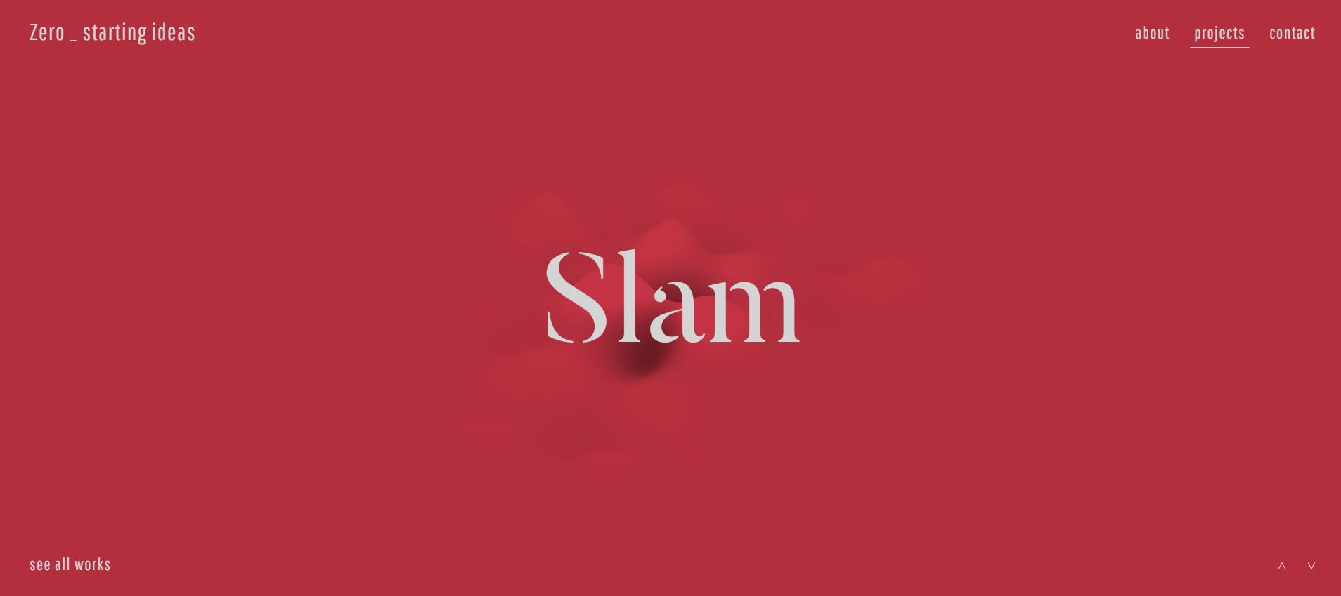
Zero is a design studio specializing in the creation of digital products with a focus on minimalist aesthetics. Their website exemplifies this philosophy through its streamlined and user-centric design. The homepage greets visitors with a stark, clean interface.
Key Features:
- Clean Typography
- Ample White Space
- Simple Navigation
Key Takeaway: Less is more. Zero’s website shows how a focus on essential elements can create an elegant and functional user experience.
Visual Artists

Visual Artists is a creative agency that represents some of the most prominent talents in the visual arts industry. Their website uses a minimalist design to effectively highlight their artists’ portfolios, allowing the work to speak for itself.
Key Features:
- Full-Width Images
- Minimal Text
- Simple Grid Layout
Key Takeaway: Visual Artists’ website shows how a minimalist approach can effectively spotlight creative work, allowing the artistry to take center stage.
Lars Tornoe
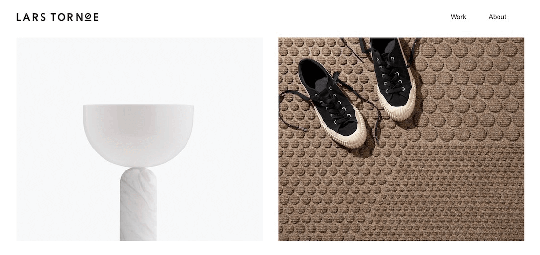
Lars Tornøe is a Norwegian designer known for his functional and aesthetic furniture pieces. His website embraces minimalism to reflect the elegance and simplicity of his minimalist website designs. The homepage is characterized by a sparse layout that puts the products front and center.
Key Features:
- Hero Image
- High-Quality Imagery
- Minimal Text
Key Takeaway: The website focuses on highlighting the beauty and functionality of high-quality products.
Field
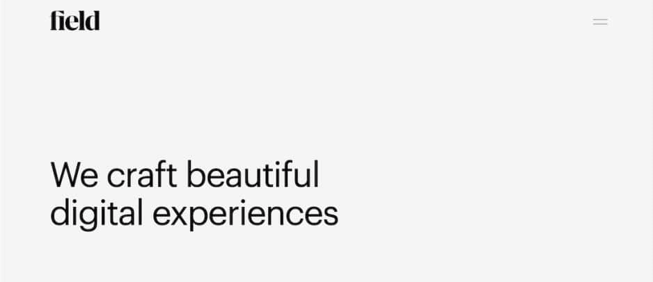
Field is a digital design studio that creates interactive experiences and digital art. Their website uses a minimalist design to convey a sense of sophistication and creativity.
Key Features:
- Dynamic Visuals
- Interactive Elements
- Sparse Text
Key Takeaway: Incorporate dynamic visuals and interactive elements sparingly to engage users while maintaining a minimalist aesthetic.
Casa Mami
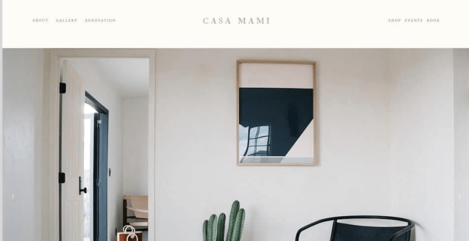
Casa Mami is an eco-friendly boutique hotel located in California. Their website adopts a minimalist design to reflect the tranquility and simplicity of their accommodations. The homepage welcomes visitors with serene images and minimal text.
Key Features:
- Serene Images
- Calm Aesthetic
- Clear Information
Key Takeaway: The website uses serene images, minimal text, and easy navigation to create a soothing and user-friendly experience.
Mogutable
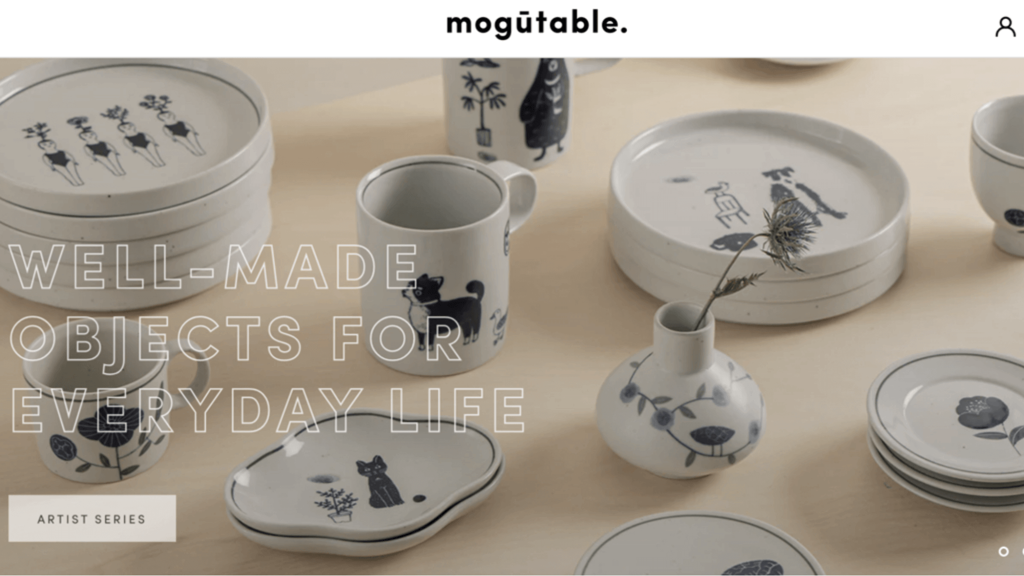
Mogutable is a home goods brand offering minimalist, high-quality tableware and home accessories. Their website uses a clean and simple design to reflect the brand’s aesthetic. The homepage features large, high-resolution images of their products..
Key Features:
- High-Quality Visuals
- Sparse Layout
- User-Friendly Interface
Key Takeaway: Mogutable can show product aesthetics with minimal distractions.
Oishii
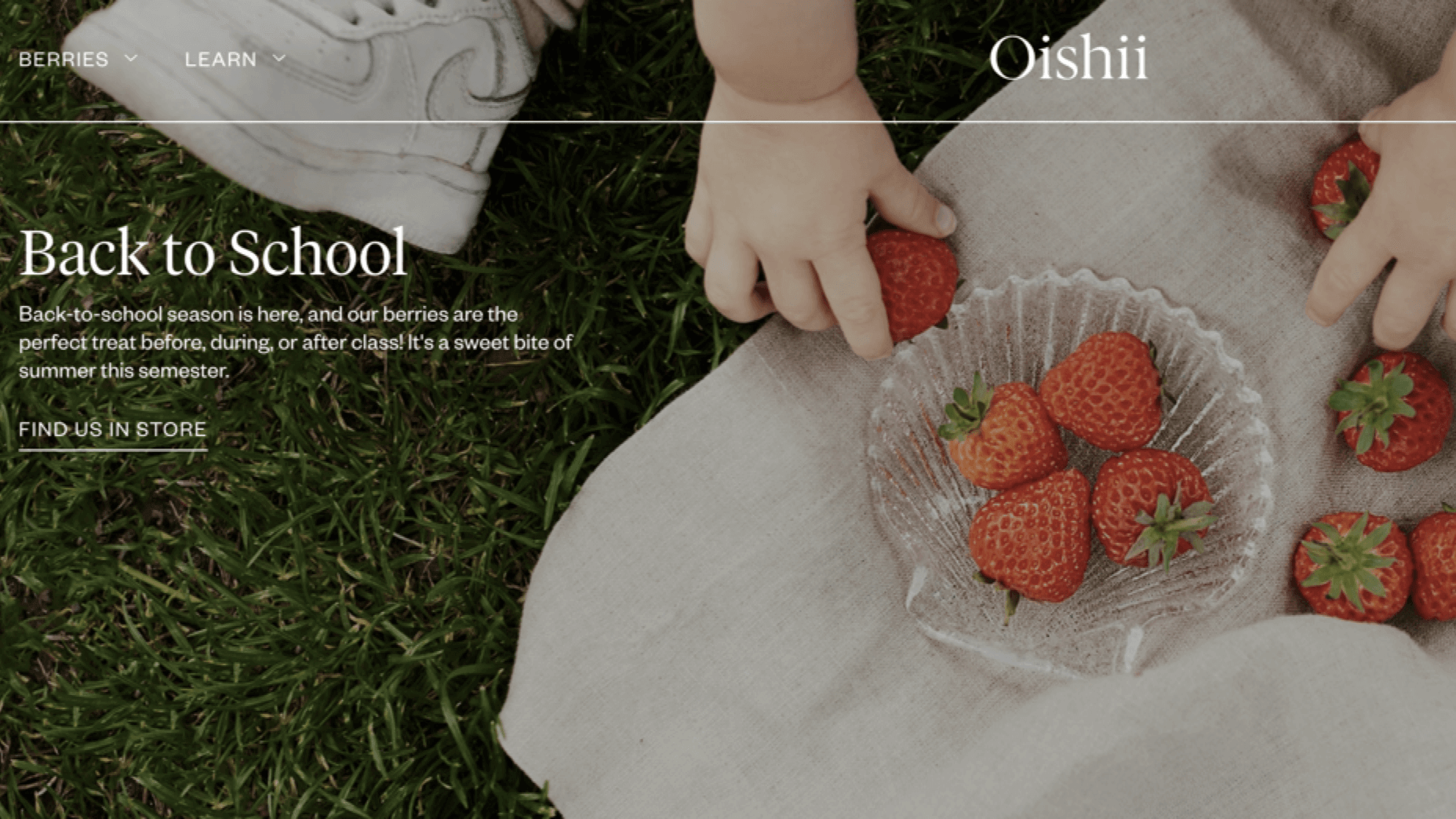
Oishii is a brand that produces premium strawberries through innovative indoor farming. Their website’s minimalist design highlights the purity and quality of their product.
Key Features:
- High-Resolution Images
- Concise Text
- Easy-to-Use Interface
- Clean Aesthetics
Key Takeaway: Communicate brand purity and quality through minimalist design. Use high-resolution images, concise text, and intuitive navigation to highlight product excellence and sustainability.
Zimik Studio
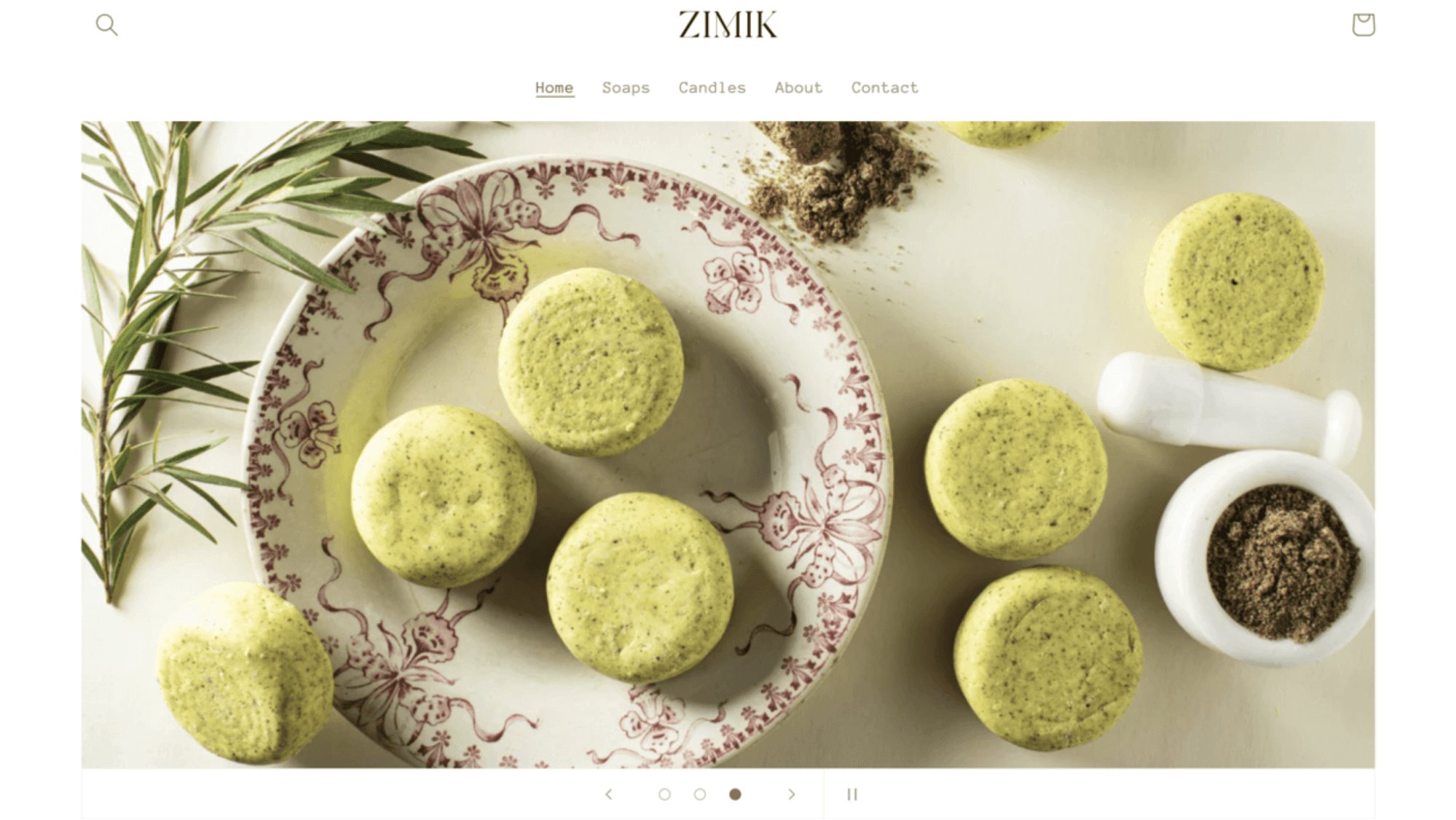
Zimik Studio specializes in handcrafted soaps and candles that embody beauty and love. Their website reflects this essence with a warm and inviting personality, curated through a thoughtfully chosen color palette.
Key Features:
- Minimalist Aesthetics
- Intuitive Navigation
- Responsive Design
Key Takeaway: The website employs a minimalistic color scheme and simple typography, ensuring that the focus remains on the products.
And Then Jupiter

And Then Jupiter is a creative studio that offers branding and design services. The homepage features bold visuals and concise text that immediately grab attention.
Key Features:
- Concise Text
- Minimalist Layout
- User-Friendly Interface
Key Takeaway: Use concise text and simple navigation to emphasize creativity and professional services.
We Ain’t Plastic
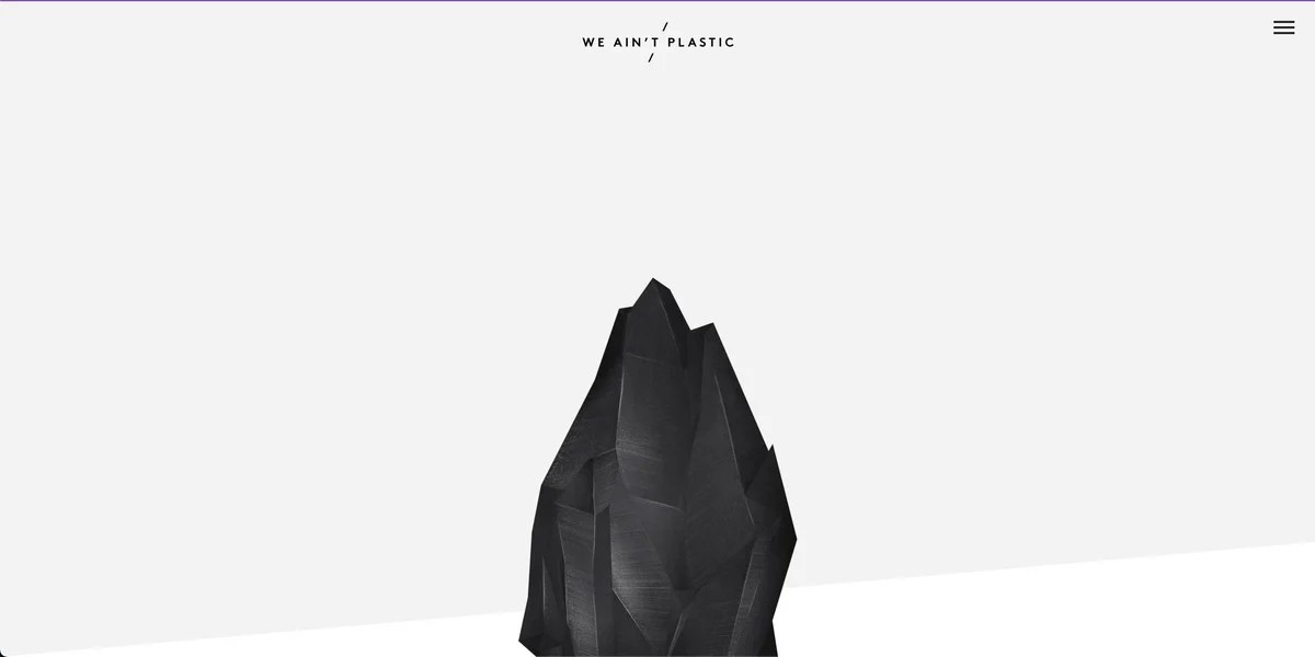
We Ain’t Plastic is the portfolio website of a digital product designer. The minimalist design of the site reflects the designer’s philosophy of clean, user-focused design.
Key Features:
- Portfolio Showcase
- Minimal Text
- Clean Aesthetic
Key Takeaway: Highlight portfolio projects effectively with minimalist design principles.
Ramotion

Ramotion is a design agency that specializes in branding, UI/UX design, and app development. Their website reflects their commitment to high-quality, user-centric design. It features large visuals and concise text that effectively communicate their services and expertise.
Key Features:
- Service Highlights
- Clean Layout
- User-Centric Design
Key Takeaway: Striking visuals, minimal text, and intuitive navigation can showcase expertise and build client trust.
Couple

Couple is a minimalist lifestyle brand offering curated home goods and accessories. Their website design features clean lines, muted colors, and spacious layouts that emphasize the beauty of their products.
Key Features:
- Minimalistic Design
- Subtle Elegance
- Focus on Products
Key Takeaway: Ensure that the design directs attention to the most important elements, such as products or key content, without unnecessary distractions.
Lulu and Isabelle
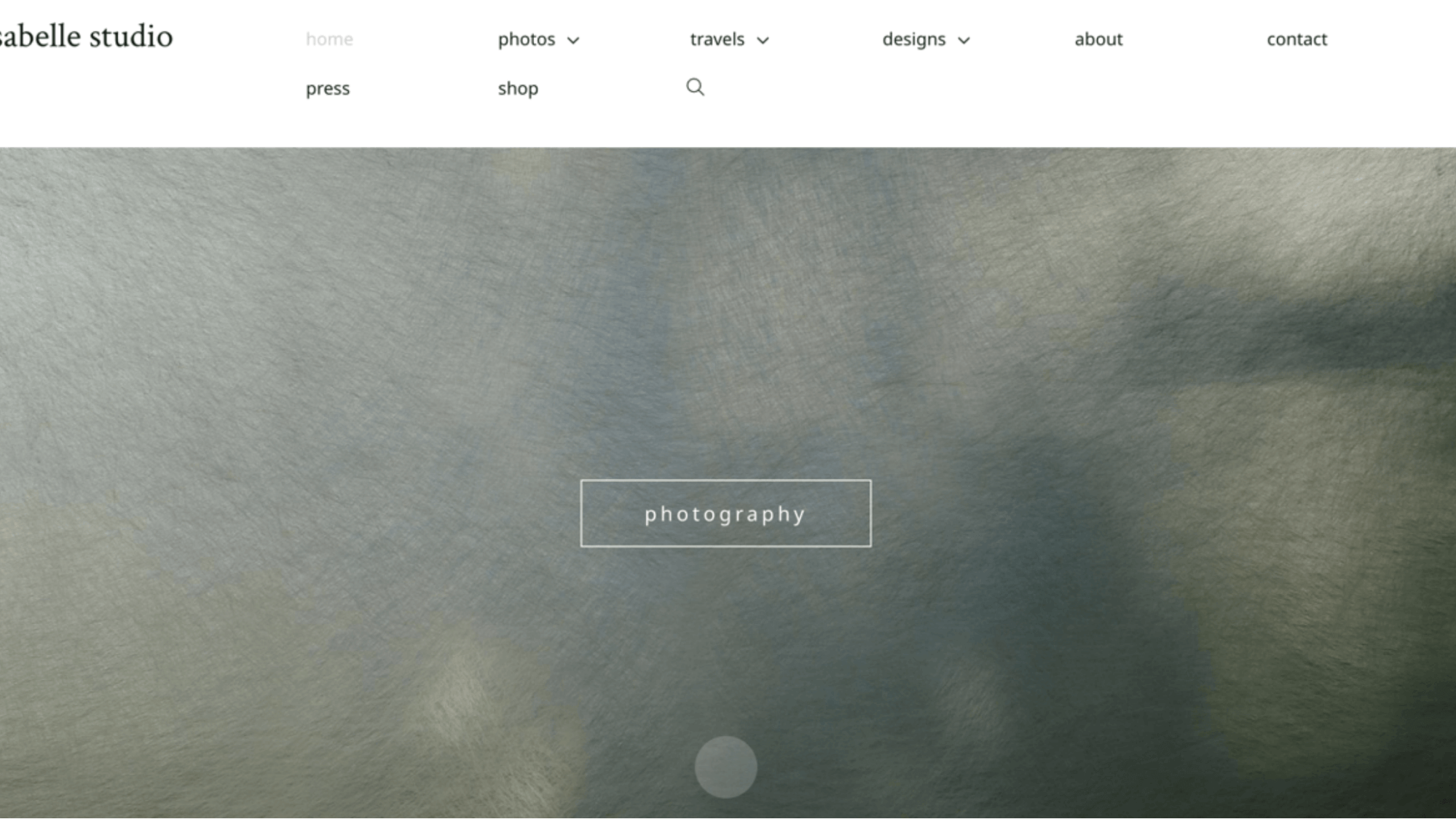
Lulu and Isabelle serves as a portfolio for Oanh Tran, showcasing her professional photography and detailed graphic creations. The minimalist website design effectively highlights her work without overwhelming visitors with unnecessary text.
Key Features:
- Stunning Imagery
- Minimal Text
- User-Friendly Experience
Key Takeaway: Keep text to a minimum to avoid overwhelming visitors and maintain focus on the visuals..
Dizal

Dizal serves the construction industry with its innovative aluminum and cellular PVC products. Their website presents detailed information in a high-quality, minimalistic fashion, utilizing key images atop dark backgrounds to create a striking visual impact.
Key Features:
- Product Focus
- High-Quality Visuals
- Simple Color Schemes
- Clear CTAs
Key Takeaway: Call-to-action buttons need to be easy to find and consistently designed to guide users towards desired actions.
Good Books
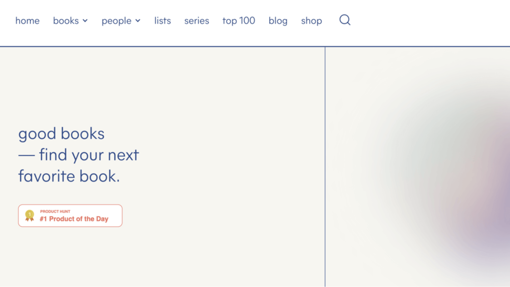
Good Books is an online bookstore that curates a selection of literary works for book enthusiasts. Their minimalist website focuses on simplicity and ease of use, providing a straightforward and enjoyable browsing experience.
Key Features:
- Easy Navigation
- Consistent Color Palette
Key Takeaway: Design with simplicity in mind to make the browsing experience straightforward and enjoyable.
Tips For Creating A Minimalist Website
Minimalist website design is a powerful approach that emphasizes simplicity and functionality. In this section, we’ll explore valuable tips for creating a minimalist website:
Use White Space Effectively
Embracing white space—or negative space, is crucial for creating a clean and organized layout. White space helps to reduce clutter, highlight important elements such as contact information and form fields, and improve overall readability. Aim for a balanced distribution of white space around text, images, and other elements to guide users’ focus and enhance user experience.
Incorporate High-Quality Visuals
Visuals should serve a purpose, whether it’s to convey information, evoke emotion, or showcase products effectively. Avoid cluttering your site with unnecessary visuals that could distract from its minimalist design principles.
For instance, the website of Muji, a Japanese retailer known for its minimalist products, uses high-quality images of their products against simple backgrounds. This approach emphasizes the beauty and functionality of their designs without distractions.
Streamline Navigation
Simplifying your website’s navigation is key to ensuring users can find what they need quickly and intuitively. Limit menu options to essential links and use clear labels that guide users to key sections without overwhelming them.
Some cases like organizing menu items logically and using dropdowns sparingly can help users navigate your site efficiently without feeling lost or confused.
Test and Iterate
Testing and iterating based on user feedback is crucial for ensuring your website meets user expectations. For example, analyzing user behavior through heatmaps can reveal where users click most frequently or where they might encounter navigation obstacles, helping you refine the design for better usability.
Maintain Consistency
Consistency in design elements such as fonts, colors, spacing, and button styles is important in designing a minimalist website design. Remember to establish a style guide that outlines these elements and ensures they are consistently applied across all pages of your website.
Free 1-1 consultation: Website Design Service
Conclusion
As we’ve journeyed through these 15 stunning minimalist website design examples, it’s clear that simplicity and elegance go hand in hand. Each one showcases how thoughtful design can create powerful user experiences, proving that minimalism is far from boring.
Now, are you ready to embrace the art of minimalist design and elevate your website to new heights?

Summer is the CMO and Digital Commerce Solution Expert with 10+ years of experience. She specializes in Magento, Shopify, ERP, CRM, AI, and Blockchain, delivering strategic solutions that transform businesses. With a deep understanding of digital commerce, she helps brands scale and stay ahead in a competitive market.
Related Post

Adobe Commerce SaaS or Magento 3? The Future of Magento
Discover how Adobe Commerce SaaS is reshaping the future of Magento. Learn the key differences, what Magento 3 really means, and what merchants should expect next.

Magento 2.4.8 Official Release: What's Updated?
In this article, we’ll explore the standout new features and enhancements that make the Magento 2.4.8 official version truly special.

Mageplaza Announces Official Separation from Avada Group
Mageplaza is pleased to announce a significant milestone in our journey as we officially separate from the Avada Group to operate as an independent company.
Adobe Commerce SaaS or Magento 3? The Future of Magento
Discover how Adobe Commerce SaaS is reshaping the future of Magento. Learn the key differences, what Magento 3 really means, and what merchants should expect next.
Magento 2.4.8 Official Release: What's Updated?
In this article, we’ll explore the standout new features and enhancements that make the Magento 2.4.8 official version truly special.
Mageplaza Announces Official Separation from Avada Group
Mageplaza is pleased to announce a significant milestone in our journey as we officially separate from the Avada Group to operate as an independent company.
& Maintenance Services
Make sure your store is not only in good shape but also thriving with a professional team yet at an affordable price.
Get Started