Ecommerce UX: What It Is and Top Strategies to Upgrade Your Store
Summer Nguyen | 12-18-2024

The rise of online shopping has revolutionized the retail industry, with consumers increasingly turning to eCommerce for their purchases. However, with numerous sites vying for attention in the market, competition is fierce. Therefore, the success of your website in today’s competitive e-commerce landscape relies on its ability to delight consumers.
As we progress into 2024, keeping abreast of emerging eCommerce UX trends is crucial for online businesses seeking to maintain a competitive edge and provide exceptional user experiences. Consequently, this blog will delve into the significance of user experience in eCommerce, offering recommendations for enhancing the UX of your eCommerce store.

Improve the user experience, boost sales, and ultimately grow your business.
Check it out!What Is eCommerce UX?
Basically, UX refers to the comprehensive design and usability of an online store, encompassing every aspect of a user’s interaction with an eCommerce website, from the initial landing on the homepage to the final purchase completion.
eCommerce UX design entails the website’s layout, navigation, aesthetics, responsiveness, and functionality. Businesses should focus on each of these elements to ensure a seamless and enjoyable online shopping experience for their customers. Visitors should effortlessly locate products, navigate categories, and smoothly finalize transactions.
A well-crafted eCommerce site undeniably enhances customer satisfaction and boosts sales. Effective eCommerce UX design is pivotal in establishing trust, encouraging return visits, and nurturing customer loyalty within the fiercely competitive realm of online retail.
How design impacts on eCommerce

There are numerous compelling reasons for eCommerce companies to prioritize delivering a positive user experience. Firstly, their website serves as the virtual storefront, making first impressions crucial. A well-designed website has the potential to attract new customers, keep them engaged, and ultimately drive purchases.
A seamless user experience can significantly impact conversion rates by simplifying navigation, streamlining the checkout process, and ensuring optimal mobile responsiveness.
Additionally, a positive user experience builds trust and credibility, leading to improved customer loyalty. When shopping on an eCommerce platform is effortless and enjoyable, customers are more inclined to return for future purchases and recommend the site to others, thus contributing to the business’s long-term success and expansion.
The importance of UX in eCommerce
The success of an eCommerce venture is closely tied to the quality of the user experience (UX) it offers to customers. Conversely, a subpar user experience can adversely affect sales, customer retention, and brand loyalty. Here are some compelling reasons why prioritizing UX in online retail is crucial:
Affect on poor user experience in business
An eCommerce store can suffer greatly if users encounter difficulties when making purchases. Customers are more likely to abandon their shopping carts and turn to competitors if the website is challenging to navigate or fails to meet their expectations. Consequently, the company may lose potential sales, and if visitors have a negative browsing experience, they are less inclined to return or recommend the site to others.
Thus, safeguarding against a decline in traffic and sales necessitates a significant investment in UX design, both financially and in terms of time commitment.
Understand customer behavior and expectations

It’s essential to understand your clients’ behaviors and what they expect from your online store. By addressing issues identified through eCommerce UX research, you can enhance your website’s usability. By meeting users’ expectations, you can increase satisfaction and profitability.
Therefore, ongoing user testing is essential for sustaining an online business, not just during the initial design phase but also as you continue to refine and update the UX over time.
Build trust and credibility
A well-designed website for an online store greatly boosts credibility and customer trust. Easy navigation and clear user flows inspire confidence in purchases. Conversely, a confusing site may raise doubts about the company’s reliability.
Investing in UX design fosters a positive reputation, encouraging repeat purchases and customer loyalty. Ensuring a seamless user experience is crucial for retaining customers and building trust in the brand, as frustrations like disappearing items in shopping carts can deter future visits.
Ecommerce UX: Best practices and crucial strategies
Now that we’ve underscored the significance of eCommerce UX design for businesses, let’s delve into how you can implement top eCommerce UX best practices personally. Adhering to these customer-centric strategies undoubtedly contributes to a positive user experience on your platform, resulting in heightened customer satisfaction, improved conversion rates, and enhanced business success.
Emphasize functionality
The focus shouldn’t be on flashy elements, but rather on having a fully functional user interface that supports the entire user journey. Your eCommerce site should be intuitive and easy for customers to navigate, ultimately leading to higher conversion rates.
The customer journey typically involves several steps:
-
Website discovery
-
Product browsing
-
Viewing product pages
-
Adding items to the cart
-
Checkout
-
Confirmation
It’s essential for all eCommerce sites to incorporate functionality that caters to each stage of the user journey, ensuring a seamless and satisfactory experience for customers.
Create sales funnels

Rather than designing a website and then seeking ways to attract traffic, it’s more effective to construct a fundamental sales funnel and proceed from there.
This approach involves initially identifying your target audience and understanding their needs. Conduct thorough user research, take into account user expectations, and prioritize enhancing the eCommerce user experience.
Subsequently, utilize the insights gathered to develop a website that guides customers seamlessly through the sales funnel stages—awareness, interest, desire, action, and loyalty—ultimately leading them to make a purchasing decision.
Optimize store navigation
Enhancing user experience involves ensuring intuitive online navigation. User-friendly menus and navigation bars guide visitors through eCommerce websites seamlessly. Use clear labels and easily recognizable icons to help customers locate products and categories effortlessly.
Implementing breadcrumbs provides users with a clear path back to previous locations, reducing frustration and encouraging exploration. Additionally, a robust search functionality, such as a search bar, simplifies shopping by enabling users to find items quickly.
Examples of well-designed navigation systems, like Amazon’s category menus, Apple’s product categorization, and Etsy’s filters and search features, prioritize user convenience, enhancing the overall shopping experience.
Focus on mobile optimization
More than half of internet traffic originates from mobile devices rather than desktops, optimizing your website for mobile users is essential.
To achieve this, consider the following tips:
-
Utilize responsive design to ensure your site adapts seamlessly to various devices, screen sizes, and orientations.
-
Optimize product images, minimize code, and utilize browser caching to enhance page load times on mobile devices.
-
Simplify the mobile checkout process by reducing steps, offering guest checkout options, and integrating popular payment gateways.
-
Enhance your site’s mobile SEO by incorporating mobile-friendly keywords and generating high-quality mobile content.
-
By implementing these strategies, you can provide a smooth mobile shopping experience and ensure a responsive website design.
Streamline checkout process
Another essential UX practice involves simplifying your checkout process to minimize cart abandonment rates, often caused by complex forms, unexpected fees, or a lengthy checkout process.
To address this issue, consider incorporating a one-page or guest checkout option. These streamlined alternatives eliminate the need for users to create an account or navigate through multiple pages, enhancing the overall checkout experience.

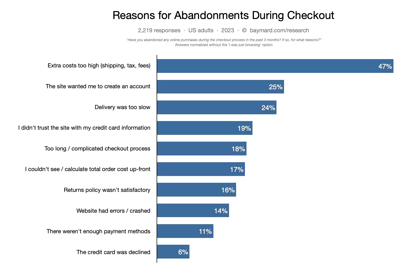
Research from the Baynard Institute reveals that 47% of online shoppers abandon their carts upon encountering fees, shipping costs, or taxes, while 25% do so when prompted to create an account. Prioritizing an efficient checkout process and seamless payment flow can significantly boost conversion rates and customer satisfaction, ultimately leading to greater success.
Include clear calls to action (CTAs)
Strategically placed and carefully designed persuasive CTAs are pivotal in guiding users through the purchasing process. Well-crafted CTAs, such as “Buy Now” or “Get Started” on an eCommerce site, can notably increase conversion rates by instilling a sense of urgency.
A/B testing frequently demonstrates that CTAs employing contrasting colors to the website’s palette, positioned prominently on the page, and featuring action-oriented language yield optimal outcomes. By boosting visibility and engagement, these elements contribute to a smoother user journey and an enhanced overall user experience.
Incorporate in-scale photos
In-scale photos accurately depict product proportions relative to a person’s size, aiding customers in understanding the product better.
Furthermore, maintaining consistency in color schemes, fonts, and logos throughout your website is essential to establish a cohesive visual identity. This consistency fosters brand recognition and trust among users.
High-quality images and product visuals are vital for engaging users, effectively conveying information, and improving the overall user experience. To optimize images, it’s crucial to balance quality and loading speed by utilizing formats like JPEG or WebP and optimizing file sizes.
Utilize user-centered copy
Dedicate time to ensure that the wording on your eCommerce site is natural, transparent, and assists customers in fulfilling their online shopping objectives. Complex language may deter individuals from completing purchases or staying on your platform.
Utilize copy to:
-
Establish expectations
-
Provide context
-
Organize the site through navigational labels
-
Prompt customers with clear calls to action
-
Present product details effectively
-
Convey essential information like product availability and shipping options.
Ask for user feedback

Another essential eCommerce UX practice is actively seeking user feedback to continually enhance your website.
Various methods can be employed to gather feedback, including:
-
User testing: Have individuals new to your site navigate tasks and share their thoughts aloud.
-
Session replays: Record visitor interactions to analyze user behavior and pinpoint areas for improvement.
-
Funnel analytics: Examine data to understand where users drop off in the sales process and make necessary adjustments.
By prioritizing user feedback, you can continuously refine your website, making it more user-friendly and enhancing the overall shopping experience.
This iterative approach ensures that your site remains aligned with user needs and preferences.
Embrace minimalism
Minimalist design principles place emphasis on simplicity and clarity, aiming to minimize distractions for online shoppers. This is accomplished by employing a straightforward color scheme and refraining from unnecessary embellishments, thereby directing attention to the products.
Moreover, incorporating ample white space allows content to have sufficient breathing room, preventing shoppers from feeling overwhelmed. Additionally, employing clear and easily readable typography enhances clarity, ensuring that product descriptions are effortlessly comprehensible.
In essence, streamlining your website and maintaining simplicity and clarity facilitates a seamless browsing experience.
Leverage visual content
You’ve undoubtedly heard the adage countless times: “A picture is worth a thousand words.” And indeed, it holds true. High-quality images, videos, and other visuals possess immense power in communicating your brand and products to potential customers.
Visual elements enable visitors to swiftly navigate your website, bypassing extensive text. Photos deliver information instantly, captivating and involving your audience. Ultimately, meaningful and visually compelling imagery can diminish returns and drive up sales for an eCommerce enterprise.
User-generated content—such as photos or videos captured by customers themselves—holds even greater significance. Encourage your clientele to share their brand experiences online, anticipating the benefits that come with it.
Ensure loading speed and performance

While images are crucial for any eCommerce site, it’s vital to optimize them to prevent slowing down your website. Research shows that if a mobile site takes longer than three seconds to load, a staggering 53% of visitors will leave and may not return.
Here are some speedy tips to enhance your website’s performance:
-
Optimize images and multimedia content.
-
Utilize browser caching effectively.
-
Reduce HTTP requests to minimize loading time.
-
Compress CSS and JavaScript files for faster loading.
-
Streamline your website’s content by removing unnecessary elements.
-
Employ a Content Delivery Network (CDN) to distribute content across global servers.
-
Consider upgrading your hosting plan for improved speed and reliability.
-
Implement server-side caching mechanisms to enhance performance.
-
Choose lightweight themes and plugins to avoid unnecessary overhead.
-
Keep your CMS, themes, and plugins updated regularly.
-
Enable GZIP or Brotli compression for faster data transmission.
-
Minimize the usage of redirects to reduce loading time.
-
Prioritize loading critical content (above the fold) before non-essential elements.
-
Ensure your website is optimized for mobile devices.
- Monitor your website’s performance using tools like Google PageSpeed
-
Insights, GTmetrix, or Pingdom.
-
Remove unnecessary code and features that contribute to bloat.
- Consider using loading animations or placeholder content to maintain user engagement during loading periods.
Test and optimize continuously
Continuously testing is essential to ensure that the user experience remains refined and aligned with user needs and expectations.
A/B testing proves to be a valuable technique in this regard, allowing systematic experimentation with various design elements and functionalities to determine what resonates best with users.
To set up A/B tests, establish clear goals and hypotheses, then create variations of your website or app and randomly split your audience. Collect quantitative data through analytics tools and incorporate user feedback collection methods, such as surveys or user testing, to gain qualitative insights. Analyze the results, make informed adjustments, and iterate as needed.
Tools like Optimizely can facilitate test implementation, while platforms like Hotjar or Lyssna (formerly UsabilityHub) assist in gathering user feedback.
Read more:
Conclusion
In today’s eCommerce landscape, success hinges on providing customers with a satisfying shopping experience. Businesses that prioritize high-quality UX design are more likely to retain customers, as it simplifies their interactions.
Achieving this requires eCommerce enterprises to carefully consider their customers’ preferences, needs, and pain points. Adhering to best practices for user experience design, such as optimizing the shopping cart experience, significantly enhances the overall customer experience of an online store.
By prioritizing usability in their eCommerce sites, businesses can expand their online presence, attract new customers, and retain existing ones. Ultimately, investing in excellent user experience design for online stores proves to be a wise investment.


